Asked on Sep 29, 2015
Vote on this backsplash
by
Elisa
+34
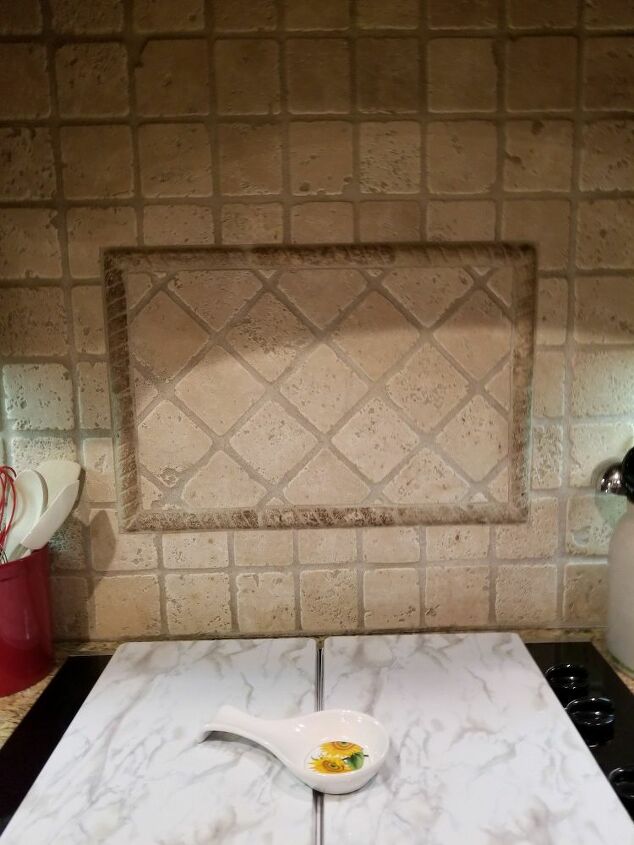
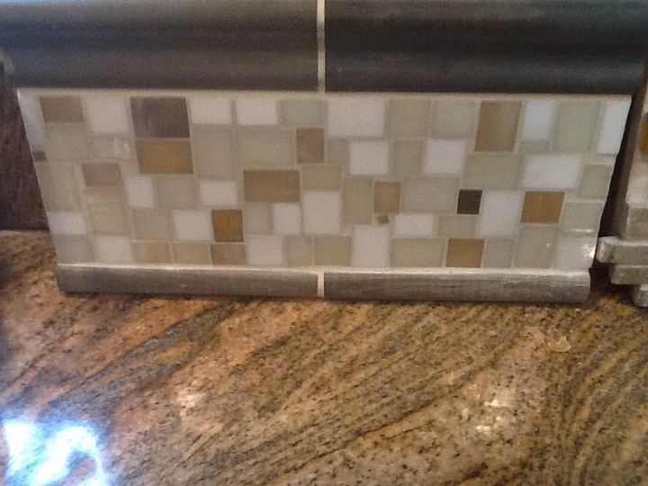
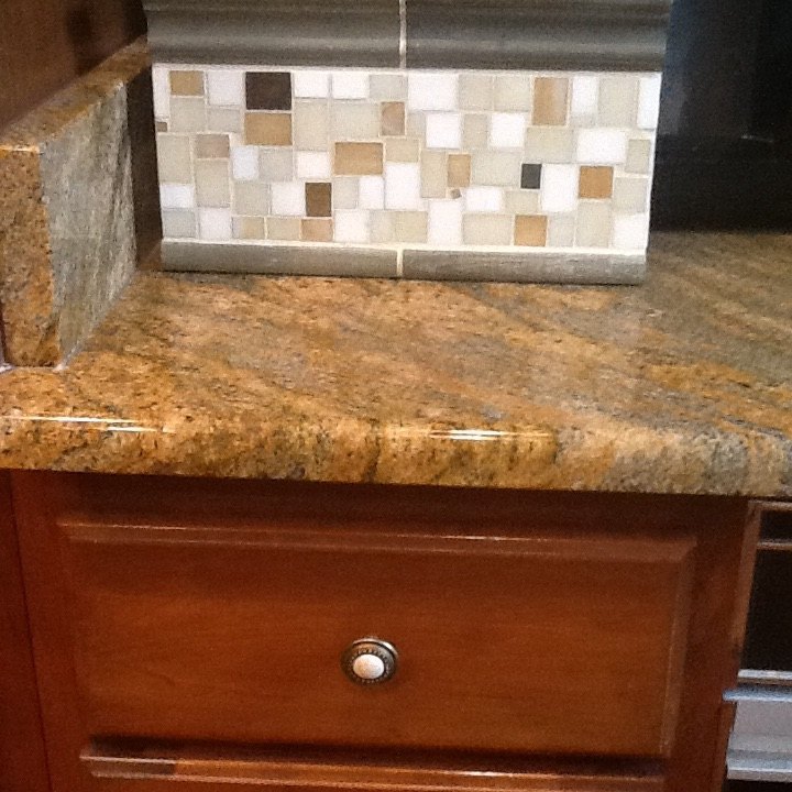
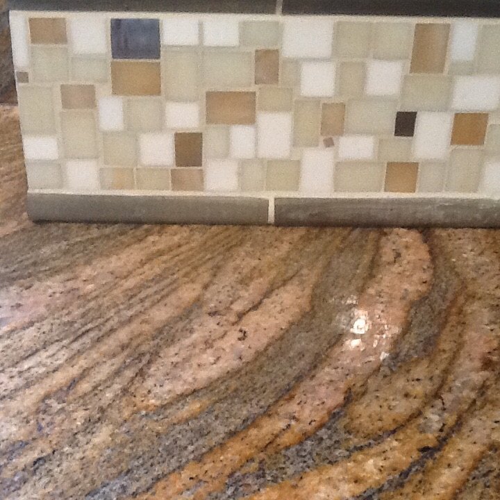
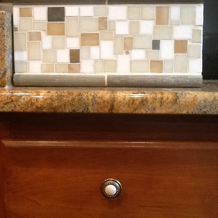
Considering this backsplash to offset the dark cabinets and granite countertop. The darker colors in the tile are metallic tiles with varying hues (don't show well in the photos) depending on the light. I like the eclectic look of it, but is it too busy to pair with the countertop which has lots of veining, movement and variation.
28 answers
-
I see this as too busy for the granite you have chosen. If it had less shapes and colors it would be better. A solid color glass tile or tile back splash would be more interesting .
 Patricia Davis
on Sep 29, 2015
Patricia Davis
on Sep 29, 2015
-
It's hard to tell with close ups. Can you take a picture of it against the wall at the back of the counter where it would be placed and get a long shot showing more of your cabinets please? If it's straight on enough, with the sample in place I can do a mock up of it for you.
 Z
on Sep 29, 2015
Z
on Sep 29, 2015
- See 1 previous
-
Because of the Iong streaks running through your granite, I would go with a rectangular shaped backsplash instead of the square shape.Good luck !
 Felecia Hernandez
on Sep 30, 2015
Felecia Hernandez
on Sep 30, 2015
-
I would use a color closer to pearl white glass tiles with clear shiny tiles running throughout
 Lynn Gronewold
on Sep 30, 2015
Lynn Gronewold
on Sep 30, 2015
-
Honestly those tiles are very busy against the granite. I to did a kichen remodel with that style of granite, I choose a tumbled marble and sealed it which brought out the hues of the granite.
 Janet Pizaro
on Sep 30, 2015
Janet Pizaro
on Sep 30, 2015
-
I would personally use more of a neutral tile. Larger squares ( like, 4X4) and maye light brown color. Maybe two or three different brown, tan, beige families. With a hint of beige through out to keep things light??
 Tracey
on Sep 30, 2015
Tracey
on Sep 30, 2015
-
I would use a more rectangular shaped backsplash, with bright shiny tiles, maybe in tan or white, with a splash of color.
 Kathy
on Sep 30, 2015
Kathy
on Sep 30, 2015
-
Too busy
 Erin Cronenwett
on Sep 30, 2015
Erin Cronenwett
on Sep 30, 2015
-
I'm with Kathy.
 Charlotte
on Sep 30, 2015
Charlotte
on Sep 30, 2015
-
Boy, these women all have opinions so I'll throw mine out there too. As I see it, your cabinets have a reddish color I guess.i might learn towards something with that color in it also. Not alot just enough to pick it up. I always look at it like this: Would you wear that as a matching outfit if it were one? Like a shirt, a belt, some slacks and shoes. Guess you think I am nuts, but I am an astute dresser. Proud, even got best dressed in highschool. So before I get carried away, just think about the colors. Not unless you are going to paint the cabinets which are a big color in your Kitchen. It all needs to compliment each other. Or else just pop a strange color in there if you are artsy? Hope you can understand all this.
 Barbara Valenti
on Sep 30, 2015
Barbara Valenti
on Sep 30, 2015
-
I think Its the white pieces that are throwing it off ( there's to .many) but I like the tans and the darker browns
 Tammy Robertson
on Sep 30, 2015
Tammy Robertson
on Sep 30, 2015
-
I personally think it's too busy looking. Too many different patterns and colours. I would chose something a bit more neutral or if you really want varying colours perhaps am ombre effect? Good luck
 Melanie
on Sep 30, 2015
Melanie
on Sep 30, 2015
-
I also think it is too busy and I don't have any suggestion of what would be better. I am also in the middle of the long process of choosing a backsplash. I know how hard it is . Good Luck
 Jean Myles
on Sep 30, 2015
Jean Myles
on Sep 30, 2015
-
I think it looks kind of busy too but if you are set on one of the two, I would go with the first one.
 Elaine Simmons
on Sep 30, 2015
Elaine Simmons
on Sep 30, 2015
-
I would go with subway tile. There are many different sizes and shades of subway tile. Good luck!
 Cornelia Schott
on Sep 30, 2015
Cornelia Schott
on Sep 30, 2015
-
I think its to busy. I would look for a solid color glass tile, which would give you more light reflection under the cabinets.
 LD
on Sep 30, 2015
LD
on Sep 30, 2015
-
Well, I'll admit it... I like it! But that's me. If you felt you needed to ask, then I suspect you are feeling it's too busy for you. And you are the one it needs to please!
 Kathleen Conery
on Sep 30, 2015
Kathleen Conery
on Sep 30, 2015
-
Too busy for my eye. Tile is a good idea, but go with one color. A "rustic" ivory tile (think Tuscany) would look great.
 Robin Robinson Stamm
on Oct 01, 2015
Robin Robinson Stamm
on Oct 01, 2015
-
I love it. and I think it would look fabulous. I have gone with something similar and while I was anxious before it was installed, once up I receive compliments all the time. It brightens everything up.
 Joanne Hayes Healy
on Oct 01, 2015
Joanne Hayes Healy
on Oct 01, 2015
-
I think I'd pick a single color theme, maybe just plain, clear glass
 Becky
on Oct 01, 2015
Becky
on Oct 01, 2015
-
It's very nice but maybe too busy with all the veining. A backsplash with just one or two colors would look very nice. The cabinets and countertops look high end so find something classic.
 Nancee
on Oct 02, 2015
Nancee
on Oct 02, 2015
-
I choose 4x4 tiles.Honestly they are not to white at all. I just used a natural grout and like I said previously we sealed them to bring out just enough color against the rest of the kitchen.
Janet Pizaro
on Oct 02, 2015
-
LOL,good luck ! I am sure you will figure something out to make you happy. It's your Kitchen******
Barbara Valenti
on Oct 02, 2015
-
Decisions, decisions! Thanks for everyone's input. I'm still considering options so I may come back with one or two more. I may wait until the under cabinet task lighting is installed so that I can see it with that. What a great forum!
 Elisa
on Oct 02, 2015
Elisa
on Oct 02, 2015
-
I have had fun just looking at it. Thanks for allowing us to participate in your decisions. Sorry its not resolved, but its better than making an expensive mistake. There are so many options in today's world its hard to decide on a tube of lipstick! Thanks again and good luck!
Barbara Valenti
on Oct 03, 2015
-
If the dark tiles could be taken out of the mosaic, it would work. Since you can't do that, go with a simpler one-color backsplash.
 Lizzy L
on Oct 04, 2015
Lizzy L
on Oct 04, 2015
-
The darker tones are metallic tiles that vary depending on the angle and lighting. The pictures don't do them justice, but it is precisely the chance that they may look to dark that is holding me up. So I am going to wait until the task lighting is completed. Thanks everyone.
Elisa
on Oct 04, 2015
-
It'sway too busy and really doesn't go with the cabinets. It's the top and bottom bull nose which really throws me off.
 Denise Boyce
on Oct 04, 2015
Denise Boyce
on Oct 04, 2015
Sign Up to Answer