


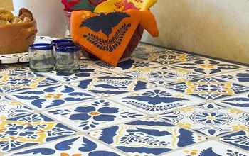
Yellow is the IT Color for 2014!
Yellow. People love it or hate it. Done right, I love it. Done wrong, well.. just get me out of there. Yellow is a home decor color you can be bold with.
The upside is it always makes a statement. The downside is, its not always easy work. If wall paint is too hard, use it as an accent color instead.
Yellow painted walls have a nasty way of showing the color underneath it after a few years.
The great thing about yellow is that it works the best when it challenges its surroundings. Your room decorating ideas suddenly look better. Like milky yellow with clear blues.
There is at least one yellow that will speak to your muted gray or chocolate color scheme. Soft and pale or strong and mango vibrant. Sharp yellow against dark purples or rusts.
Yellow is incredibly versatile.
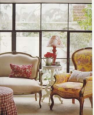
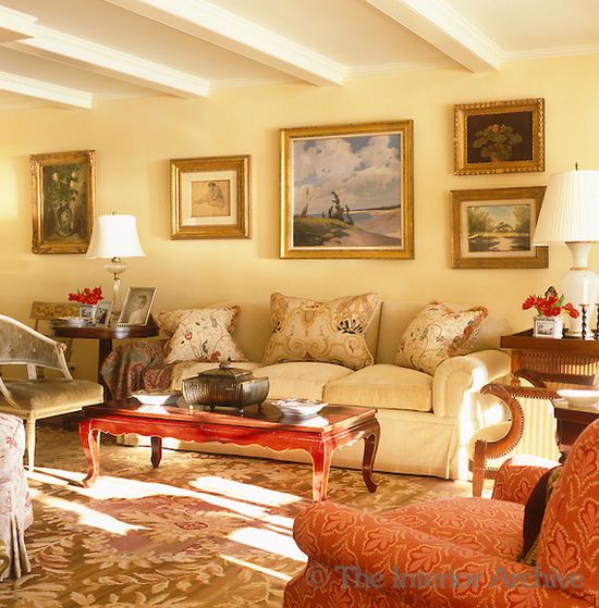
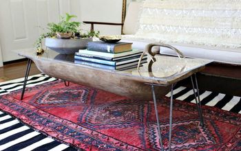
Yellow takes on whatever it's placed next to. Here with red, it takes on a red hue.
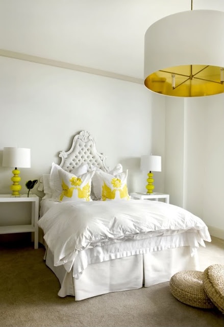
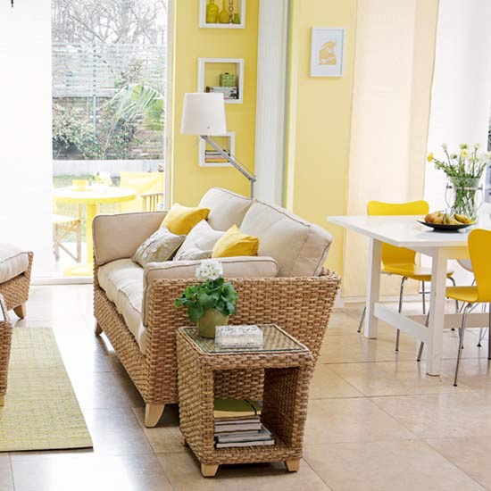
Yellow curtains in dark rooms will help make the room appear as if it has more natural light.
If you are not used to decorating with yellow, try using a little and adding to it to get the right amount of yellow in your rooms.
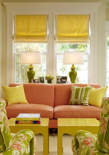
Yellow cushions can be enough to create a yellow color scheme.
Yellow painted walls are perfect as long as you get the undertone right, so you don't end up with green or muddied walls in a few years.
The range of yellow, from daffodil to duck yellow means it's incredibly versatile as a color scheme.
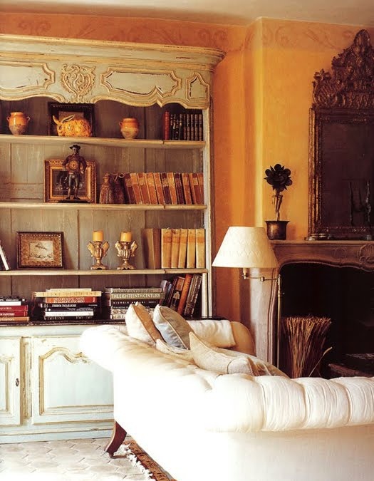
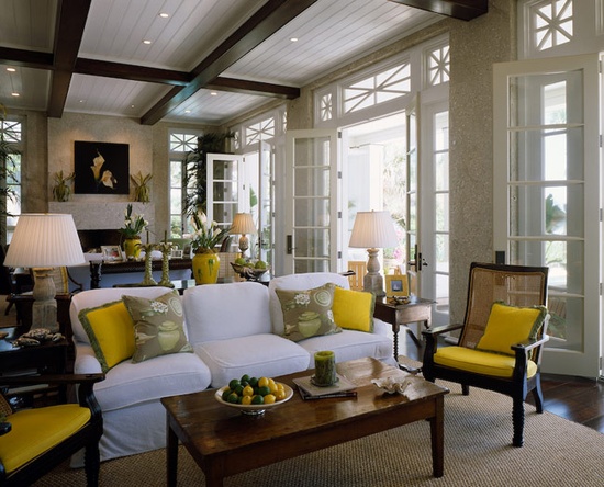
This room may not look as if it has a yellow color scheme but look at the components; from candles, walls, lamps and yellow book spines and yellow waxed furniture.
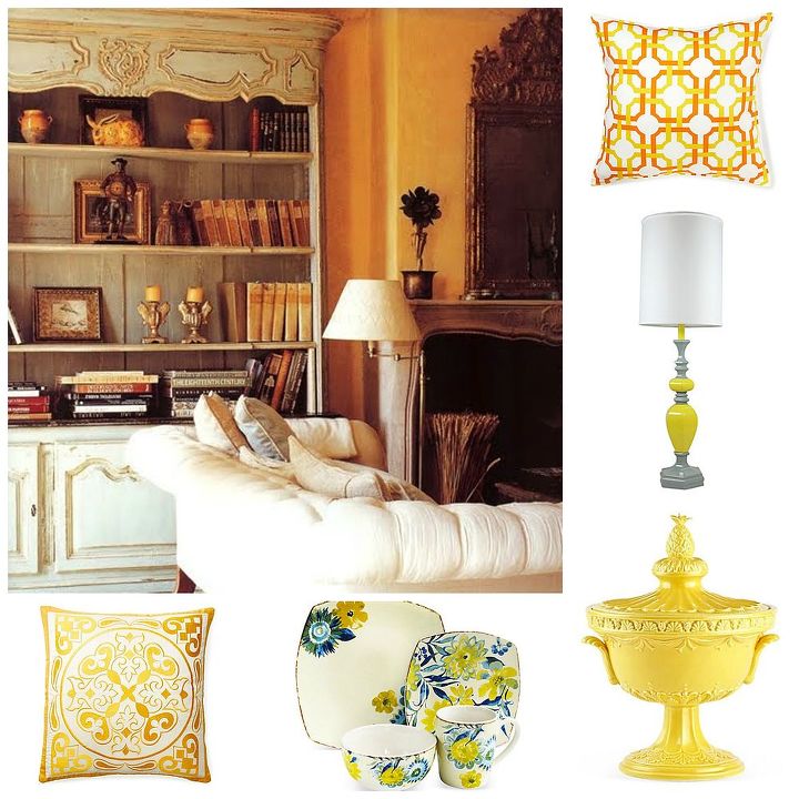
You can add yellow in lots of ways; lamp bases, cushions, porcelain pieces and even crockery.

Want more details about this and other DIY projects? Check out my blog post!
Comments
Join the conversation
2 of 5 comments
-
Great advice Txvoodoo, you need to account for your natural lighting.
-
Around 1978, my mom decided to add some yellow to her federal/chinoiserie styled family room, which previously had LOTS of black with some very 60s orangey accents. She had a lovely bucket chair with ebony-stained wood that had been something pumpkin-like! She had it redone in a bright gold fabric..and it looked AWFUL in the room. Gorgeous in the showroom, but once in the room, hideous. She took it back, found a daffodil shade, and voila! Perfection. Then she took a swatch of that fabric and got all accessories in that same hue, and it looked fabulous. (Well, minus the black & white almost-shag carpet. It WAS the 70s! :D)


Frequently asked questions
Have a question about this project?