


2014 Color Schemes; Purple, Yellow, Teal, Geometric and Floral Designs
2014 home decorating is all about contrasts. If you're thinking of changing your color scheme in 2014 then you'll be interested to know that Color of the Year has been named along with a supporting cast of colors, floral and geometric designs.
Radiant Orchid... that's a purple with fuchsia highlights is color of the year. If you love purple and can't work out how to get it into your home decorating, then this post will show you the other colors in the 2014 color schemes and lots of ways to use this with your existing paint colors.
It's not all about purple, but adding it to your existing rooms to give them a lift of strong, vibrant color, away from all the whites and muted shades we've had so much of.
Think soft pastels along side vivid bright colors. Pastels are easy on the eye.. you can experiment with color combinations and color schemes without changing absolutely everything about your living room furniture.
As for texture, it’s all about contrasting the practical and luxurious to create a perfect balance of opposites.
Gilded, carved mirrors against distressed painted furniture, folk or country rugs over polished hardwood floors and layers of softly textured fabrics against industrial polished steel or wrought iron.
Mix it up with some florals and geometrics and you have a great layered look.
The wider the contrast them more effective the look.
Read more at http://bit.ly/1cSiLfr
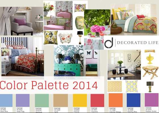
Here is the color of the Year and its supporting cast of colors! Lots to work with - even if you're not a purple fan!
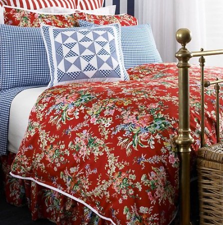
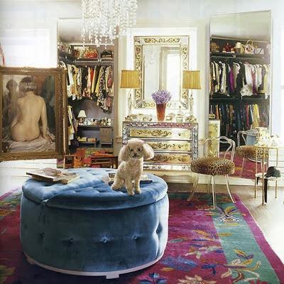
Deep reds and blues feature a lot in 2014. Its a great country look when you mix florals in too!
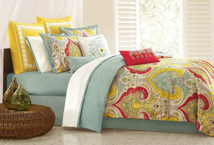
Yellow, pale blue and deep reds are supporting colors along with florals designs in 2014 - you can do so much with them!
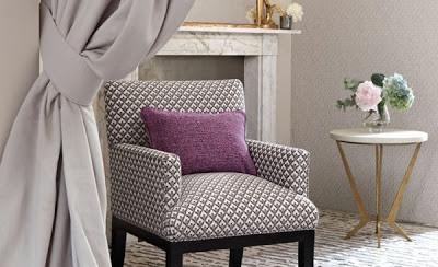
Tiny amounts of purple go along way - it looks great in this mostly gray and white muted room.
Radiant Orchid (Color of the Year) is about spilling in some vibrant colors into your color scheme in 2014
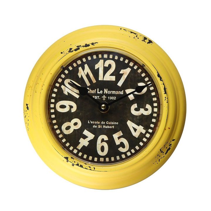
Yellow is a great color in 2014! This rustic clock says it all. Sharp bright yellow contrasted with a distressed look.. all about contrasts.
Here is Radiant Orchid.. purple with shades of fuchsia..

Want more details about this and other DIY projects? Check out my blog post!


Frequently asked questions
Have a question about this project?