Which background paper should I choose?

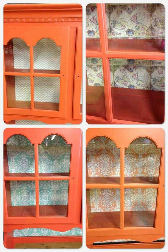
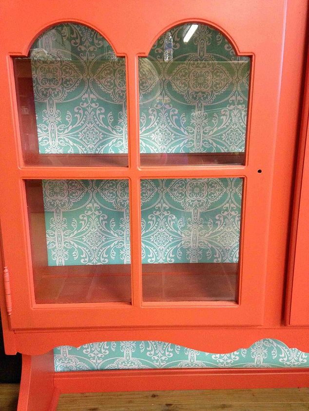
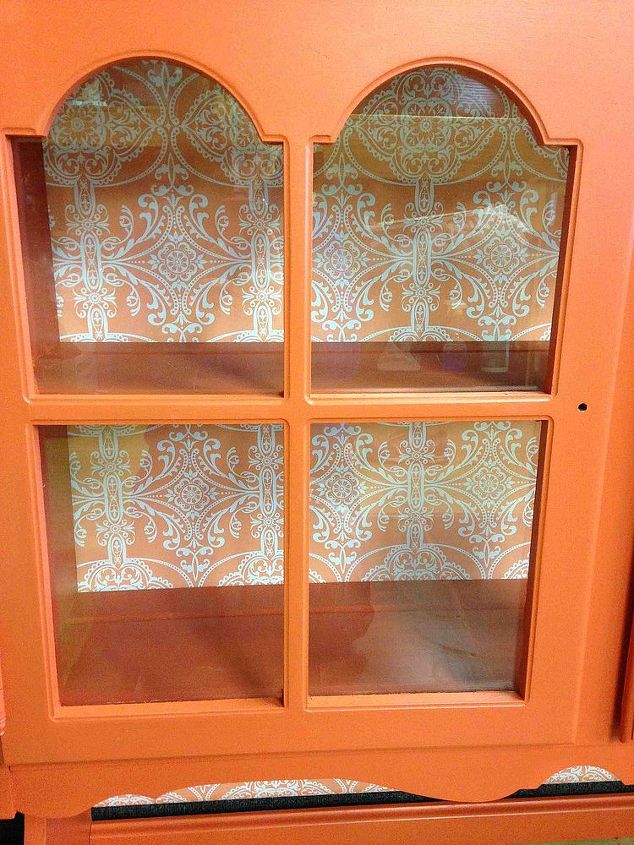
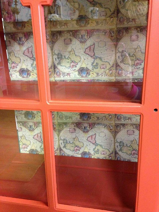
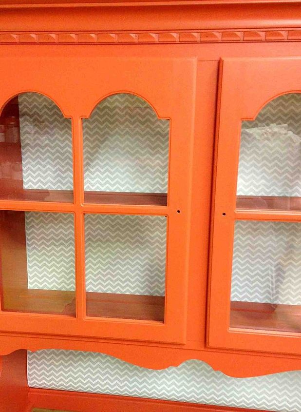
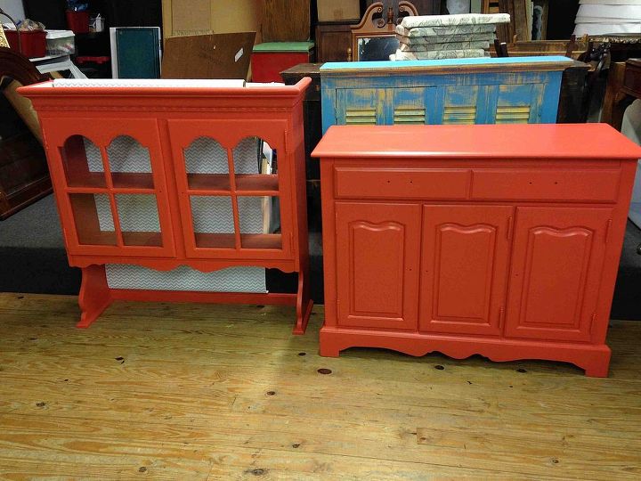
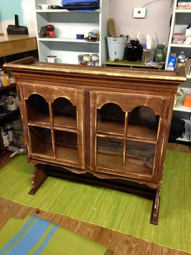
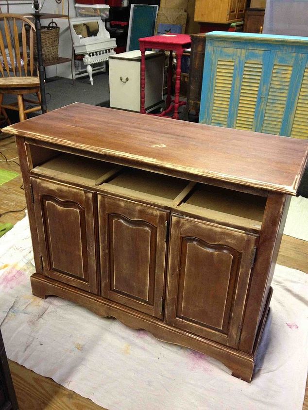
I painted this 70's era china hutch bright orange and I want to line the back with a decorative pattern but don't know which of these I like better. I would appreciate the input!
  69 answers
  • Adrianne C Adrianne C on Feb 28, 2014
    I like the orange one.
  • Lenzie Smith Lenzie Smith on Feb 28, 2014
    I like the orange as well!
  • Christine Christine on Feb 28, 2014
    Definitely orange!
  • WalkTheCreativePath WalkTheCreativePath on Feb 28, 2014
    Went with the blue, and I am so thrilled with how it turned out, it was between the orange and the blue. Thanks for the input!
  • WalkTheCreativePath WalkTheCreativePath on Feb 28, 2014
    Now I have to change out the knobs, the ones on the bottom are too tiny.
  • Lori J Lori J on Feb 28, 2014
    I actually was going to vote for the blue! But I would look for knobs that would provide a bit of blue accent as well.
  • Bonnie Lewenza Bonnie Lewenza on Feb 28, 2014
    The blue was an easy choice as it just made it pop more. My kitchen is done in orange, I love it.
  • Lynn Zawojski Lynn Zawojski on Feb 28, 2014
    Blue is to orange and purple is to red. They compliment each other. They are opposites on the color wheel, which i never understood while in school. :)
    • Lori J Lori J on Mar 01, 2014
      @Lynn Zawojski Red and purple are not complementary colors, as much as I love them together.
  • Moxie Moxie on Mar 01, 2014
    I like the orange one seeing it empty...but I think it would depend on what is going in it...
  • Linda Stone Linda Stone on Mar 01, 2014
    I love the blue too. Good job!!
  • Katie Katie on Mar 01, 2014
    The blue was the best!! YEAH!
  • Shelia E Shelia E on Mar 01, 2014
    chevron
  • Carol Harris Carol Harris on Mar 01, 2014
    chevron
  • Lorrie Walter Lorrie Walter on Mar 01, 2014
    I like the orange one to blend nicely with the orange, but depending what showcase pieces you display, the chevron design might work better as a background and let your pieces be the focus. Nice !
  • C Crow C Crow on Mar 01, 2014
    Love the cabinet (I would use the orange paper, personally)
  • I would say the blue or chevron, but the blue pops the best and compliments the orange the best. Great job!
  • DeMarie I DeMarie I on Mar 01, 2014
    Blue for the pop, and orange for blending. Either one would be good depending on what you are trying to accomplish. I like both for different reasons. I think it depends on what you would want to put inside. Nice thing is.....if you get tired of it, you can always easily change it!!!! YAYYYYYYY
  • Diana Diana on Mar 02, 2014
    I like the blue but you need to think about what your going to display, then the chevron might work better. Love the pop color, good job!
  • Joan Joan on Mar 02, 2014
    I like the orange background; would look lovely with all white dishes placed in the cabinet...yes, I agree with everyone, beautiful job!!
  • Lisa Lisa on Mar 02, 2014
    Definitely the blue- it compliments the orange beautifully, but I would only do it in the glassed in section. Nice job!
  • Donna Shipley Donna Shipley on Mar 02, 2014
    I would probably choose the orange because it would blend better and not fight for attention with what you plant to put inside.
  • Dorothy Dorothy on Mar 02, 2014
    I think you have a great choice between the blue or orange. Either one is striking. Do you want to bring out some blues in the room or keep things more subtle? This is a beautiful project, good luck.
  • I agree with Donna, I really like the orange. The hutch is a "pop" of color itself. I would use only 2 colors when choosing what to display in it; maybe that's where you could use the teal / blue (& white as Joan suggested).
  • Melissa Leach Melissa Leach on Mar 02, 2014
    I like the Chevron because it adds some visual interest but won't take away from what you put on the shelves. Blue is good if you want high contrast. Good job!
  • Carole Crawford-Evon Carole Crawford-Evon on Mar 02, 2014
    I like the blue, but it depends on the colors of what you are going to display. Any of the 4 will be nice!
  • Peggy Lawrence Peggy Lawrence on Mar 02, 2014
    I like the blue as long as it compliments the other accents in the room it will be in...second orange then chevron! :)
  • Miz Amerika Miz Amerika on Mar 02, 2014
    I'm not always a matchy, matchy! But I love the orange!
  • Kay Love-Wood Kay Love-Wood on Mar 02, 2014
    two to the right. like both of those and would probably go with the one with more colors but second would be the orange
  • Janet F Janet F on Mar 02, 2014
    I tend to go with matchy matchy so I tried to think outside the box but my eye was still drawn back to the orange which isn't generally a favorite color of mine......except for Halloween and of course my SF Giants. So I'd say go orange. Could depend on what color dishes you are planning to showcase as well. White would look awesome.
  • Marianne F Marianne F on Mar 02, 2014
    Blue, love it!
  • Beth T Beth T on Mar 02, 2014
    Chevron :)
  • Judy Adams Judy Adams on Mar 02, 2014
    The orange is complimentary, and will also accent things of another color on the shelf, with out demanding your eye to do battle with a color disinant. Love the color and style of the furniture.
  • Karen Rossman Clark Karen Rossman Clark on Mar 02, 2014
    I am partial to damask type prints which blend in with any items that you might want to put in the cabinet.
  • Ene19230 Ene19230 on Mar 02, 2014
    Depends on the rest of your decor and the look you're going for? What will you use the piece for? Blue is a complementary color for orange and will enhance it while orange blends in smoothly.
  • Jeanette S Jeanette S on Mar 02, 2014
    Hey, the decor of where this goes is going to have to be compatible to orange or it won't work at all...so I say go with the orange! It is classic and does not add a second color...let the second, third, or more colors come from other items.
  • WalkTheCreativePath WalkTheCreativePath on Mar 02, 2014
    I'm going to be using it in my craft room which is why I went with the bold colors, to keep my creative juices flowing. I get a happy feeling every time I look at it, one of my favorite things I've ever done!
    • Lynn5280 Lynn5280 on Mar 02, 2014
      @WalkTheCreativePath love the 2nd from the top turquoise I believe
  • Anita W Anita W on Mar 02, 2014
    Love the Blue!
  • Susan Leslie Susan Leslie on Mar 02, 2014
    I'd use the orange, too. Keep it simple since the cabinet itself is bright. I think it's beautiful!!!
  • Genie Krivanek Genie Krivanek on Mar 02, 2014
    The chevron. More modern looking!
  • Ene19230 Ene19230 on Mar 02, 2014
    It's very inspiring! You've achieved your goal. I wonder if you noticed in your photos how using complementary colors (orange and blue) gives both the background and the hutch equal attention? It's very effective.
  • Patty Morgan Patty Morgan on Mar 02, 2014
    The teal blue is my pick. It is also complementary color of orange and gives it a fresh look.
  • Kerry Morris Kerry Morris on Mar 02, 2014
    I like them all except the maps. And I'm partial to maps. But it just doesn't look right
  • Debbie Boltz Debbie Boltz on Mar 02, 2014
    Orange for sure! Love it.
  • Centrd Centrd on Mar 02, 2014
    My favorite is definitely the blue/turquoise damask...it's the complementary color for orange on the color wheel so it's a natural fit. Personally, I think the orange paper is too much of a good thing, and chevron is definitely on its way out...I love the blue damask print. Great piece, how fun for a craft room, or any place you want a bold pop of color. Orange is such a stimulating color...love it!
  • Lisa C Lisa C on Mar 02, 2014
    I also love the blue damask in this.
  • Susan Susan on Mar 02, 2014
    I would paint it instead of using a pattern.
  • Regina Regina on Mar 02, 2014
    I like the aqua and the peach (maybe the peach a little better). I think the map is way too busy and the tan/white chevron looks a bit boring.
  • Regina Regina on Mar 02, 2014
    Oh, I like Susan's idea to paint the inside. Maybe a creamy white color.
  • Vanessa Rose Vanessa Rose on Mar 02, 2014
    orange on orange got for it!!
  • Ellen Knox Ellen Knox on Mar 02, 2014
    The orange is nice, but the turquoise really pops. I vote for turquoise.
  • Opal Opal on Mar 03, 2014
    I like the contract of the blue/turquoise damask.
  • Cheryl Cheryl on Mar 03, 2014
    I really like the orange.
  • Bj Bj on Mar 03, 2014
    ORANGE!
  • Linda T Linda T on Mar 03, 2014
    Oh boy! Now you'll NEVER be able to choose, with so many opinions! Personally, I love the orange, but agree with Genie, the chevron is perfect and more 'classy' than the others. The map is awful (and upside down BTW!)
  • Kim Kim on Mar 03, 2014
    If it's going in your craft room and you want it to pop use the turquoise it's an attention grabber !
  • CynK CynK on Mar 04, 2014
    Blue first choice, orange second
  • Mary C Mary C on Mar 10, 2014
    Maybe put a few mirror squares instead of paper or etc ...just an idea.
  • Donna G Donna G on Mar 10, 2014
    The teal is such a fresh idea. What color is the room you are going to put it in. let us know what you do.
  • Gu3mom Gu3mom on Mar 14, 2014
    1st choice is orange, then the turquoise, but I'm also intrigued by @Mary C 's idea of a mirrored back! Post pix of the finished project!
  • Katt Katt on Mar 14, 2014
    I love the teal, yet depends on what you wan't to put in it. If a pattern will clas with the items you put in it then paint white. I have an old fasion hutch and I painted the interior pink to accent my dishes and glasses. The exterior is painted a color called Vintage Meliot. These colors are puled from the wallpaper behind the hutch.
  • Jeanine Jeanine on Jun 01, 2014
    Either the aqua and white or the orange and white
  • Marion Nesbitt Marion Nesbitt on Jun 01, 2014
    When empty, I like the peachy-orange. Depends on what you are going to display. If really colourful items - then paint a neutral colour to use as the backdrop.
  • Linny McCauley Linny McCauley on Jun 02, 2014
    Turquoise!!!
  • Linda Maglio Linda Maglio on Jun 02, 2014
    I like the orange but I think the turquoise is the best choice.
  • Garlorr Garlorr on Jun 02, 2014
    The turquoise looks more modern and the contrast is the best!
  • Kerry Morris Kerry Morris on Jun 03, 2014
    So you must have completed it. Which did you choose??
  • Centrd Centrd on Jun 04, 2014
    You know what?...I voted for the turquoise, but somehow overlooked the orange and white in the same pattern. Or maybe it's just because I'm fickle. It all depends on where it's going and what else is happening in your decor, but if you need something a little more monochromatic, cuz orange is pretty bold to begin with and will have lots of impact all on its own, then I actually really like that one too. White dinnerware would look great on that orange/white background. I'd def rule out the map & chevron papers though.
  • Amazing Grace ! Amazing Grace ! on Dec 23, 2021

    I would use a thin mirror, and glue it to the back of the cabinet.

  • Pat60026371 Pat60026371 on Mar 29, 2022

    Orange