Asked on Mar 17, 2014

THE RED SIDEBOARD - WOULD YOU HAVE PAINTED IT A BRIGHTER RED?

This sideboard was a total dud with a dark base and natural wood top. I also did not like the round wooden knobs. I wanted it to have some flair so I painted it with oil paint which I tinted red and then covered the whole piece in a custom black oil glaze with was then wiped off. I replaced the knobs with awesome pulls and knobs from D. Lawless Hardware. I really like the end result but wonder if I should have went for a brighter red. This red is very toned-down especially with the glazing.
Jacqui
www.portaverdestudio.com
www.facebook.com/portaverdestudio
#sideboard #buffet #server #painted furniture #shabby #arts and crafts
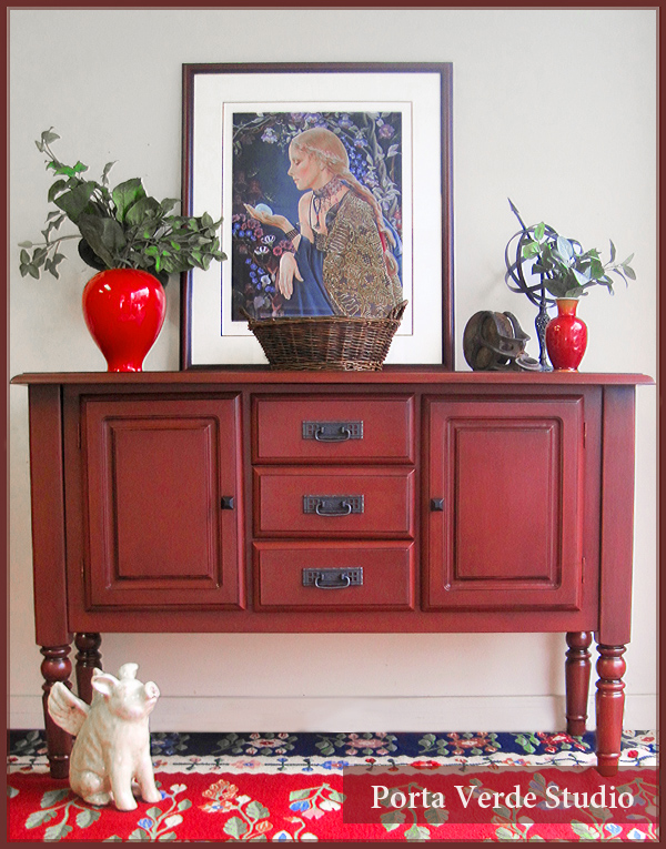
Finished red sideboard painted and glazed
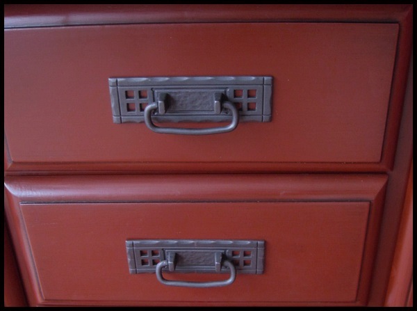
Detail of arts and crafts hardware from D. Lawless Hardware
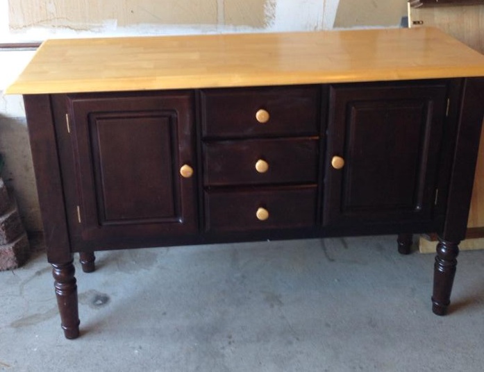
Before Pic with original knobs
  99 answers
  • Cindy Jonson Wagoner Cindy Jonson Wagoner on Mar 17, 2014
    No love the color.
  • Mary Mary on Mar 17, 2014
    I Love that color!!! Looks great!
  • Beverly L Beverly L on Mar 17, 2014
    Love the red!!!
  • LB LB on Mar 17, 2014
    This looks awesome,,, good job! The only thought I have it that you could have painted the top a color to match the handles to give it some pop. Otherwise the color is nice.
  • LB LB on Mar 17, 2014
    Like the hardware too! very nice.
    • Porta Verde Studio Porta Verde Studio on Mar 18, 2014
      @LB The hardware is made by D. Lawless Hardware. They are based in the U.S. and have tons of very affordable hardware for furniture in every conceivable style. Their website is www.dlawlesshardware.com.
  • Chris Chris on Mar 17, 2014
    Does the source of your concern relate to the different shades of red (comparing buffet to the Chinese red of the vases and the red in your area rug?) If so, change out the vases (for a dark blue to blend with the rug), and don't worry any further. I LOVE the color treatment you used; have used this shade of red several times, and it always turns out phenomenally. Great job! Don't worry, it looks gorgeous.
    • Porta Verde Studio Porta Verde Studio on Mar 18, 2014
      @Chris that's a great idea about the vases. I think they are too bright to sit on top of the sideboard.
  • Linny McCauley Linny McCauley on Mar 17, 2014
    No! Just perfect!
  • Jeanette S Jeanette S on Mar 17, 2014
    No, this is a perfect red! And actually, I like the different reds together! I also like the hardware you added to this!
  • Linda Santos Linda Santos on Mar 17, 2014
    What is the name of this particular red. Love.
  • Kath D Kath D on Mar 17, 2014
    LOVE it!! I painted an old dresser I got at an estate sale last summer a similar red, then antiques it. It sits in my dining room, now. LOVE it!!
  • Heidi Pepin-Clark Heidi Pepin-Clark on Mar 17, 2014
    NO!! It's gorgeous
  • Lori J Lori J on Mar 17, 2014
    I wouldn't change a thing, except perhaps the geography. Your house to mine! It is truly lovely.
  • SK on Elderberry SK on Elderberry on Mar 17, 2014
    I love your choice. It looks great. Live with a while and if you think it needs a little something, you could just glaze the top a little darker. If you don't like it wipe it off. This looks wonderful. I always wax my table tops for a slight sheen and durability. Very nice job... sk
  • Becky P Becky P on Mar 17, 2014
    no, don't change a thing! That is a perfect red.
  • Janet Smith Janet Smith on Mar 17, 2014
    The color is absolutely perfect for that piece. I wouldn't change a thing!!
  • Anna Ibarra Anna Ibarra on Mar 17, 2014
    I feel that it was meant to be this red, this color. It's perfect with the new hardware. It's so perfect it looks like it was meant to have been that from the start.
  • Carolyn Rush Carolyn Rush on Mar 18, 2014
    It looks great the way it is!
  • I LOVE the red. I think you might feel it is not bright enough in contrast to your rug. But, I wouldn't change a thing. Great job!
  • Amy Ogden-Paparone Amy Ogden-Paparone on Mar 18, 2014
    I think you did a beautiful job! I have those same handles in my bathroom :) The only thing I think I would have done different was, I would have sanded and stained the top walnut. And you picked the right color too, it really is so pretty!
  • Julie Latenser Julie Latenser on Mar 18, 2014
    Nice job. I love it
  • Glenda Webster Glenda Webster on Mar 18, 2014
    No the color is perfect!!
  • Debbie Steele Debbie Steele on Mar 18, 2014
    I think its perfect red. i would even distress it alittle to bring out a antiquey look.
  • Beloved M'Beloved Beloved M'Beloved on Mar 18, 2014
    Veryyyyyyyyyyy beautiful !!! love the new hardware over the originals !!!! I have a red credenza !
  • DeMarie I DeMarie I on Mar 18, 2014
    Nope...the red is perfect. I love it. Been scouring estate sales & auctions for a side board to do something similar. You did a great job.
  • Ellen S Ellen S on Mar 18, 2014
    I wouldn't change a thing. It's beautiful! Love it!
  • Michele Ratcliff Michele Ratcliff on Mar 18, 2014
    I painted my hutch a similar color...same issue with brightness...its bangkok red, distressed with a brown stain over then wiped off in areas, for the worn out look...so i put a satin sheen on it...love it more now!!!
  • Kathy C Kathy C on Mar 18, 2014
    It's beautiful.
  • Linda Stone Linda Stone on Mar 18, 2014
    Beautiful! I wouldn't change a thing. Great job.
  • Darlene Hill Darlene Hill on Mar 19, 2014
    I really like this piece. You did a fabulous job!
  • Sumaya Warwick Sumaya Warwick on Mar 19, 2014
    It looks like one of those expensive Asian cabinets. The hardware and the color so exotic. Beautiful!
  • Liliana Wells Liliana Wells on Mar 19, 2014
    It'd a beautiful piece. Very elegant.
  • Jeanne Jeanne on Mar 19, 2014
    the sideboard has a blue tone and more of a muddy color while the rug appears to be red with an orange tone and more of a clearer color, maybe that is what is the issue. Love the color of the sideboard, very nice.
  • Gloria Duy Gloria Duy on Mar 19, 2014
    I don't have red in my house but I love this color and the hardware. You did a great job, much classier than bright red.
  • Margie*Lee Margie*Lee on Mar 19, 2014
    NO!!! That color of red you chose is so classy. I love what you did and that sideboard would look great in our dining room. ;)
  • awesome looking
  • Devon Cretella Devon Cretella on Mar 19, 2014
    I think it is awesome! You may have grown tired of it if you used a brighter red.
  • Jeanne Focht Jeanne Focht on Mar 19, 2014
    Fabulous color!
  • Karen Karen on Mar 19, 2014
    I love the dark red. Thinking of painting a piece I just bought this same color.
  • Shari Veater Shari Veater on Mar 19, 2014
    I LOVE what you did with this piece...don't regret your color choice, it is one of a kind!
  • Phyllis Greene Phyllis Greene on Mar 19, 2014
    My opinion I would leave it the red it is,it is so rich looking. Just Beautiful!
  • Connie K Connie K on Mar 19, 2014
    I love the subdued red! As an earlier comment said, it does indeed resemble the traditional dark red of some Asian furniture. Although a brighter red would also be pretty, this red has a wonderful depth and richness. I was sad to hear it was oil paint that you used because I really love this and have the prefect piece for it, I cannot use oil based products (breathing problems). I am going to try to get a similar effect with other types of paint and hope of the best.
    • Porta Verde Studio Porta Verde Studio on Mar 24, 2014
      @Connie K Some of the new hybrid paints act quite similar to oil paint. You might want to try Benjamin Moore Advance. It has a slow dry time.
  • I Play Outside The Box I Play Outside The Box on Mar 19, 2014
    I think it is GORGEOUS!
  • Gail Griffith Gail Griffith on Mar 19, 2014
    This is beautiful!
  • Pamela Pamela on Mar 19, 2014
    I love the color just as is. I do not like the red vases sitting on top they are too red, I would have gone with a blue as in the back round of the picture which would also pick up the blue in the carpet.
  • Vetsy Vetsy on Mar 19, 2014
    I agree with Pamela.... You've done a lovely Job with the color choice and replacement knobs.... But those red vases are throwing it off, you need some interesting vases with-out a shine to them.. But for the most part you have done a Fantastic Job!
  • Lorraine V Lorraine V on Mar 20, 2014
    perfect as is! I would agree with a different choice in vases.
  • Terri S Terri S on Mar 21, 2014
    I love the color it is!
  • Linda Linda on Mar 21, 2014
    Beautiful color! Love it!
  • Deborah Deborah on Mar 28, 2014
    Totally disagree about the red vases - love them!!! I think they set off the darker red of the piece beautifully\\\\\\\\\\1
  • Melissa W Melissa W on Mar 28, 2014
    Can you tell me what color of red and glaze you used. I'm starting a new project and I love this effect. Please let me know the name brands and colors you use. The picture below is my thrift store find. I think it would be lovely with the color choice you used.
    • Porta Verde Studio Porta Verde Studio on Mar 29, 2014
      @Melissa W Hi Melissa, I mixed the paint colour and made the glaze myself so unfortunately, it doesn't have a name! That is a really nice piece you have and would look great painted. I can tell you that the red I had was a brown-red and then the glaze was black/brown.
  • Kathy C Kathy C on Mar 29, 2014
    I like the red vases. It pulls the red from the rug and picture. So your choice was spot on.the use of blue in the future gives you a season color change without much effort.
  • Jennifer G Jennifer G on Apr 16, 2014
    Fabulous color red!! Rich, warm, deep and happy without being obnoxious. I Love it!
  • Chris Sabol Chris Sabol on Apr 17, 2014
    Can I ask, what color red and what kind of custom black oil glaze did you use? I absolutely love what you did..the color is awesome.
    • Porta Verde Studio Porta Verde Studio on Apr 17, 2014
      @Chris Sabol Hi, both the colour and glaze were mixed by myself. I often "eyeball" the colours I'm mixing so I can't say acurately what the exact colour is.
  • Katie Price Katie Price on Aug 10, 2014
    I love the color! It suits the style of the piece better than a brighter red. It's perfect.
  • I Play Outside The Box I Play Outside The Box on Aug 11, 2014
    I think it's beautiful just as it is!!!!
  • Beth Mitchell Beth Mitchell on Jan 08, 2015
    Nope - it looks great that color! Just perfect!
  • Colimbia1 Colimbia1 on Jan 08, 2015
    Great color! Thanks for sharing!!
  • Sco358494 Sco358494 on Jan 11, 2015
    Love the color,but do away with vases
  • Carolyn Carolyn on Jan 11, 2015
    Now I love what you did to this
  • Carolyn Carolyn on Jan 11, 2015
    No vases takes away from the beauty of the piece. Also, love the picture behind it
  • Sharon Connors Sharon Connors on Jan 12, 2015
    This came out absolutely GORGEOUS. I love it.
  • Bonnie Bonnie on Jan 14, 2015
    THAT.....is an awesome color!! The cabinet turned out PERFECT! Nonono on the brighter red. This color is classy! A brighter red would look more diner-style. I think the bright red vases are what is making you re-think the color....while they're beautiful, maybe the vignette would look more appealing to you if you placed another color instead of the bright candy apple red....maybe something picked from the painting, such as that nice cobalt blue. Or even black, if you're wanting a more dramatic flair. The hardware you picked for the new look is stunning! Works perfectly!!
  • 169756 169756 on Jan 14, 2015
    Perfect shade of red. Very rich. Don't mess with perfection :) BTW I used the same pulls on a chest I redid. Found them online. Great accent.
  • Sandi De Luca Gales Sandi De Luca Gales on Jan 14, 2015
    I love, love, love it. Wouldn't change a thing, it's beautiful
  • Suzann Suzann on Jan 14, 2015
    I love the color. Bright red would look ok but this color is much better.Good job.
  • Karyn Roesler Karyn Roesler on Jan 14, 2015
    No that is such a pretty red.
  • Ruth Trendel Ruth Trendel on Jan 15, 2015
    it is the perfect red
  • Gail Salminen Gail Salminen on Jan 17, 2015
    @Porta Verde Studio I think you chose the right tone. It is classic and will have a long life. A brighter red would have become more tiresome and the draw to refinish would have come over fairly quickly. The hardware is fabulous and really accents the piece nicely. Thanks for sharing.
  • Leslie L Leslie L on Feb 17, 2015
    Absolutely Not! It is just gorgeous the way it is. Love that red! I would never have given the original a 2nd look. I love looking at how creative these people are. I don't always like the final piece, but still love to see what they come up with. Love hometalk!
  • Lori Lori on Mar 02, 2015
    I think it's unanimous, the red is perfect and smart people don't mess with perfection. You mixed it yourself and got the perfect red. Genius!
  • Rosalie chow Rosalie chow on Mar 03, 2015
    I love this one. Color are perfect. I love the handle on the drawers. The smaller vase has to go. Maybe another bigger vase might work. Thank you for sharing this.
  • Tiger Tiger on Mar 03, 2015
    For me I would have added dark gray, black, or the blue in the picture for the vases. I think you can leave the vases....but the piece of furniture is just the right color for my dining room. Feel free to give it to me if you want.....LOVE.....
  • Jeannie Andrews Jeannie Andrews on Mar 09, 2015
    Love this.
  • Tangiela Helem Mason Tangiela Helem Mason on Mar 15, 2015
    Perfecto! Do not change anything. Personally I've never found red furniture to be appealing, but I would buy this in a second.
  • Kathy ortiz Kathy ortiz on Mar 15, 2015
    Its beautiful, love it
  • Eric Turner Eric Turner on Mar 16, 2015
    The color is perfect. Its the red vases that are the problem.
    • Gail Salminen Gail Salminen on Mar 16, 2015
      @Eric Turner I think you are right now that I view the pic again. I was so busy looking at the piece I didn't pay any attention to the accessories. Perhaps she can spry paint the gold with a touch of black to go with picture in the middle and highlight the furniture.
  • Eric Turner Eric Turner on Mar 16, 2015
    @Gail Salminen I'm confused. What gold?
  • Eric Turner Eric Turner on Mar 16, 2015
    @Gail Salminen LOL Now I'm more confused then ever. I must be going color blind because the vases look red to me.
    • Gail Salminen Gail Salminen on Mar 16, 2015
      @Eric Turner LOL, guess I am less than clear - the vases are red which does fight with the colour of the furniture - if painted gold and black (one of those solid colours with accent of the other) they would compliment the piece rather than fight with it.
  • Eric Turner Eric Turner on Mar 16, 2015
    Aha now I see! Yes I think that would help show the red to the best advantage. Vases the color of the hardware would look good too. Even solid black, gold or white would help.
  • Teresa Teresa on Mar 26, 2015
    It's gorgeous!!
  • Kathryn Dubovsky Kathryn Dubovsky on Mar 30, 2015
    This is a beautiful red and with the handles you chose, perfect, but I would have used different color vases to accent the red sideboard. Maybe a large yellow vase, or blue. The red vases just don't look right.
  • Lynda Lynda on Apr 18, 2015
    Love Love Love this! GREAT job GREAT color! Thanks for sharing with us.
  • Gayle Gayle on Jun 18, 2015
    I prefer this red to a brighter one. I don't like a piece of furniture to scream for attention in a room.
  • Lori Lori on Aug 15, 2015
    It is the perfect shade for the piece, please don't change it. I think it's the rug and vases that might be throwing you off. They ARE bright.
  • Cynthia H Cynthia H on Aug 15, 2015
    I think it's lovely, but is it the color you want? I think the others are right about the colors you put on it. I would try something else on top and see if you like it better, first.
  • Nancy B Nancy B on Aug 25, 2015
    I love this color. Perhaps it does not work with the other items in the room and that is why it is bothering you. But on its own this is a stunning piece.
  • Suzann Suzann on Aug 26, 2015
    I think it looks great. You did a beautiful job.
  • Tina Hill Tina Hill on Aug 26, 2015
    IT"S PERFECT ! I love it , the color is perfect and the handles are wonderful ! GREAT JOB !!!
  • Danita Campbell Danita Campbell on Sep 09, 2015
    The color is perfect...
  • Pamela Langone Pamela Langone on Oct 07, 2015
    I like it as it is
  • Don2080794 Don2080794 on Oct 28, 2015
    Gorgeous!
  • Dfm Dfm on Jan 03, 2016
    barn red... very easy on the eyes.
  • Mic2698675 Mic2698675 on Mar 12, 2016
    What is the color:?
  • Nancy Flemming Nancy Flemming on Mar 26, 2016
    colour is perfect
  • Sandy T Sandy T on May 05, 2016
    I love it!
  • Elaine Elaine on Aug 11, 2016
    Absolutely beautiful! Wouldn't change a thing.
  • Denise Hardy Denise Hardy on Sep 04, 2016
    Beautiful
  • Harriett Fergason Harriett Fergason on Sep 24, 2016
    It looks great, leave it like it is.
  • Rosie Rosie on Jan 06, 2020

    No, don't change the color. I think it is perfect.