S.O.S. Need Kitchen Paint Advice

by
Judy
+19
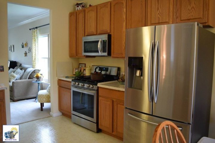
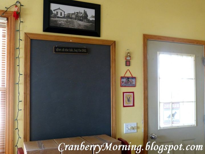
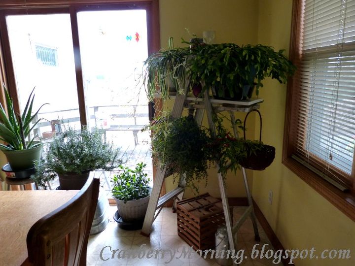
For many years, our kitchen was white, as were most of our interior walls, because when we were building on/remodeling it was just easier to paint everything one color and be done with it. Years later, I decided to be adventurous and started painting rooms with a little more color. The kitchen got a pale yellow. Unfortunately, I've never liked it.
I'm hoping to repaint this summer and would love advice on which color might look good in a large kitchen that on a scale of 1-10 regarding light, gets about a 7 - so it can't really stand anything dark.
My complete blog post and way too many photos at http://cranberrymorning.blogspot.com/2014/05/sos-need-kitchen-paint-advice-please.html.
Any suggestions?
10 answers
-
Start from the floor then decide the rest
 Funnygirl
on May 05, 2014
Funnygirl
on May 05, 2014
- See 1 previous
-
I'm not surprised you didn't like the yellow. You have a lot of oak going on with your cabinets, trim moldings and furniture and I have read on more than one occasion that decorators say yellow is not the most complimentary color to use with oak because it brings out all the orange tones in the oak. Yet it seems like everybody tries using yellow with oak. Apparently, according to what I've read, blues and greens are the best colors to pair with oak. As a starting point, I would recommend you consider sage green for your walls. Take a look at the Behr (Home Depot) paint colors called "Turtle Dove," "Mountain Haze," "Restful," and "Promenade." They're all on the same paint strip. (I personally do not like Behr paint but I do like their colors and they can always be color matched in another brand.) "Mountain Haze" (my personal favorite of the 4 colors) is a gorgeous muted sage green that looks beautiful with oak. My daughter used it in the kitchen of a former home that had oak cabinets and it was simply stunning. I loved it so much I used it in the living room of my former home. I also used "Restful" (one shade darker than Mountain Haze) in the small family room of the same home. These shades of green seem to "play" well with almost any other color you want to use with them. I wish I had a picture of my daughter's former kitchen with the oak cabinets and Mountain Haze walls so you can see how great they looked together but, unfortunately, I don't. I do have a couple pictures of the living room and family room of my former home I can share though. The rattan furniture in my family room was a natural color, which is not too terribly different from the shade of oak so you can at least see how the color of the rattan and "Restful" looked together.
 Shari
on May 05, 2014
Shari
on May 05, 2014
-
Judy, after looking at your blog I'd recommend a light blue. The only paint chips I have available right now, not sure where my others disappeared to, are Laura Ashley/Valspar, from Lowe's, so my choices are from that line. LA1118 Vintage Blue (it has a bit of a hint of gray) 1303 Sky Blue 3 (it's a beautiful soft, watery blue, not pale though) 1309 Powder Blue 3 or 4 depending on how much color you want. LA1314 Country Blue (I like this the best as it gives the feel of warm country welcome) 1403 Chambray 3 (like a faded chambray shirt)
 Z
on May 05, 2014
Z
on May 05, 2014
- See 2 previous
-
I'd prime the walls with white and cover with a soft white (it looks like a small kitchen from photos) but since you have yellow counter tops, that could then become the "pop" color in the room, from there you could add in some other softer yellows and blues or whatever you decide. Or, you could pick up the grey diamond color from the floor and redo your countertops white. Or you could do a faux on countertops. Krylon has some great tips on faux techniques from marble to french washes that you could use on them as well. It's not hard, or time-consuming either. But I do agree with Becky that getting some paint strips are a good idea; there are so many beautiful colors now. I did that in my bathroom of my old apartment (it was very small) and found just the right color and I did stippling too; it was such fun! Good luck, put up some pics when you're done!
 Susan Bates Fiano
on May 05, 2014
Susan Bates Fiano
on May 05, 2014
-
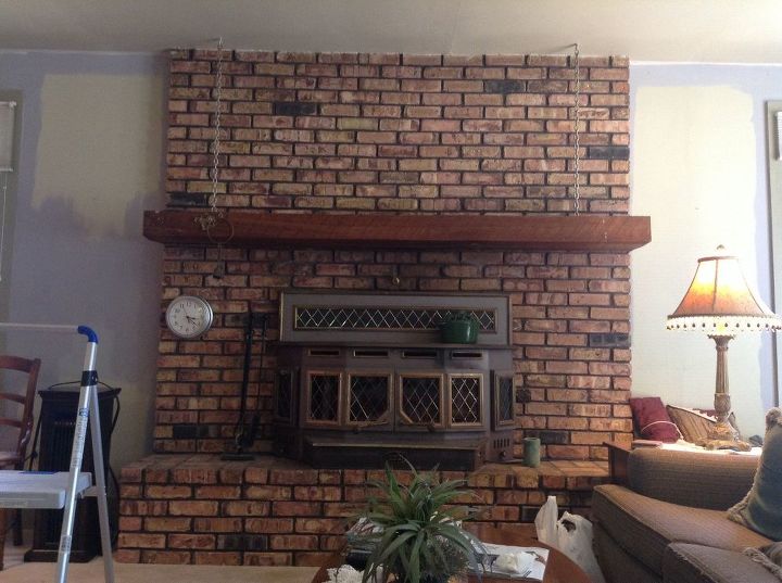
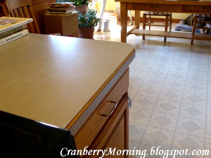
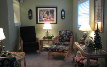
Hi Susan. The kitchen is an appx. 400 sq.ft. 'L' with the dining at one end (along with the antique cookstove, not shown). The kitchen countertops are a gray, granite-looking formica. The need for a lighter color comes not from the size of the room but from the fact that the working part of the kitchen is in the center of the house. Thanks for your suggestion, as others have, of getting the paint strips. I'm leaning for a pale sage green. That should go okay with the oak, the brick (behind the cookstove) and the flooring. I appreciate your help!
 Judy
on May 05, 2014
Judy
on May 05, 2014
-
My neighbor painted her kitchen a light to medium peachy color. It was absolutely beautiful - the room always looked light-filled and glowing. I still remember that kitchen and how warm and welcoming it always felt. Myself, I'm all about the pink, but that's a color that's not for everyone. I currently have my small apartment dining room painted in a pale to light pink, with cream cabinets and ceiling, with a bright coral accent wall in the kitchen area, and that looks pretty great, but like I admitted, it's not for everyone. But I can't imagine anyone not loving the glowing peach.
 Cheryl
on May 07, 2014
Cheryl
on May 07, 2014
-
I like a light blue for that room as well. Something with a little green in it.
 My Wonderful Walls
on May 07, 2014
My Wonderful Walls
on May 07, 2014
-
The TOH colors are amazing. They would look fantastic with your oak furniture and your countertops. Go for it.
 Pam Bolton
on May 08, 2014
Pam Bolton
on May 08, 2014
-
Judy you might look at some of the chalk paints also. They have some really nice colors that are light and bright but with the chalk paints they tend to also give them more of a depth to them. I'm using alot of the Valspar colors also and they are easy to clean. Do you plan to update the cabinetry or leave as is? I was in a model home recently and they used a very soft light tiffany blue/green that reminded me of an ocean color but light and relaxing and the cabinetry was painted in the coolest color of chalk paint that was a lighter grayish almost mauve it seemed to change with the lighting. Easy update from experience is adding new hardware to cabinets something that works with the flow of your colors and theme your going for. Good luck know it will look awesome when your done! :)
 Rae E
on May 09, 2014
Rae E
on May 09, 2014
-
Hi there!! I'm a little late in the convo because my computer was broken and I wasn't getting notifications on my phone. I use a blue grey color a lot because it is still neutral, gives color but not overpowering. My favorite is Quiet Moments or Beach Glass. They are Benjamin Moore colors and I would suggest NOT trying to have them color matched with Lowes or Home Depot because it is just never the same. As a Designer/Painter, I stay away from yellows as often as possible. It just seems to be a hard color to work with when certain lighting can make it look awful. These blue grays I've suggested are very forgiving and work with many other colors as they are fairly neutral. Have a blessed day!!
 Angel View Cottage
on Jun 20, 2014
Angel View Cottage
on Jun 20, 2014
Sign Up to Answer