


Hanging Artwork

by
Kathy R
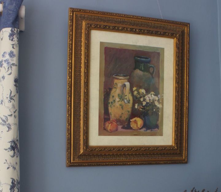
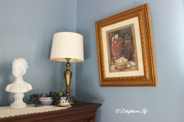
Our dining room now has a very serene look all in blue and cream. I've been considering ideas in hanging artwork on the walls. Initially I intended to only use these frames and to add lighter artwork to compliment the cooler theme. But, my husband really liked these prints and I believe he is right. These prints add just enough warmth to the room to bring interest and comfort.
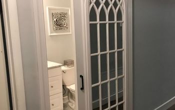
This artwork adds just the right warmth to the right side of the French doors - there's just enough blue and complimenting colors as well as the French theme.
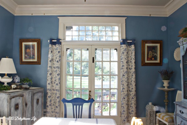
Two of these prints hang alongside the French doors - balanced by the curtains that serve to cover the doors when we wish to have privacy
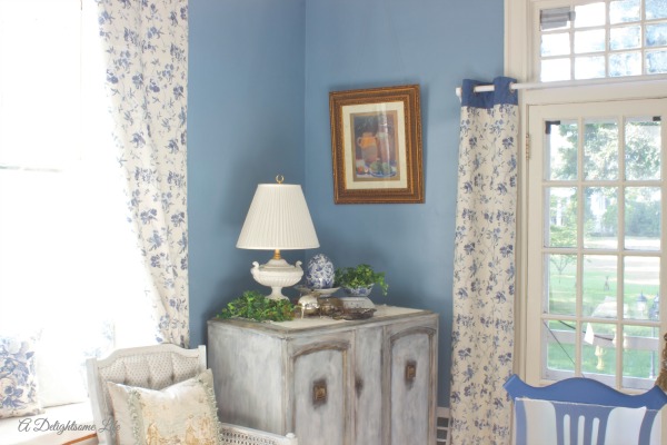
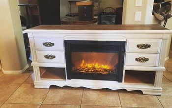
This print hangs over the little chest I painted last month - adding to the tabletop vignette in height - working well with the Golden Ratio principle.
Opposite to the print on the right are the creamware platters that flank the painted china hutch.
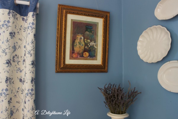
The third print hangs to the left of the windowseat and to the right of the piano, once again adding to the vignette on the piano and at the same height as the two prints on the opposite side of the room
Want more details about this and other DIY projects? Check out my blog post!
Comments
Join the conversation
2 comments
-
These are classic pictures and I love them. If you will notice, they have a lot of different muted colors in them...that is why they look so good anywhere! Hubby is right!


Frequently asked questions
Have a question about this project?