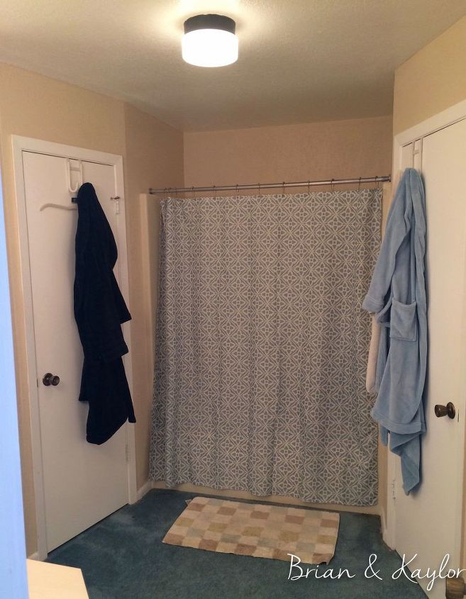
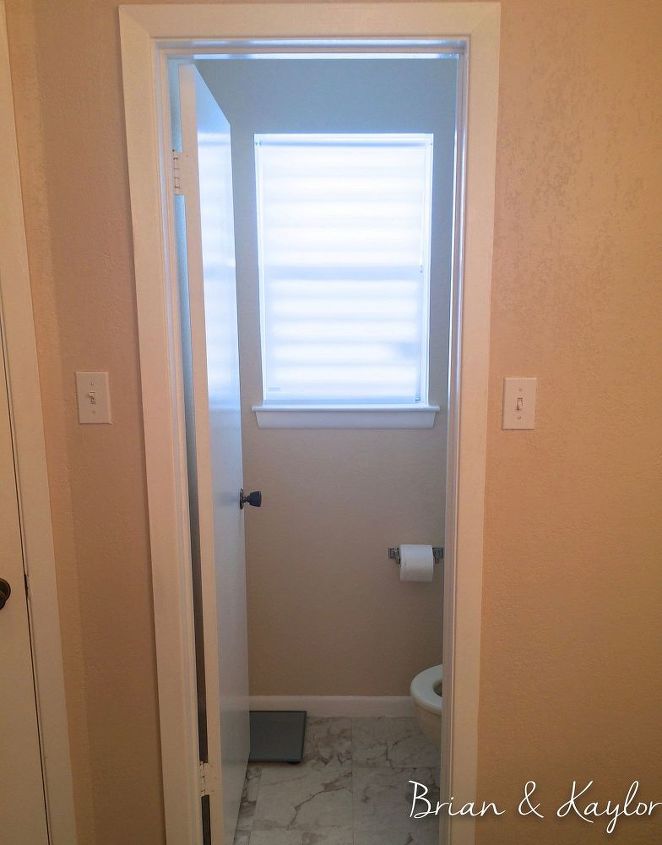
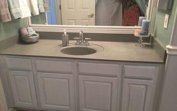
Brian & Kaylor Master Bath Before
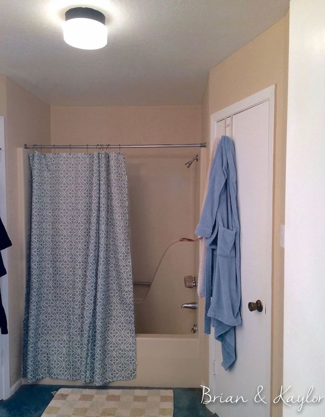
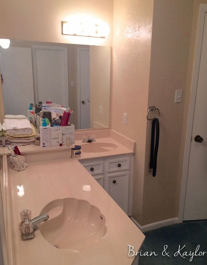
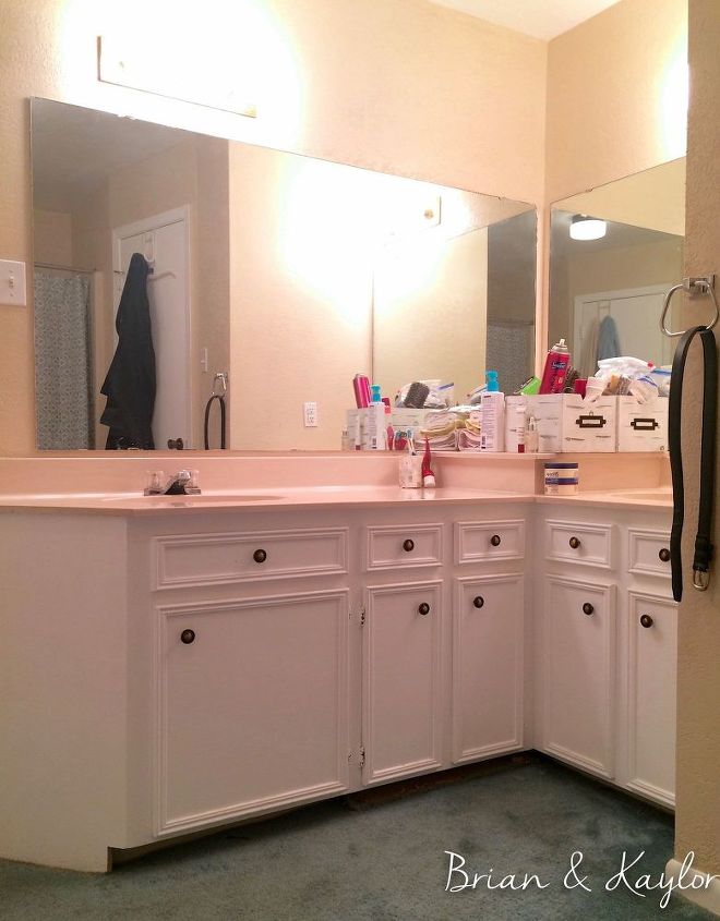
Our master bath has been one of our biggest DIY projects. The bathroom was painted peachy crayola color that was almost a perfect match for the tub/shower enclosure and countertop. It all blended together except for the brassy, out-of-date fixtures and hollywood lights. Then there was the harsh yellow lights, blue carpet and seashell sinks with the handy soap shelf. Hello 1980's.
The vanity area is L-shaped which uses the available space well but the sink placement was bad. The sink on the short side was inconvenient and cramped. It was like being put in the corner so we never used it. It usually had my blowdryer and brushes in it. The reason the builder put it there had to do wth construction codes and the sinks needing to be a minimum inches from each other and from the edge. We had to take all those codes into consideration when we started the renovation. Goal was to not have a sink in the corner but still have two sinks in the master AND use the existing vanity base.
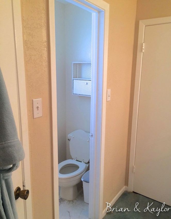
Storage was also a problem. There was no handy place to put towels and things we use daily. Also, there was not a great place for storing extra toilet paper and other toiletries needed in the toilet area. There was this sad little plastic shelf waiting to fall that hung over the toilet but we never trusted it enough to actually use it.
The after turned out beautiful....or at least we think so but there is a little bias in there. :) We did the majority of the work ourselves. We hired out installing the shower door, moving the electricity for the vanity lights and installing the countertop. Those things were out of my comfort zone and after pricing each, it was worth the money to have the professional do it. Visit the www.brianandkaylor.com to see more before details and progress pictures.

Want more details about this and other DIY projects? Check out my blog post!


Frequently asked questions
Have a question about this project?