I Need Your Help!! What Color Should I Paint the Guest Room?

+22
I have these photos as inspiration and I am trying to decide on a paint color for the walls...what do you think?
#hometalktuesday
#hometalktuesday

Photo inspiration
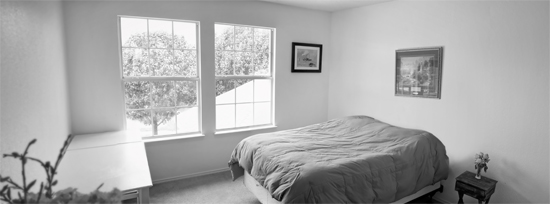
Here's what the room looks like now. Blah, with white walls.
Painting inspiration
25 answers
-
what about a dusty blue on the wall at the window and on the other side a sand paint. That will give a relaxed feel about it. You can also look to stain the floor a bit darker if you can.
 Earp Construction
on Jul 02, 2013
Earp Construction
on Jul 02, 2013
-
I would paint the walls a blue gray color. Then I would pick up colors from the art for window covering and bedding. The bed needs a dust ruffle, accent pillows, and a throw. I don't know your style of decor to know if you would want the traditional dust ruffle or not. Therefore, I will mention that I have seen where the box springs is wrapped in fabric and stapled to the box springs. From the picture, the bed does not appear to have a headboard. Since it appears that you like water, I would suggest making a headboard out of aged wood, drift wood or a large picture (your photo inspiration) on canvas or wood framed out.
 Kimberly Barney
on Jul 02, 2013
Kimberly Barney
on Jul 02, 2013
-
Nice idea for the headboard*
Earp Construction
on Jul 02, 2013
-
I think too much blue gray would drown out the picture. I would pull out the pale green color of the first boat in the picture... It's a beautiful color!
 Alexandra Arena
on Jul 02, 2013
Alexandra Arena
on Jul 02, 2013
-
Looking at your paintings and photos, I would paint the space in a calming color. Sherwin Williams has some great colors....Silverpointe or Tradewind, would look great on the walls. Your accent colors for your decorative accessories would be pale greens, soft whites and different hues of blues.
 Tamela Bowie Interiors
on Jul 02, 2013
Tamela Bowie Interiors
on Jul 02, 2013
-
I would go with a 2-color gray scheme, with the walls the darker shade, and the ceiling a shade that is on the same color chip, but about 2 shades lighter. Make sure the gray has blue undertones that blend with the painting or it could make the walls look olive, or purple-ish when you hang the painting if you get a green or red undertone gray. Gray makes a great neutral, and you can brighten up the room by using lots of white on the bedding, drapes, etc., with a few pops of that beautiful golden orange color of the pier in the painting, and some green plants. You love the painting (which is fabulous, btw), so you are obviously attracted to those colors. I don't think gray walls would drown out the picture, especially if the tone of gray chosen is one of the darker tones as used in the painting, after all, look at the dark barnwood against the painting in your own picture...looks great with it. Some people are afraid of darker wall colors, but I used a dark gray in my living room and family room (lots of windows, and it appears your room has good natural light, as well), and while the darkness may shock you as it goes on, the accessories/drapes will brighten it up. Dark colors look very elegant on walls, so don't be afraid. It's only paint. :)
 Leslie D
on Jul 02, 2013
Leslie D
on Jul 02, 2013
-
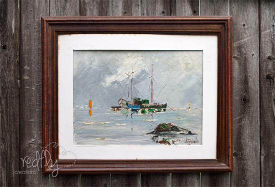
Would you mind sharing the artist's name? Looks like "Armindo" in the pic, but not quite sure. I love the impasto/impressionistic quality of the work, and would love to look at their work for something for my house.
Leslie D
on Jul 02, 2013
-
Pick your bedding and window treatments first. That will be the inspiration for your wall color.
 WallsTreat Studio/ Kass Wilson
on Jul 03, 2013
WallsTreat Studio/ Kass Wilson
on Jul 03, 2013
-
Paint the room Sea Salt SW6204 by Sherwin Williams. Make window treatments out of drop cloth, so they look like old sails (Use grommets to hang.) Add touches of turquoise, yellow and grays from the artwork. Look for buoy and rope accents. Install a ceiling light that is that industrial warehouse look.
 Reinventing Space
on Jul 03, 2013
Reinventing Space
on Jul 03, 2013
-
I think grey, but you NEED ;o) pops of orange and the blue in the painting and orange on the bridge (lived there for 20 years and that orange #2 will always be my fav bridge color ;o) around the room! If you want to go brighter...which I am leaning towards these days...do a similar yellow for the wall..buttery and both the photograph and painting will pop more. And one more color...a light aqua or turquoise blue...still need pops of yellow and orange in the room! o) Ha...like that helped you some!
 Sfg178760
on Jul 03, 2013
Sfg178760
on Jul 03, 2013
-
I agree that you should choose the bedding next and then try for a color in that (which should include the colors in the painting) - tho if you pick a bedding and it doesn't match the painting, you can get another painting.
 Roberta Alessi
on Jul 03, 2013
Roberta Alessi
on Jul 03, 2013
-
We have a friend who has several rental homes. He mixes white with a silver paint. The silver picks up whatever color is predominant in the room and reflects it back.
 Nancy Hatcher
on Jul 03, 2013
Nancy Hatcher
on Jul 03, 2013
-
You cannot quickly name a color off the top of your head and know that it will match. Also there is not enough color in the room for a paint mixed with Silver to reflect back any strong characteristics. I would take the painting down to your local professional paint dealer. Hold swatches on the painting and find a color that just feels right. I would look towards the greyish blues, but let the painting be your guide and try to find the most dominant background color that is present in the painting. The room will fell like an extension of that picture if done correctly.
 Promark Painting
on Jul 03, 2013
Promark Painting
on Jul 03, 2013
-
OK. Here goes. I love the room and view. Paint walls gray. Make drift wood headboard. Check JCPenney web sight for Happy Chic by Jonathan Adler bedrooms. I love the Lola quilt set in yellows and grays. They (and other retailers) have nice darker blue sheet sets. Which can also be used for drapery panels and/or pillow cases make good valances if you can sew a bit. Yellow sheers are also offered at the bottom of that web page. White faux wood hortizontal blinds would be clean. Last but not least, use varying shades of blue accessories to tie in the pixs and bedding. I have left the flooring up to your imagination. Good luck!
 Linda Seger
on Jul 03, 2013
Linda Seger
on Jul 03, 2013
-
I'm a big fan of anything blue and green. Very calming. Maybe you can do the walls a soft green and use cobalt accents. Would take colors from painting.
 Cynthia
on Jul 04, 2013
Cynthia
on Jul 04, 2013
-
Have to say I love the pale green idea for walls then pops of the blue and orange and a brighter green colors for fun accents.
 Lisa C
on Jul 04, 2013
Lisa C
on Jul 04, 2013
-
I think you need to start with the bedding since it is a focal point in any bedroom. That would make it easier to decide the color of the walls.
 Diana
on Jul 04, 2013
Diana
on Jul 04, 2013
-
It is claimed that "green" is the most soothing color for a room. Since it is a calming color, I suggest a medium shade of green, such as sage. Should be pleasing to anyone using the room. Some colors can be very disturbing to people. I know I can't be comfortable in a blue room. Research that angle a bit.
 Rosalie M
on Jul 04, 2013
Rosalie M
on Jul 04, 2013
-
Take if from me, do your linens first, then the paint will be easy. The reverse can be a nightmare, even if you have a fortune to spend.
 Sheryll S
on Jul 04, 2013
Sheryll S
on Jul 04, 2013
-
Looking at your prints, as your inspiration...to find wall color selections and then your room décor...I would have to say I love the color of the sun.. how it reflects on the water. .I would myself would most likely choose that as my wall color. AND use that photo as my inspiration for me vrs the other picture. It is neutral and will compliment a lot. With that color you would still be able to find your bedding and window treatments...Many artist may go a different direction, out of the box if you will, and use many objects as their inspiration piece. Many have taken an object. .like a family heirloom, and use it as the piece to decorate around. I t can be done. .and is fun !
 Simple Pleasures
on Jul 04, 2013
Simple Pleasures
on Jul 04, 2013
-
Hi! Gray is certainly the new "in" color right now. But, is that what YOU like? A yellow wall with the photo would bring out the gorgeous sun and help wake you up in the morning. The grayish blues for around the painting so that the wall looks like an extension of it as Promark says, sounds wonderful, and would be calming for going to sleep.
 Traci Winyard
on Jul 05, 2013
Traci Winyard
on Jul 05, 2013
-
Leslie D. The painter is Armindo. My grandparents purchased it when they lived in Portugal about 25 years ago. Thank you everyone for your help!!!! Definitely a lot to go on. I love all your ideas......now to pick the one that reflects us the best. Again, Thank YOU!!!!
 Redfly Creations
on Jul 05, 2013
Redfly Creations
on Jul 05, 2013
-
"I SAY FLAT out GRAY!" (goes great with warm woods or cool summer tones) and with in grey there is every color range - Silver/Pewter/Nichol/Iron- metal tones are the GRAY is the new IT COLOR - can also be a disaster and difficult to choose as is white (ironically) But if you go to Sherwin Williams and choose a grey and white from Jeff Lewis Line your in safe territory. As a professional designer I offer 1 personal piece of advise - ensure the walls are prepped primed and remember Flat shows the least imperfections (and ceilings should simply just always be flat unless your really skilled and have an art eye and attempting something bold) and the more sheen you add the more likely you are to see the imperfections.
 DinoTURCHIdesign, Deano. Dean Turchi
on Jun 14, 2014
DinoTURCHIdesign, Deano. Dean Turchi
on Jun 14, 2014


-
Grey. I prefer dark.with white trim.
 Pam Payne
on Jun 14, 2014
Pam Payne
on Jun 14, 2014
-
Sherwin Williams has a color called Rainwashed. I'm dying to use it somewhere. http://www.thriftdiving.com/wp-content/uploads/2013/06/Sherwin-Williams-Rainwashed-1024x918.jpg
 Michele Eures
on Jun 14, 2014
Michele Eures
on Jun 14, 2014
Sign Up to Answer