I love decorating, but I ran into a snag. We just purchased a condo in
by
Maryann
+30
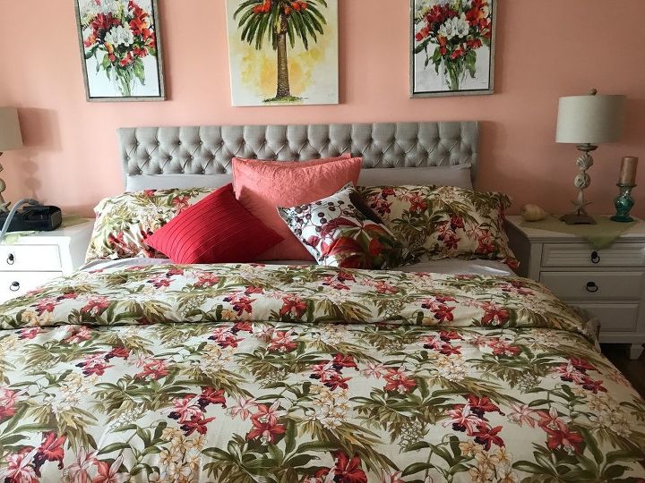
We just purchased a condo in Florida and I can't figure out what is wrong with these pictures above the bed. They just do not look right to me.
It might be a little too matchy-matchy. Try using something with one of the colors you'd like to feature rather than all of the colors.
#1 Spaced too far apart; # Are they the same subject matter/things/items?
Closer together and lift the middle one up, could add something decotive under or over the centre one after you lift it
perhaps because the 2 side pieces are identical... with such a busy print on the bed, I think it would be better to just remove those 2 and probably the small matching printed pillow on the bed. If the newly created blank space over the bed bothers you, then add some decorative pieces to the wall.
First, it is just too busy - the bedspread itself provides enough busyness. I would replace the three pictures with a long mirror that spans the length of the headboard. If you want a picture up there, find one long, narrow piece - again the length of the headboard and is a simple, one or two colors - maybe something abstract.
Remove the middle one. It is too tall for the horizontal headboard. Center the remaining two over the headboard, about have their width apart - about a foot above the headboard.
They do match the bedspread a lot, which some people like and others think looks too much like a hotel room. Having the middle one lower isn't really a problem - it's bigger than the others and centering it vertically somewhat isn't a wrong way to hang it. What I noticed right away is that they're not centered over the bed and the left-hand picture looks slightly higher than the right-hand one. If you like the pictures and that two of them are the same, and you like the spread, you can either move the bed over a little, re-hang the pictures, or move them to other places in the room.
In my opinion three pictures are to many for that wall. I would keep the middle on and move the other two to a different wall.
move the two outside ones to abov the lamps, perhaps at a higher level than now. On the centre above the bed maybe something not rectangular. I think that, with all the cushions, there are too many squares.
Move each outer pic to hang closer to center so they don't go past edge of headboard. If you like the match with the bedspread (as I do), the middle one is the problem. It's like the bed and 2 outer pics are framing that center one so it needs to be something you really like, a cityscape or beach scene, definitely in black & white to blend with headboard, hanging just a little higher than the other two. I'd love to see what you create!
With the tall rectangular headboard, the low straight line of art images makes too large a block. For me personally, the wall color does not work well with the full color scheme. With the busy pattern of the bed, I'd not use the prints but would use metal palm leaves or the like - like these... Deco 79 Metal Palm Wall Decor, 35 by 34" https://www.amazon.com/dp/B004DFV7SC/ref=cm_sw_r_cp_tai_feIzzb3TA61HD. If you want to use the prints, spread them out a bit and stagger their heights.
Yes - really busy and hung incorrectly. If you want to use them there, hang them higher and closer together. They are too far apart to look like a grouping. Make sure the bottoms of all the pictures are on the same level.
Get rid of the one in the middle, it doesn't coordinate. Move the outside 2 closer together. I find that using blue painters tape helps....cut out the shapes of the pictures on paper, quick draw the subject on the paper and tape them up until they "look right." Then install.
I would actually remove them all and leave the wall blank. Since the headboard is nice and tall, you don't need anything over it. Just my personal opinion.
I would also look for smaller (shorter) lights. Try to have them the same level as the head board
You are correct that these don't do a thing for that wall. I would remove them totally and if you can find a long horizontal picture that is not too busy to clash with the bedspread I would go with that.
I'd remove the pink paint and make it a cool sage (green) shade. Take down the artwork and add some plants! Have fun!
I agree with many of the ideas already suggested. I don't like the 2 flanking identical pictures. And the frame on the middle one doesn't match. Like someone else suggested - a long horizontal picture. Maybe the middle on a different wall. Put one of the identical ones, over the toilet?
I'm not a fan of the wall color. A green would be nicer. You should have a horizontal picture over the bed. Can't really tell what the outside pictures are, (I think just a design) but what if you hung them horizontall? Either 1 or 2 whichever looks best
Agree with all the above, especially the change in the paint color or go to a plain bedspread. I love your headboard, start with that and coordinate your wall and nightstand colors , remove the prints from above the bed until you coordinate everything else, go from there. Good luck, it shouldn't take more than a day.
You need a focal point that wow factor as you enter that room, I would paint the wall that behind the bed sage green and the other walls the same color as the comforterback ground, ditch those pictures they date the room along with the wall paint that victorian from the 80's. Add taller bed side lamps that are called buffet lamps, if you hate to part with them then check thrift store for readers diegest books that come in many pretty color but you gotta look under the paper cover and place those under the lamps for height . Omit those extra toss pillows (wrong colors) and add the new wall colors in throw pillows. I'm up loading pictures to help complete your wow factor😎🌴
the outside edge of outer frames should lime up with edge of bed for symmetry. :)
i haven't read all the comments but if you like the way the room looks and your only concern is the pictures...just beef up the frames. They need wider frames so they won't recede into the wall, if that makes sense.
I would put a bit heavier gray frame and rose mat on those pictures to make them more of a grouping.
The pictures are a bit much with the comforter print. I would go more simple with the pictures/ artwork you use. A mirror would make the room look bigger.
Too much of a "good thing". Too many plant things. Change out the pictures to a beach or water scene. One large and the headboard seems too formal for Florida. My opinion.
Just simply moving the artwork closer together makes a big difference! (see amateur mockup pic!)
I would start with a change of wall color as well. I would keep the lovely driftwood grey headboard and go with light aqua walls and a white bedspread or coverlet. Watery blues are calming and good for the bedroom. Bring in beachy colors with throw pillows. For pictures, I would grab my camera and go out and start shooting. Then choose those I like the best and frame them. I live in Florida and love bringing in shells, driftwood and other items nature provides. If you are blessed with Florida living, play it up!
I would love to see an after picture
A simple shelf could replace the pics. Match the shelf to the. Ugh this stands. You can add a few favorite collectibles for the shelf. Keep it simple. The pictures are overkill in my opinion.
The bedspread doesn't match the peach walls. If you just like the bedspread, you'll have to change the wall color to match the spread. Too much going on with the pictures on the wall.