I have difficulty picking paint colors
by
Lucyof ak
+4
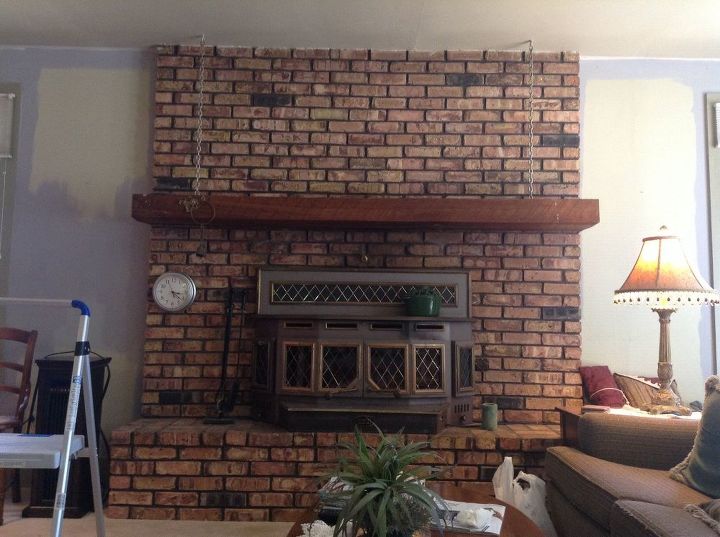
MY STONE FIREPLACE HAS SHADES OF DARK BUTTERSCOTCH, LIGHT BEIGE, BROWN AND BROWNISH GRAY WITH GRAY MORTAR. I WANT TO PAINT THE WALL SO THE FIREPLACE POPS. KNOTTY PINE CEILING. ORIGINALLY THOUGHT OF A FOREST GREEN BUT EVERYONE SAYS IT WILL BE TOO DARK. SUGGESTIONS ?
Related Discussions
Suggested Project Book

paint so very personal,pick a color that you really like out of the stone
the Butterscotch might be good or Copper or Turquoise.
Pick a colour from your fireplace, the gray or butterscotch would be nice (although that may be too close to the ceiling colour). I had forest green walls for years. It looks good if it is broken up with white, and art work. It will look dark with your knotty pine ceiling. You already have a lot of colour in the stone.
If any of the samples below from Pinterest are similar to your stone, you could use the coordinating colours.
If you have furniture that the forest green will complement, then go for it. If you're hesitant, then the dark butterscotch will cause the wall to "fall back" and complement both the fireplace and pine ceiling. If you're not crazy about browns, then a darker gray in the same grey family of the mortar would be nice (by family I mean that the grey may be a "green grey" or a "yellow grey" or a "blue grey". Try to get a paint color paddle from your local paint store and find a grey that is right).
I would get paint chips in colors lighter, darker or brighter than the colors in your fireplace, and tape them to the wall next to the fireplace, and live with it for a week until you see which one you like. You can also have a quart tinted to your color choices and paint a big rectangle of each next to each other to pick. The various times of day have different light that affects how colors appear.
You might try going to Design Seeds https://www.design-seeds.com/ which has a palette of compatible colors. You can see if they have colors that are similar to your own and go from there.
I recently painted the interior of my home with Valspar's Oyster Pearl. It's a wonderful neutral light shade, just like the shells found on the beach. It complements everything. Your pops of color can be added with accessories and changed with the seasons. Semi gloss white trim will also enhance the wall color. Best of luck.