How to create harmonious colors in a home.?

Related Discussions
Blackout curtains behind vertical blinds
I have two 6' patio doors, and I want to add blackout curtains to keep the sun/cold out. What is the best way to hang them, and what can I use to push the curtains ba... See more
How to make a balloon garland?
Does anyone know how to make a balloon garland or a balloon arch?
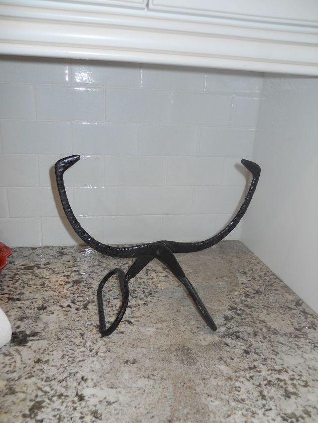
Does anyone know what this is?
Just turn them upside down and open them, then insert a roll of paper towel and tada, you have yourself a brand new paper towel holder that is not only beautiful, but... See more
Can anyone identify this vintage wooden crank box?
The item is solid wood, standing aprx. 26" high x 16" wide, no exterior holes or outlets, side crank handle turns four wooden paddles inside with various size holes o... See more
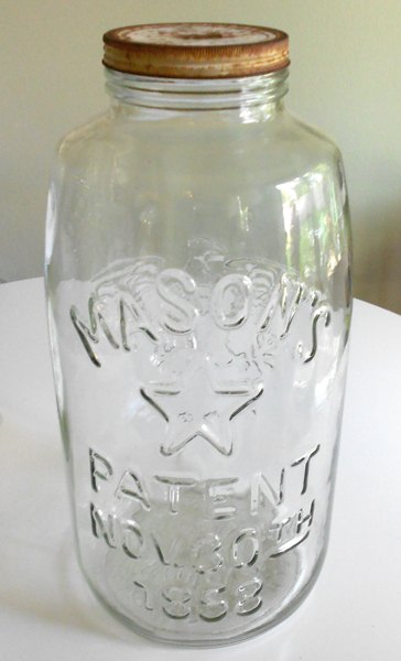
What to put in this huge mason jar?
I have a HUGE mason jar. I would like some ideas on what to put in it for decorations, other than flowers.
How can I find discontinued Pulaski or Neiman Marcus/Horchow furniture
I am looking for the discontinued Pulaski Royale collection nightstand, Neiman Marcus/Horchow also sold it, but called it the Royalty collection. I have looked all ov... See more
Ideas on different things I can do with these yummy old spools?
I'm a picker and came across lots and lots of these beauties. I took home several boxes of these purdies and are using for different projects. However, I want to find... See more




Google harmonious colors. Visit your nearest paint store and ask for assistance or just play with their sample cards until you find a combination you like.
http://www.housepaintingtutorials.com/paint-color-schemes.html
The one thing you can do is paint every room the same color and have the same carpet throughout.
Make the walls a neutral color and make your coordination with accent colors.
If you are having trouble deciding which are compatible colors, go across the color wheel for a color that will work. a lot of coordination has to do with tone and tint. In ther words you might want to "tone" down your wall color with a light grey and then use a brighter "tint" with a yellow trow on the sofa.
If you decide to use any white, be careful not to pick a white with too much blue...it can become glaring!
Here is a good link on "tone and tint"...
https://www.google.com/search?q=what+is+the+differece+between+tone+and+tint&rlz=1C1GGRV_enUS751US751&oq=what+is+the+differece+between+tone+and+tint&aqs=chrome..69i57j0l2.8007j1j4&sourceid=chrome&ie=UTF-8
Look at these color wheels and see how decorators have put different colors together over the years...
https://www.google.com/search?q=color+wheel&rlz=1C1GGRV_enUS751US751&oq=color+wheel&aqs=chrome..69i57j0l5.1768j1j9&sourceid=chrome&ie=UTF-8
I've been painting (including murals & faux finishing) for over 50 years and have found that it's a personal preference, what's your favorite color and what pleases you? Here in Florida I've painted the ceilings Clark Kensington's Designer White in both satin and semi-gloss wall paint which will reflect light into the room. I choose Valspar's Oyster Pearl (#7002-2) in a satin finish creating a neutral tone that will complement any flooring while working with all furniture designs. Pops of color can be added with your window treatments and linens. If you stay neutral with your walls, changing out linens and tablescapes with the seasons will be budget friendly in the long run. Best of luck.
Most paint manufacturers put out paint Palettes... a group of colors and tints that all work together....everything from whites to wild.... HGTV Home (paint) has an number of these... pick a "palette" and choose from the colors in that palette
Learn about the color wheel. Pick 1 main color of the primaries ( red, yellow, blue) whittle it down to a particular shade. Now pick a second primary color and only choose colors within that marriage (secondary colors made from mixing your primaries. Some colors do well in multiple shades, like greens b/c there are so many shades of green in nature. So, if you picked blue, and further whittled to a cobalt blue, then picked yellow, a nice bright sunny yellow, then blue and yellow together make green, and since your blue and yellow are bright rich colors, then I’d go with soft sea green, bright grass green or rich blue green/ teal shades. Stay away from the muddier olive or Forrest green shades.
Find a paint chip in a color that you love. Make sure it has at least 6-8 colors on it Ranging from dark to light.
Now look for a single chip with a bold, opposite color that looKs awesome with the 4th color on your multiple paint chip.
EVERYTHING that comes into your house or is used in your house MUST match one of the 6-8 colors on your multiple chip. That includes paint, furniture, dishes, trim, rugs, etc. (Always carry a chip in your purse for matching at the store).
The single chip is your accent color. Use No more than 10% of this color per room.
Lets say you fall for a chip in multiple shades of gray. Then you find a single chip in a luscious cranberry that looks amazing next to the 4th color on your main chip. Use the cranberry for pillows, vases, picture frame matting, window valances, bath towels, placemats, etc. Remember, it is only used to add a POP of contrast to your different shades of gray.
Follow these simple rules and VOILA!! Good luck🤗