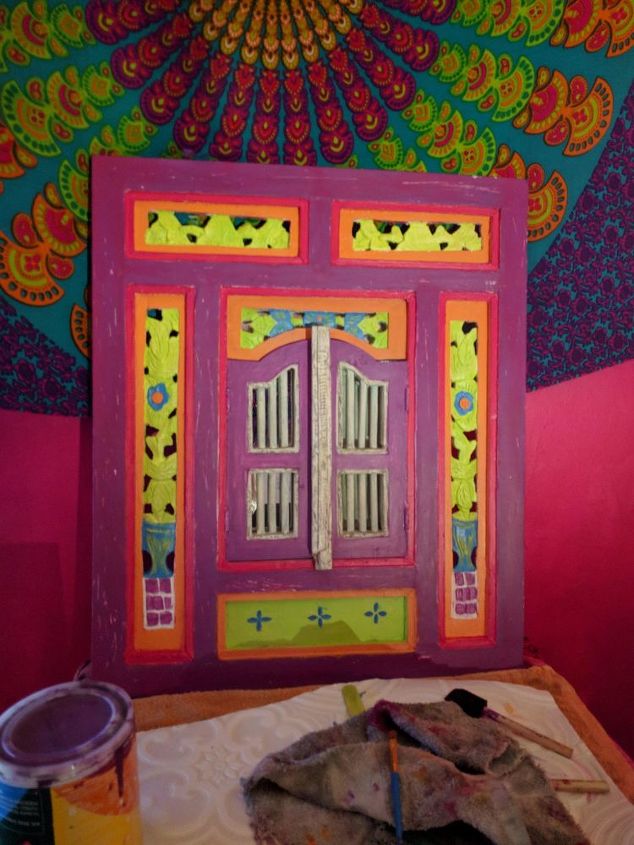
I have since this pic added some more turqoiuse to the flowers at the top just a few but I don't like it. HELP!
Ok having trouble with colors and how to proceed..

I got this lovely asian wood ornate mirror for cheap and I love color so I thought a pink and orange..my style is bohemian/moroccan/indian/mexican. I am stuck..any suggestions on what to do next? Basically the scarf behind it is my inspriation. So pink/orange/turq/lime green..at the moment I am thinking about buying a white spray paint and doing the whole thing over! Any ideas would be great, changing colors, or where the colors are anything. Thank you!
Related Discussions
Should I paint or stain my oak kitchen cabinets?
I was wondering if you could help me with something -- I have an entirely oak kitchen. I know it's the rage now to paint or gel stain cabinets. I've been considering ... See more
How to paint a metal front door?
How do I paint my front door? It's metal.
How to paint grout?
How do I paint grout to change the color? The grout is in great shape, but the color - meh.
How to whitewash a brick fireplace?
What is the best method to whitewash bricks surrounding a fireplace?
Should I re-stain or paint my cabinets?
Edit:””” 3 years later😂 I decided to paint them white and I am so very pleased with the results!We bought a new house with these ugly cabinets. I really cann... See more
New siding, what color should I paint the wooden porch?
I've had new siding for about six months. It's barn red with ivory or beige trim. I'm wondering what color to make the porch? What color to make the door? I had thoug... See more

Maybe swap purple to green everywhere, n swap orange with the blue everywhere, but then do the vertical stripes on the door orange with blue in sunken vertical stripes!!
I think it's really lovely Leslie. I adore the whole boho vibe too. I'm not sure what paint you used but if I may suggest, perhaps you can add some dark wax to bring out the details on the scroll work down the sides and make them pop. Try a little on the back to see if it you like it first.
I think the colors you have chosen are really fun!!
I would try painting the left and right vertical panels back to solid green. This type of carving isn’t super fine , ,so trying to pick out those details is really hard. It makes you feel like your painting ability isn’t very good, but it’s not you at all, it’s the carving underneath
Keep going....put some orange paint around the “door “windows and down the center unpainted pole, tourquoise bars on the windows ,and red on each side of the center unpainted bar. Keep the tourquoise details on the green panels above and below the doors. I’d even try to make it a bit more aged by lightly sanding the outside edges and the edges of the center doors, or wherever you like.. you’ve started beautifully, keep going and don’t get discouraged.
Good luck!!!
I like Michelle's answer about the wax to bring out the carving details and I love what you're doing. I think adding a darker green or navy to give it some color contrast would be nice (looks like those are the colors for the scarf's outlines??) While I love the bright green, I think there is too much of it, my eye is drawn to it.
yes thank you I was going to add a wax when it was done..and yes and yes thank you so much! I will post back with results!
I think it looks great. You could add another coat of purple paint and deepen the color with paint or wax. Maybe sanding the frame edges here and there would add extra interest. Anyway, I love your choices so far!
I would subdue the yellow/green color, it is so bright that it draws your eye to that and not the details in the rest of the piece, otherwise your colors are pretty spot on, but brighter than the hanging. The purple somehow looks a little off, but the wax may even it out, as well as the brightness of the other colors. I love the look of the hanging and the piece, it will go well when you are done with the tweaking you are doing.
Ok I thought I would share where I am now with my Moroccan Wooden Mirror. I went back to what I originally had planned! That damn scarf in the background got me all confused. Always go with your first instinct. I love orange and pink together and I have added some beads for pop. I AM DEFINITELY NOT DONE YET. I have loads more to do...but this is where we are at now! THanks for your input really appreciate it. Phew...this is taking FOREVER!
I agree with a couple of the comments that suggest something dark. I've noticed with these mandala type designs that there is always a dark muted tone that grounds all the bright colors. In your scarf, for example, I see a very dark purple that has a different intensity than the other colors. I like to think of it as adding cumin to a dish. It's that warm earthiness that grounds the bright flavors like citrus or yogurt.