Picture Mat color? I hate the white
by
Linda
+19
what would be a better neutral color picture mat for the picture. My living room walls and furniture are gray. I thought this would liven it up, but I hate the white mat.
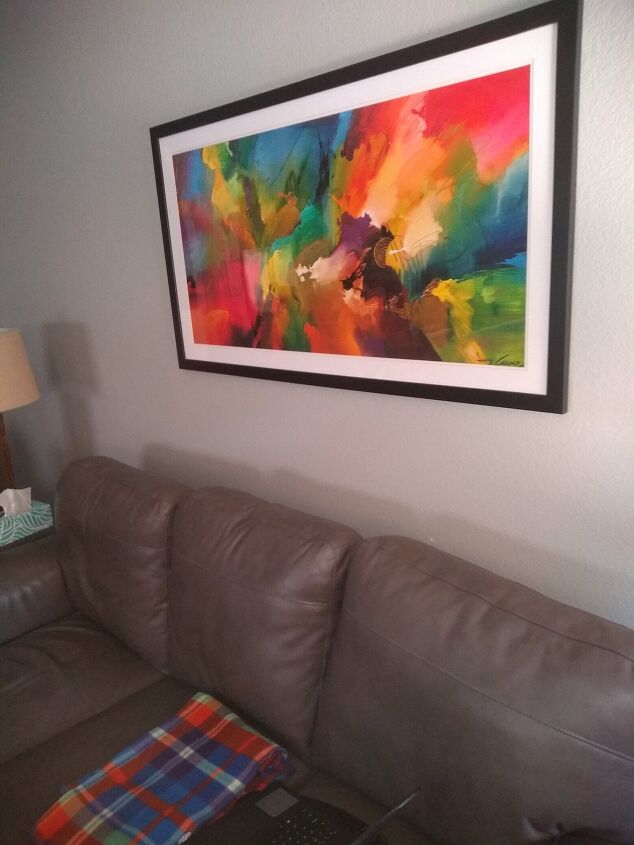

I would pick a shade from the picture....maybe the blues or reds?
Most quality artwork is framed with a white mat -- it cuts down on the "distractions" -- and let's the viewer focus on the work. (Look in galleries... it's always white mats!)
Second option: light grey
Hi Linda, I suggest you try a few different colors found in the art. I'm often surprised how a very small change in mat can reallly bring out the beauty of the art. Maybe yellow, light blue, or rose to contrast with your beautiful black frame. Not that you'd want to do it, but you COULD paint your current mat in one of those colors, just be sure to let it dry thoroughly before placing back in the frame.
Hi Linda, I would pick a grey the same color of the walls, I think it will look great and still let the art pop!
Hello while white can be the classic choice, a off white, ecru or very light gray might be more pleasing to your tastes.
Either pick on color from those in the "painting" or just use black. It will make the frame look larger. You could also use black and paint the frame one of the colors from the painting. Chose a bright pop like red or the lime green for the frame.
Hi Linda, Picture this: change the frame color instead of the mat. Leave the white and blend it in by adding white pillows/throws to your couch.
As far as the frame, match it to one of the print colors then add other simple decor or pillow in that color.
I used colors from the painting Purple and green.
Hi! I would skip the mat. Good luck!
I really like it, makes to picture pop. A sandy colour might work if you want to tone it down a bit.
A black mat would work with the thinnest strip of white mat near the colorful picture. That would set off the colors with a bit of contrast rather than a burst of contrast. You might have to experiment a bit to see what works. You could do that by taking it to a store that does framing and hold up different mats, then go do the job yourself.
I was thinking charcoal or the color of your lamp shade. I think the white looks fine but is stark against the black frame and color pops.
Hello,
I would use the grey of your walls or slightly lighter grey or any of the colours in the picture to colour it. If not sure, start with the lightest colour and then work progressively darker until you are happy (Maybe Cream),
I would use a light grey mat, they have textured ones too which are like fabric
Hi Linda: Did you know that you can spray paint matts. I do it all the time. I use Rustoleum. Do light even coats, spray outside, make sure you start and finish a little over the edges for no smudges. Let dry about 15 minutes before second or third coat. Like I said light even spray. For your picture I would choose either a dark gray or that purple that is in the middle of the picture. You want something dark not light. But the beauty of spray paint is if you do not like it you can repaint.
If you want to do it yourself, you can paint the existing mat the same color of your wall using your wall paint. Take apart the painting and paint the mat, being sure mat is dry before reassembling. Or if you have it professionally matted, double mat it and choose a narrow mat color that's in the painting (maybe the golden yellow) then use a gray for the larger mat to match your upholstery. Finally, I would add a couple of golden yellow throw pillows on the sofa to bring out the color in the painting. Then add a few accessories in that same yellow as accents in the room---maybe a lamp, some books covered in yellow & a small container of sunflowers. (btw, I would lower the picture 2 to 3 inches. I lowered it in my version below as it seemed a bit high and lowering it would create a more balanced look...jmo :-) Good luck!
Baxter, I love people who can photoshop and render so perfectly! I am a total clutz.
grey like the walls!
I would keep the white mat and spray paint and change the color of the frame. Perhaps use you accent color for the frame.
I see some dark teal in the art I'd do that
I'd use a gray mat that is a little bit darker than the walls.
greyish but light would look good