


Where to Start When Choosing a Paint Color
3 Materials
$25
4 Hours
Easy
Is choosing the right paint color keeping you from making any decision at all? Yes, choosing the right paint color can be stressful and paralyzing, but I'm here to help!
In non-technical terms, using a project from my own home I'll guide you through simple strategies to make the process easier.
CLICK HERE FOR MY WEBITE AND MORE HELPFUL INFORMATION!

We are going to skip things like hue, value, contrast, etc. because it doesn't make sense to anyone other than those trained in color theory. Let's instead use terms that most people understand to keep this as simple as possible :)
Like when you go to mix paint at Lowe's, if you say "I'd like a deeper value of this same color" do you think that's going to translate most days?
Color = A paint chip and color of the object you are painting.
Dominate Color = In a multi-colored object, the main color.
Light, Medium, or Dark = The feeling the color creates (dark and moody room or light and airy room).
Natural Light = How much actual sunlight is in the room.
Match = A color that matches another color.
Coordinate = A color that goes with another color.
In your own home, you have to start with something to "match" or coordinate" with BEFORE you pick a paint color. We are only going to be talking about interior colors.
DO NOT JUST PAINT THE WALLS A COLOR YOU LIKE BEFORE BUYING ANYTHING.
Examples of Base Objects to Work From
- Fabric
- Artwork
- Rugs
- Pottery
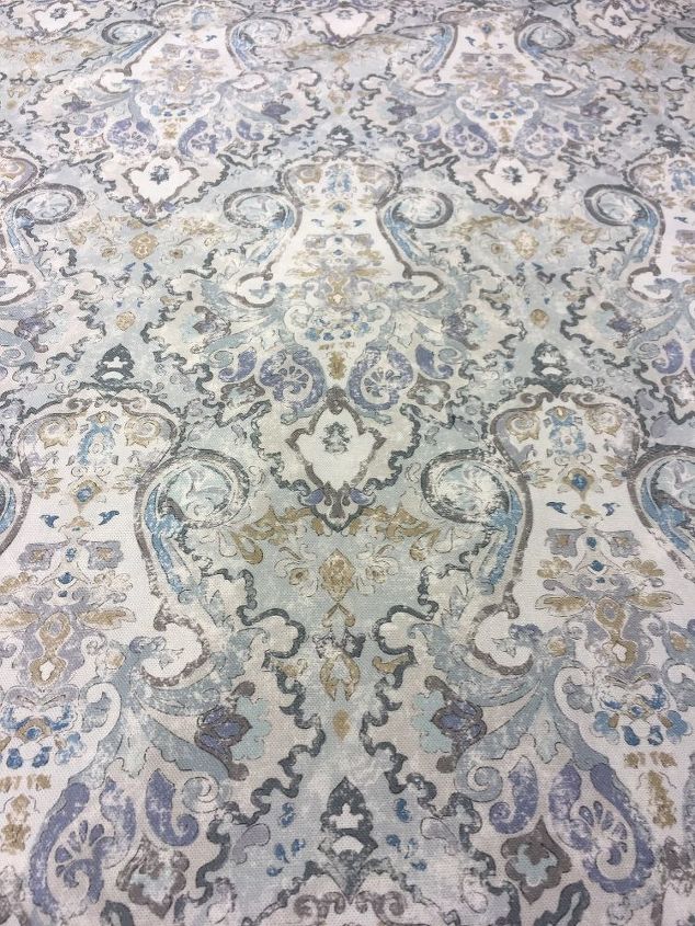
99% of the time I start with a fabric. I find a pillow cover or go to a fabric store and design the room from that point forward.
Analyzing Color
It's time to stare and I mean STARE at the item you have to match or coordinate in your room.
- What is the dominate color you see?
- What other colors do you see?
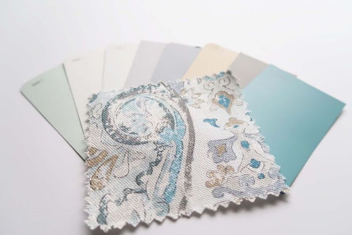
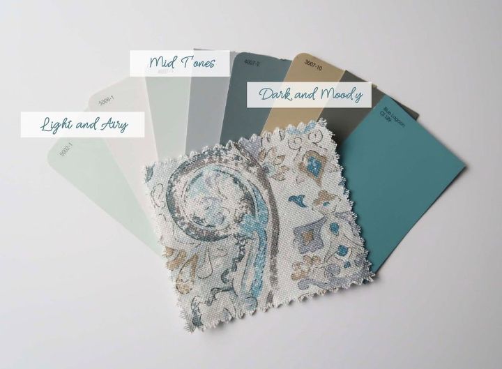
That is the basis for everything. You will be choosing a color that "goes" with a color in the object and for this example we are going to work from the main fabric in my dining room makeover.
Dominate Color
When I look at this fabric, I see the lighter blue green color first but that's just because it's a color I love! You may look at this fabric and see a dark gray, or tan color, or even the deeper shades of blue.
What ever color you see is the dominate color. There is no right or wrong answer to the color you see - UNLESS you are color blind. Then this color selection thing is best left with someone else :)
Coordinating Colors
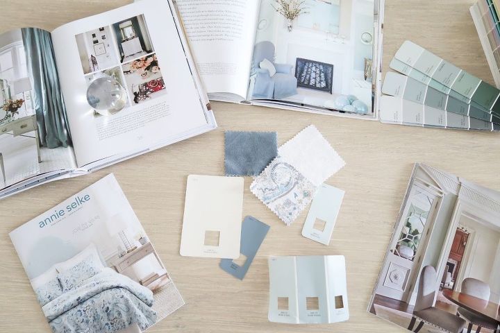
In analyzing the fabric, I found 8 colors that worked with the fabric and narrowed it down using the next part of the process.
Once you have a general idea of what colors "go" with the fabric/rug/pillow, now it's time to look at the light in the room.
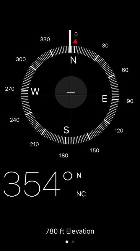
Using the handy compass on your mobile phone, look to see what direction your room faces. My dining room faces almost due North.
North, South, East or West
How much light a room gets is very important in picking a paint color. North and south facing rooms tend to be a darker because they don't get direct sunlight. East and west facing rooms will get direct sunlight in the morning or later in the day respectively.
How Many Windows?
If a room has a wall of windows floor to ceiling, even if it faces north it will be lighter - like my office and man cave. If a room has very few windows or small windows, the room will be darker.
The Feel of the Room
Do you want a light and airy, a little cozy, or deep and dark feeling in the room? That will help you decide if you pick a light shade of paint, a mid tone, or a dark color.
Choosing the Color
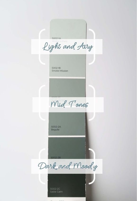
Now that you know what colors work with the decor, the light in the room, and the feeling you want to create it will be easier to focus on the color itself. Layout all of the colors you found from light to dark. Each one of those colors can most likely be selected in a lighter or darker version - easy!
Light to Dark
If you know you need to brighten a darker room then pick a lighter color, if the room seems too bright and you want to make it feel cozier pick a mid-tone, or if you really want to make a cozy space or do just an accent wall go with a dark and moody color.
- Lightest shades on the paint chip for a light and airy feel.
- Middle shades on the paint chip for a mid-tone feel.
- Darkest shades on the paint chip for a dark and moody feel.
Natural Light Factor
Natural light plays a HUGE role in how dark or light the paint color should be. The more natural light a room has the farther down into the mid-tones you can go and still have a lighter feeling room.
If the room has very little natural light, realize a darker color will really close in the space. If that is the look you are going for, then do it!
Color Emphasis
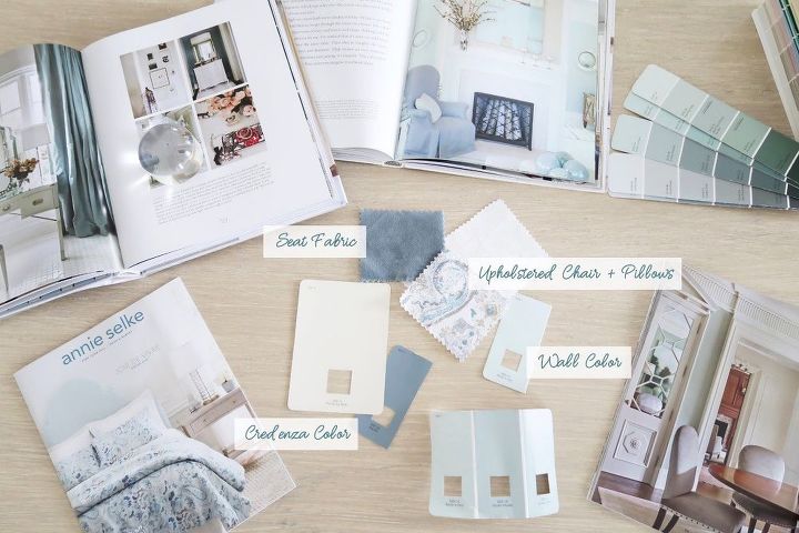
Now that you've done that exercise what color do you want to emphasize. The walls are the BIGGEST color impact and will guide everything else you do, so choose something you can live with and work around.
In my example, I have a few options and can paint the room in a variety of colors:
- Blue/Green
- Gray
- Tan
How I made my selection:
- The room faces north, the windows are narrow, the front porch blocks light to these windows, and drapes block light further. So it's the darkest room in my home.
- To bring more light into the room with the wall color, I choose a very light color. The easiest way to think about this is on a color chip it is the LIGHTEST color.
- It was important to coordinate with the downstairs of my home and the adjacent rooms were in a light cream color.
In order to create differentiation, I went with the most dominate color I saw and wanted to emphasize - the light blue/green color.
Samples
YES, please spend the money to test the color you chose first. Try to paint a large area like a 1ft x 1ft swatch of the colors you are thinking about. If you don't want to paint the walls, use white poster board and label the back.
TIP: Choose your final selection during the day.
Wall color will reflect other colors in the room and cast a color onto to other objects in the room. Try the colors on different walls because each wall will reflect light and the color differently.
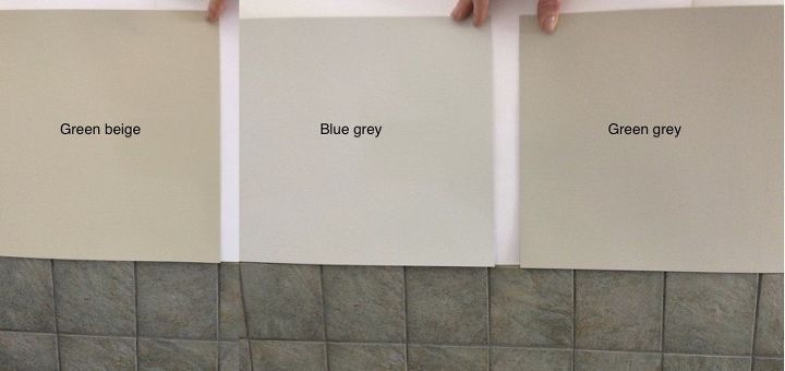
IMPORTANT: hold the paint chip behind any stained wood, tiles, or drapes hanging. Do you still like it? Does it coordinate or match or even complement other items in the room?
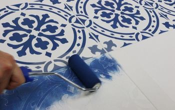
- Here is a great example of testing a color against tile from In-Form Design. Each one looks good with the tile, so it is a matter of what you like best!
- Watch the color ALL day long. Do you like it as much in the morning and at night. Does it take on a strange look at various times of the day that you don't like?
- Avoid a color you don't love all day long!
This process can take days or weeks. Give it a little bit of time and get opinions if you aren't sure.
It's decision time and I hope with this guide you found your perfect color!
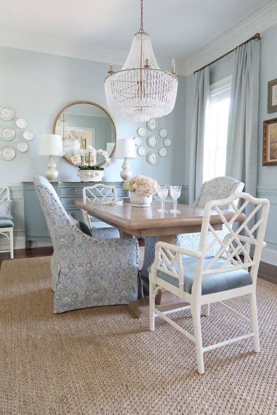
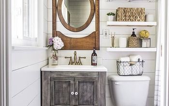
Here is the final color I chose for my dining room makeover to coordinate with the upholstered chairs.
Valspar Sea Salt Blue and I LOVE it!


Any price and availability information displayed on [relevant Amazon Site(s), as applicable] at the time of purchase will apply to the purchase of this product.
Hometalk may collect a small share of sales from the links on this page.More info

Want more details about this and other DIY projects? Check out my blog post!


Frequently asked questions
Have a question about this project?