The Beginner’s Guide to Color Psychology for Interior Design

It’s no secret that color affects our minds, moods, and even our bodies. Changing the color scheme of a room has more of an impact than meets the eye. By repainting your room, you change the entire atmosphere and how it affects you and your emotions. Before you pick out your paint colors, consider which emotions you want your room to evoke.
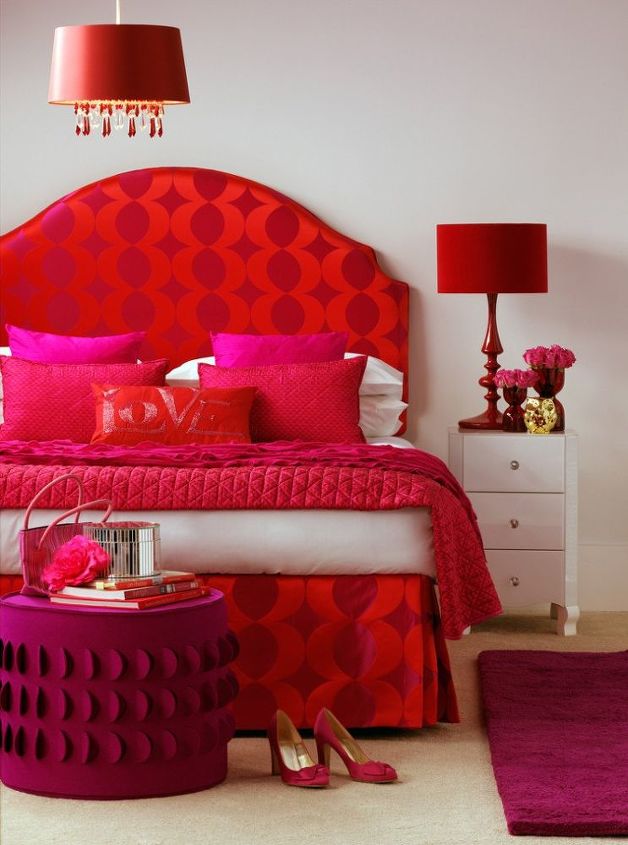
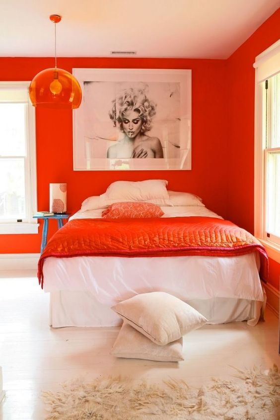
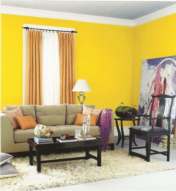
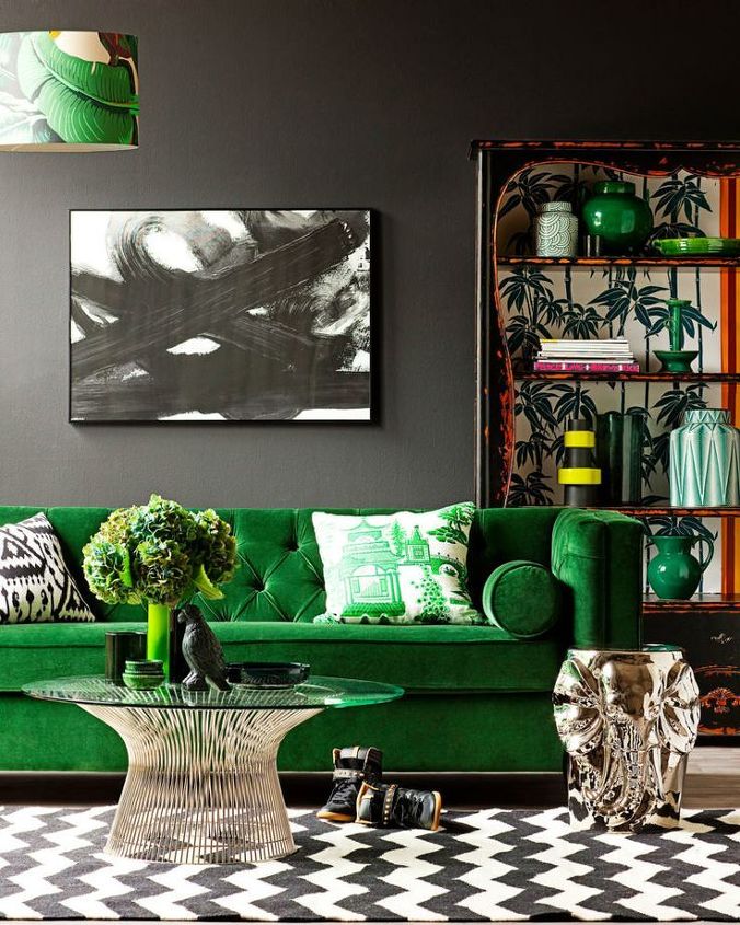
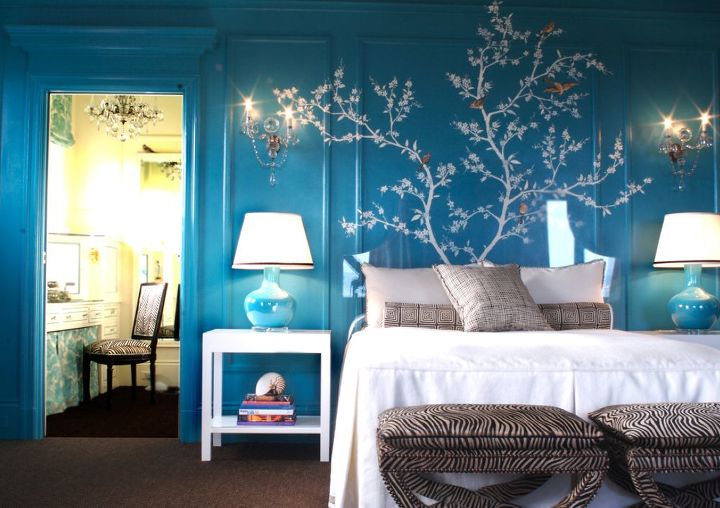
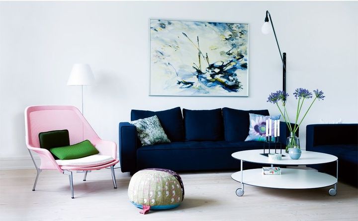
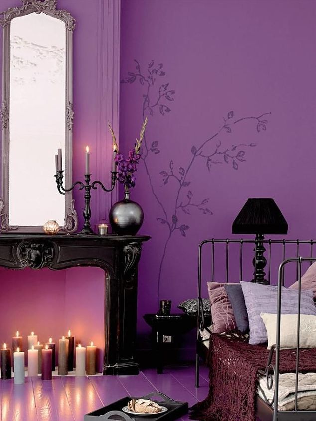
Do you want your living room to be bright and open or darker and cozy? Do you want your bedroom calm and quiet or passionate and sensual? By deciding the mood of your room and following this Beginner’s Guide to Color Psychology, you’ll be able to create whatever style of home you want.
Red is by far the most powerful color. Red is full of passion, emotion, danger, and life. Physically, the color red can actually raise your blood pressure and increase your heart rate.
It is also a color commonly used in restaurants because of its ability to increase appetite. In homes, red is often found in dining rooms and kitchens. Avoid using red in children’s rooms, however, as it can be too powerful a color to allow for a restful sleep.
Orange is an energetic, fun color. It can also boost focus and productivity, which makes it an excellent color for a home office. Even if you’re not a fan of orange, try decorating your living room or home office with subtle pops of the color. It will make your room look more fun and modern and you’ll be surprised how much happier the room will feel.
Yellow is bright like sunshine. It is a color that instantly makes any room cheerful and happy. It inspires conversation and happy memories. Yellow is an ideal color for kitchens since they are the heart of any home. It also brightens up dark hallways that get little natural light.


Pops of yellow also work well in living rooms and home offices as the color can help with focus and concentration. Avoid yellow in bedrooms or other restful areas since it is such a high-energy color.
Green is the most common color found in nature, but can also work well inside your home. Green is a very versatile and promotes harmony and balance. Use rich greens like emerald and forest in rooms where luxury and elegance are key atmospheres. Avoid lime green or a yellow-green in bedrooms as they are very energetic colors.
Considered the most popular favorite color, blue is calming, relaxing, strong, and versatile. Blue can be used in practically every room in your home as long as you take advantage of the different shades of blue and how they evoke certain moods.
Bright blues, for example, are great for pops of color through the living room or kitchen while darker blues are fantastic for bedrooms because of their ability to promote peace and restful sleep.
Being the most royal color, purple is luxurious, rich, and wealthy. It is also considered the sexiest color for bedrooms since it combines the passion of red with the calming qualities of blue.
It can be both feminine or masculine, making it a wonderful color choice for couples. While you can certainly get away with painting an entire room purple, you may want to consider using different shades of purple instead of one color to give your room depth.
Black, white, and gray are the most common neutral colors. White is probably the most common color found throughout homes as it is innocent, versatile, and works with any other color. White is the best choice for small rooms as it creates the illusion of making the room appear larger.
Black is sophisticated and powerful. Many homeowners stay away from using black in their homes because it can easily become overpoweringly depressing and morose. However, when used as an accent, black can add a certain amount of boldness and drama to a room.


Gray, on the other hand, is quickly becoming a popular choice as a neutral color because of its ability to bring the sophistication of black and the purity of white together. Gray complements most colors and can make bright colors pop and dark colors more powerful.
Meredith - Arts & Classy
Want more details about this and other DIY projects? Check out my blog post!
Go
Frequently asked questions
Have a question about this project?
  1 question
Comments
Join the conversation
2 of 3 comments
  • Eroque022810 Eroque022810 on May 10, 2017

    People need to remember that the colors you coos to show us are in a very deep hue. You can like a color but in a different hue to make you feel more comfortable. Some of the colors you picked were just awful examples. Plus people out there ,these are just examples and red doesn't make everyone feel these things nor that blue the trim was even painted the white was blinding to me just like the yellow so for me these examples don't work. I still think your closet let's people know how you feel. Look at your clothes and stick with those colors because you purchase them because you like them. Then explore different hues to see what you want to make you smile. Red is not sexy to everyone this is very very general since each person has their own personal make up. But even with that said at least it gives a general broad guide it's a place to start if you really have no clue.

  • Wonderfulwatermelon Wonderfulwatermelon on Feb 24, 2021

    Love all of the colors, just FABULOUS, darling. FABULOUS.

Next