« View Post
Photos

Oops! Leave without saving?

If you leave this page, the information you have entered will not be saved!
Are you sure you want to leave this page?

Leave this page Stay on this page

Hometalk.com

  • Sign Up
  • or
  • Log In
  • Professionals
  • Community
    • All Members
    • Professionals
    • Bloggers
  • About
    • About Hometalk
    • Blog
    • FAQ
    • Guidelines
    • Resources
    • Support
    • Press
    • Contact
    • Terms of Use
    • Privacy Policy
  • Following
  • All Topics
    • Cleaning & Organization
    • Crafts
    • Design & Décor
    • DIY Projects
    • Gardening
    • Home Maintenance & Repairs
    • Outdoor Living
    • Painting
    • Remodeling
    • Repurposing & Upcycling
    See More Topics »
  • Questions
    • All Questions
    • Open Questions
    • Unanswered Questions
  • Clips
Post & Ask
Join Now Log In

Hometalk is where people share and help with everything home & garden

0
Teresa D
Teresa D Snellville, GA on Jun 03, 2012
Like Clip

Is this picture too big for the space? Seeking a little design advice.

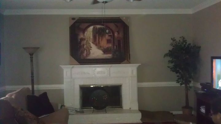
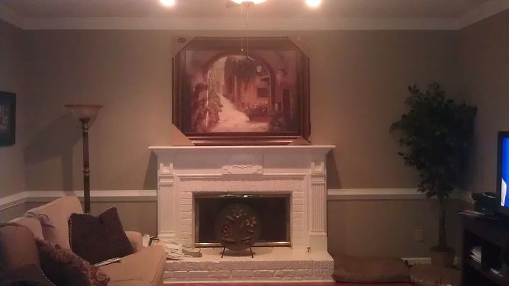
I have been watching this picture since last year and it finally went on sale. I rushed to purchase it - so thrilled that I was finally getting it! I put it up on my mantle, where I plan to hang it ... stepped back and thought, "geez ... that's much bigger than it looked in the store". It's HUGE!

Now I'm torn. :-( I love the picture but I think maybe it is too large for this space. I have 9 ft. ceilings. What do you guys think? Too big? Can I do something to make it work? (not raise the ceiling of course) Flank it with sconces or something?
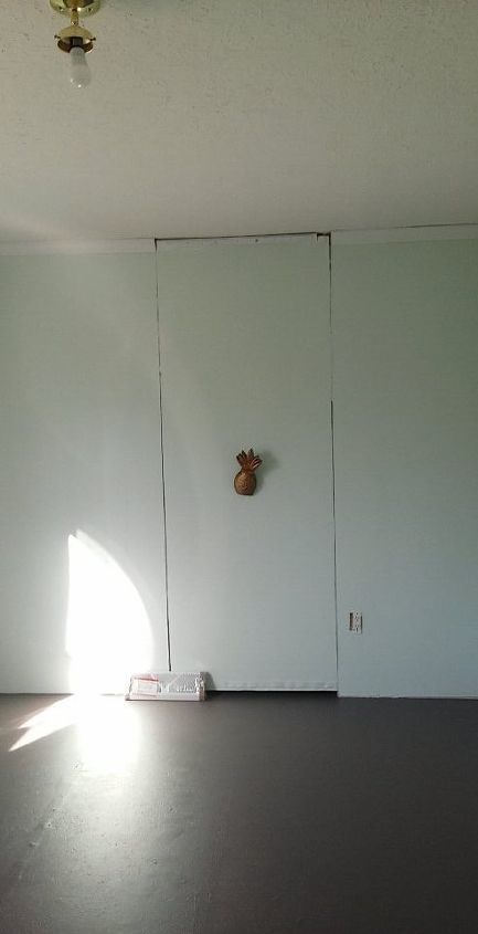
  • Like Clip
    3
  • Like Clip
    3
Post Comment | Like | Clip | Share
1249 Views
45 Comments Displaying 25 of 45 comments | See Previous
  • Susan S Fredericksburg, VA
    ummmmmm . . . .I STILL say it would work!! LOL
    on Jun 04, 2012 · Like 3
  • Teresa D Snellville, GA
    lol Susan. I haven't totally abandoned it. I meant to mention that I moved my furniture around today to see if it makes a difference. We'll see!
    on Jun 04, 2012 · Like 1
  • Culpepper Carpets and Int... Atlanta, GA
    You can adjust & change things for color, but scale & proportion do not change in stationary architecture. I love the idea of using it in the dinning room & painting the fireplace. Aren't you glad you asked! More projects....
    on Jun 05, 2012 · Like 0
  • Jeanette S Atlanta, GA
    Beautiful painting, but too big and too stark a contrast with fireplace. If you love it, move it to one side of the fireplace and lower it.
    on Jun 05, 2012 · Like 0
  • Dee W Rock Creek, OH
    Good luck Teresa-loved meeting you and hope you'll let us know with pics how you decided to resolve this

    .

    on Jun 05, 2012 · Like 0
  • SheilaG, Plum Doodles Acworth, GA
    It's a nice picture, but I'd have to agree with everyone who says it's too big. It overpowers a beautiful fireplace. A general rule of thumb I've heard is that the picture should be approximately the same width as your firebox.
    on Jun 05, 2012 · Like 0
  • Leslie D Las Vegas, NV
    I think it could work. I see the main problem is that the dark color of the painting on top, and the light fireplace, makes it look ":top heavy". Excuse the rudimentary drawing, but I wanted to show that by simply putting somthing large and dark, on each side, and extending something to bring the two together for height, I think it could work. This helps make the grouping work, imo.
    on Jun 05, 2012 · Like 7
  • Marg C Middletown, NY
    I still don't believe it's too big. I imagine the fireplace the color of the picture frame...then adding something on either end of the mantle. It would be the focal point of the livingroom which is what the fireplace is meant to be anyway. The painting is beautiful by the way. Here's one more thought....Can you have the picture re-framed to something that is not so wide? Then I think your problem is solved.
    on Jun 05, 2012 · Like 2
  • Susan S Fredericksburg, VA
    OMG - Leslie I love your drawing!!! I had to laugh - just because it was sooo ingenious to do this on top of Teresa's picture. Never seen this done before!! I am definitely in the minority here but I still maintain it's the stark contrast of picture frame to fireplace (partly) but I think you have a really valid point to add more visual & physical bulk- and it adds interest instead of the whole thing being so perfectly symetrical & vertical!! It'll still be symetrical but the eye will ...»
    travel from the left up to the picture and then back down to the right!!

    on Jun 05, 2012 · Like 3
  • Leslie D Las Vegas, NV
    LOL, I'm not an interior designer, but I am a builder and scale comes into play a lot.when balancing architectural features. I love a large piece over a fireplace, and I honestly think it's a color/balance issue, not size.
    on Jun 05, 2012 · Like 4
  • Marg C Middletown, NY
    I also agree! love you drawing :)
    on Jun 05, 2012 · Like 3
  • Susan S Fredericksburg, VA
    @Leslie - Oh THANK YOU THANK YOU THANK YOU!!! That was exactly my point - color does have visual weight and in this case the picture visually looks heaver over top the white FP!!! I was always taught that we accessorise furniture - we do not decorate walls!! In other words, if accessories are placed over furniture whether it is a grouping or a single large piece - the sides should not extend beyond the edges of the furniture. Ideally, inside the "framework" of what is under the picture ...»
    or grouping. Nor should it be so high that there's total disconnect. The job of accessories is to compliment and enhance one's furnishings to create a more harmonious room!!

    on Jun 05, 2012 · Like 1
  • Therese C Greenfield, IA
    This is a balancing act, but very do-able! I love the idea of a large picture..you just need to balance it with the fireplace. By adding larger objects to the right and left of the fireplace, it appears to expand the size and balance it with a larger piece. You will have to excuse me for "killing" your pretty picture. I would darken the areas of the fireplace as shown just to give weight to it with such a heavy print above it.
    • sorry for my computer drawing..it was just to give you an idea... :) 1
    on Jun 05, 2012 · Like 1
  • Project Style, LLC Kennesaw, GA
    a good rule of thumb is to allow 7" between the bottom of a piece of art or a mirror and the top of the mantle
    on Jun 05, 2012 · Like 2
  • Susan S Fredericksburg, VA
    Normally, that would be the case - actually I would say NO MORE than 7" - but, I think in this case the general guideline goes out the window simply because it's over an already high mantle and the picture is large so I think just barely above the mantle, say no more than 2". I'm not even sure she has that much space because of her ceiling moulding. I've seen many situations where a mirror or picture are hung but the frame appears to be resting on the mantle. ...»

    Teresa, just for the sake of playing "let's see" - why don't you move your Ficus Tree over to the side of the fireplace just to give yourself a sense of perspective??

    on Jun 05, 2012 · Like 0
  • Teresa D Snellville, GA
    lol ... I love you guys! Leslie & Therese, GREAT drawings! I don't have anything big enough to move over there right now. You see how the torchiere (sp?) lamp looks dwarfed next to it. I'll move the ficus over (glad you can't see the dust in the picture!) just for you @Susan! I'll also take the packaging off the corners and maybe even hang it just to get a better feel. It is simply leaning against the wall.
    on Jun 05, 2012 · Like 1
  • Susan S Fredericksburg, VA
    Well, if nothing else, you are an excellent student and listen well!! I'll respect whatever your final decision is (begrudgingly lol) The important thing is that YOU have to live with it and be happy at the end of the day!!

    Just keep us updated on the Finals, ok???

    on Jun 05, 2012 · Like 1
  • Therese C Greenfield, IA
    to bad you are so far away Teresa..I have a6' ficus (artificial..but very real looking) that I would just give you...lol...ps..sorry I killed you beautiful artwork with my sample drawing :)
    on Jun 05, 2012 · Like 1
  • Juana A Seminole, FL
    I thnk it is. It takes away from your beautiful fire place. I am sure there is another place in your home for your new picture. It is also beautiful.
    on Jun 07, 2012 · Like 0
  • Lisa B Raleigh, NC
    yes!
    on Jun 07, 2012 · Like 0
  • Collette O Yellowtail, MT
    makes your mantel look like a shelf for the picture
    on Jun 07, 2012 · Like 0
  • Diane M Richmond, OH
    pretty but too big
    on Jun 10, 2012 · Like 0
  • Sonya M Huntersville, NC
    I agree pretty but too big.
    on Jun 10, 2012 · Like 0
  • Crystal N Savannah, GA
    As an interior designer the picture overwhelms the mantle but Sonya is right, it's beautiful
    on Jun 10, 2012 · Like 0
  • Dawn M Trimble, Principal... Atlanta, GA
    Teresa, you may have already received an answer, but I would say instead of focusing on the central location of the picture (and the fireplace and the small display plate in front), try to balance the room - in other words, look at the entirety of the wall and think of balancing the wall. Sometimes having items too centrally focused can be a bit much, but if you think of balancing it with the room (through the scale of other photos, items) it could work. Good Luck!
    on Jun 10, 2012 · Like 0

NOTE: You can drag and drop your photos to reorder them
Required
Comment Saving...

Related Posts

  • Our Back Porch
  • "French Made" metal pot
  • Upcycle a Cheap Door Mirror
  • 5 Likes

    Nicole S Ana M Jeanette S Marg C Susan S

Related Topics

Design & Décor

Recent Questions »

  • Home Rejuvenator
    Chevron Wallpaper
    2 hours ago 17 answers
  • Catherine
    I have a 1962 house with wood cabinets a...
    4 hours ago 9 answers
  • Maria Salcedo
    Mirrored Bedroom Wall
    11 hours ago 8 answers
  • Have a question?
    Ask now & get answers»
Back
to top
Feedback