What Colors Would You Use for This Wall?
by
Mary
+36
My walls are done in a raised plaster like in the photo. But in old world colors.
I still like the raised plaster effect but would like to change the colors of my wall to achieve the look in the photo . I know it is several colors . I just need some suggestion as to what colors I should use. What colors do you see. Thank you
I still like the raised plaster effect but would like to change the colors of my wall to achieve the look in the photo . I know it is several colors . I just need some suggestion as to what colors I should use. What colors do you see. Thank you
Although they are not identical, maybe these can help.
They sell Venetian Plaster kits...check on line.....Home Depot and Lowes use to carry them. Ralph Lauren made some nice ones. Several different colors /shades are available to achieve the look you want. Kits come with everything you need. Time consuming but it turns out gorgeous!!!! Please post a pic when you are done!
I would still look at the kits avail- ...as they have all the pre matched paint colors they use in them.....then you can just get the colors in the paint you need, it will let you see the finished product ahead of time ....also look at Houzz/Pintrest for some Venetian Plaster walls and see if they name the colors used since that is the look you are going for. Good luck.....jealous!
here's some colors
Keep in mind that there are both warm and cool colors, so get an idea of which mood you'd like in that room when choosing colors. Also Google Faux Venetian plaster effects , images to get some ideas. You don't have to do all that, but you'll get an idea how color combos look when done. Have fun!
For the love of grey looks right.
I like the bronze paint idea Your white should not be a yellow tone. I see greys and tans. Those colors can be mixed with your white to make varying shades of them. But I do think a little bronze accent would be beautiful.
I like the idea of looking at the plaster kits for ideas. But basically this is how it should go . .do your lightest color as a base, then use several of the other colors wiped or brushed over , one at a time and wiping off if it seems too much. I would use the next darkest color after the light base, then after that is dry and you are comfortable with it, use the next darker color. I think no more than two or three colors in addition to the base, and definitely try some bronze or silver or gold rub over it at the end. Just enough to be seen here and there, it will look spectacular. I do think making a board first with some sparkle to imitate the plaster look and feel will be really helpful for you to practice on. But the great thing about using these flat paints is you can easily paint over and start from scratch. Artists use canvasses over and over just by painting over the previous work. I think it will be easier than you think . . Don't over think it. But maybe print out the pic and take with you to the paint store and get tons of chips, take them outside and look at them as they look different in different light. Since it is plaster do make that practice board to make it easier :)) also, if you use the paint samples, aside from the base, you may only need to buy those samples and have enough paint since it mostly accent anyway :)). Good luck and please post finished project!!
I think the brown is too dark. But, you can always make it lighter by mixing with one of the light colors. I am concerned that you don't have any beige or tan tones in there, if you want your colors to look like the picture you provided. I am wondering if you have a hard time discerning some colors? Maybe you have some color blindness, and that is why you have problems choosing colors? If so it is nothing to be ashamed of, just something you need to work with is all.
Having said that, I do like the two grey tones you have chosen but am concerned that the white is just that, too white. You might want a little softer, like a creamy white instead of a bright white. What you are looking for is warmer softer tones, and a creamy white will work better for that. More towards ivory than bright white.
I would look for those two beige kind of tones, not use the darker brown, because you can always pick up a darker color if you think you want it darker, but it is harder to make it lighter .
So change the bright white to a creamy white, don't use the brown for now anyway, and get your two beige type colors, one lighter and darker, like some of the samples that some people posted for you. Unfortunately those are not coming up here right now, so I have to go find them on the post, if I can find the post!! And the. I will make another comment on the main post for you. Would that help? Or do you want to make another response here so I can then answer you privately here instead? Just let me know. I am going to look for those colors now.
Looks like the conversation is not private after all! Lol anyway, if you look up to the color palate called "for the love of gray" above on the post, they have the three other tones I think you need. If you can print it out and take it with you to be able to match that would be the best way to do it. If not, do you have a smart phone that you can take and then pull up this picture to use at the paint store? I think that would help you immensely. I can't read the names of the three colors on the "for the love of gray" picture above, but all you need to do is match those colors. The very small one in the middle is the color that should be your base / white shade. You see how much warmer it is ? Then the two colors that are in the upper right and lower left are your two beige/tan tones.
Now the two greys that you bought are a bit lighter than those there, but just try and see how they work. I think you might want to use the darker grey of the two you have and then a darker grey than that, and not use your lightest grey. But, you have to try and see how you like it.
So get that first base coat in the middle, and cover your practice area with that so all you see is that color.mthen the fun part starts :)) you start with your beige tones, brushing or sponging those in here and there, then when those are dry you start working adding in some grey spots here and there. Then you just play with it and see what you come up with. You have to wait until they are all dry to see the final do.or of them, so I say you should wait to be sure one coat is dry before starting the next color. You just won't know how it will look otherwise. Be sure you have some cardboard with some sparkle on it to give you a better idea of what you are dealing with, or you can just use one small corner of your wall if you wish. Wish you lived by me, I would love to come help!! But I am in Northern California :(
get hose beige colors and try a small section and post it, then we can help guide you better :))
Sorry just saw all my typos. Meant to say wait until they are dry to see the final color of them . .
And cardboard with spakle, not sparkle. Dang auto correct!!!!! Kept changing it to sparkle!!! Sigh . .
Excellent choices!!! I think the palate is great, but still only get samples and try them first. Have to see how they work in your space. I am excited to see your practice board or a small corner of your wall!!!! Woohoo!!
assuming you have the base coat already, I would go with numbers 3,4,5 :)) You already have both the lighter greys and the dark brown, so those colors, ( as samples of course) are the ones I would get and play with, then you can see what it looks like in your space. Once you have all your paint colors chose, before you do the whole wall, I would like to see you try a sample of a bronze glaze here and there over it. Or silver could work nice,y too, just depends what combination of colors you ultimately choose. Can't wait to see !!!
Hi There! How is it going? Did you get your base coat? I picked up some paints for my own projects that might work well for your accent colors, and they are cheap too! Chalk paints, between 5 and 6 dollars at Walmart. I love these colors! Already painting a frame with the Elephant color. Love it!!! Let us know how it's going :))
That is gorgeous!!!! What do you think???? Do you like it? How do you feel when you look at it? Does it feel like what you wanted for the room?. I think it is fantastic, but you are the one who knows what you are looking for . About two years ago I went in to Home Depot looking for a turquoise color to paint a vase. I took oodles of paint chips home, nothing seemed right, too green too blue, too light too dark like teal, etc. I got one I thought might work . Put it on the rescued vase and hat I finally figured out is that the color was not saturated enough. Took the quart back with a paint chip that had that color on it and darker shades. I asked if the guy could tint the color I had to make it the darkershade on the chip and he said no, they are all separate recipes. Huh. Learned something that day. But the guy said let me try something and if you don't like it I will let you have a quart free. Ok. He messed with the color and I was in love with it!!!!!!
I say all that to say even when the colors look right or seem right on the chip or in our minds, they don't always work out.
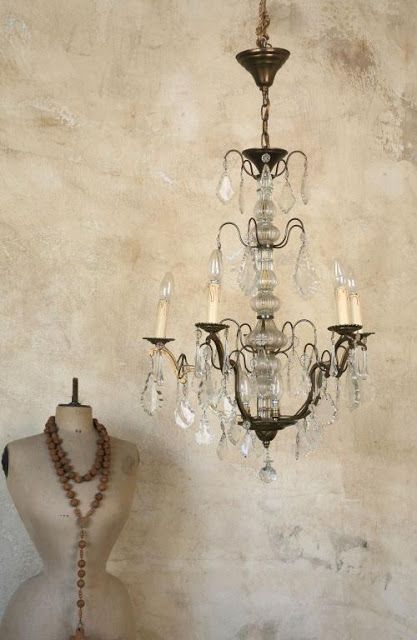
But I love what you did!!!! And especially love how you used a stencil and covered up a lot of it, so Artistic!!!!!!! I cannot wait to see your wall when you are finished!!!!!! I say if you don't have a crystal chandelier, get yourself one as a treat!!! Just $100 at Home Depot or less if you search. Or find something at a thrift store, paint it and add crystals. I make fashion jewelry by hand so I can help you if you decide to do a project like that.
Kudos girl, kudos!!!!!!!!!!!!!!!!?!
Forgot to ask, did you have fun painting it??
Um, I am assuming you ar a woman! What if you are a guy? Sorry but your name does not give me a clue!
Duh, just saw your name Mary! Was so taken by the pic did not even see your name . . Tunnelvision.
Oh is that gorgeous. I did my ding room like that, using a photo of a wall in Italy as inspiration. Just picked out the individual colors, three, and went at it. Have no fear!
Dining, not ding, dang!