


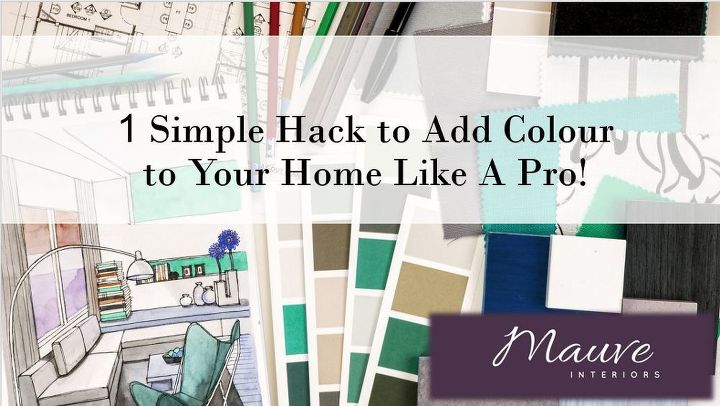
1 Simple Hack to Add Colour to Your Home Like A Pro!
3 Materials
I’m here to take some of the stress ways and give you a super easy and fun way to pick colours for your home like a pro, create a perfectly matched colour scheme, and add some excitement to any room. All of this without ever having to flip through a gazillion colour swatches or getting lost in the paint aisle, promise!
{
"id": "3777676",
"alt": "",
"title": "",
"video_link": "https://www.youtube.com/embed/o1VCj6JLg8c",
"youtube_video_id": "o1VCj6JLg8c"
}
{
"width": 634,
"height": 357,
"showRelated": true
}
How you use colour is the most important part of making a room feel complete! But, you ask, how the heck do I choose the right colours or know what is going to look good with so many choices?
The world of colour and paint can be overwhelming, especially when after sorting through thousand of swatches, trying different colours on your wall, consulting with family and friends, and trying to match your couch you put that first coat of paint and you think to yourself – shoot… I should have gone with the mushroom colour instead of the Ivy green. Arrgh!!
But that’s what makes it exciting  There are so many possibilities! And when used in the right places you can change as many times as you want. One year you can have mushroom walls and the next you can change to Ivy green ;).
There are so many possibilities! And when used in the right places you can change as many times as you want. One year you can have mushroom walls and the next you can change to Ivy green ;).I’m here to take some of the stress ways and give you a super easy and fun way to pick colours for your home like a pro, create a perfectly matched colour scheme, and add some excitement to any room. All of this without ever having to flip through a gazillion colour swatches or getting lost in the paint aisle, promise!
I LOVE playing with colour and keeping up with the latest colour trends. You can express so much and completely transform a space just with colour!
Here’s a sneak peak into my secret formula!
1 – Pick your colour palette inspiration
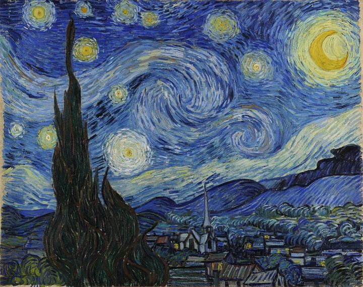
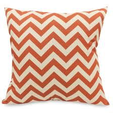
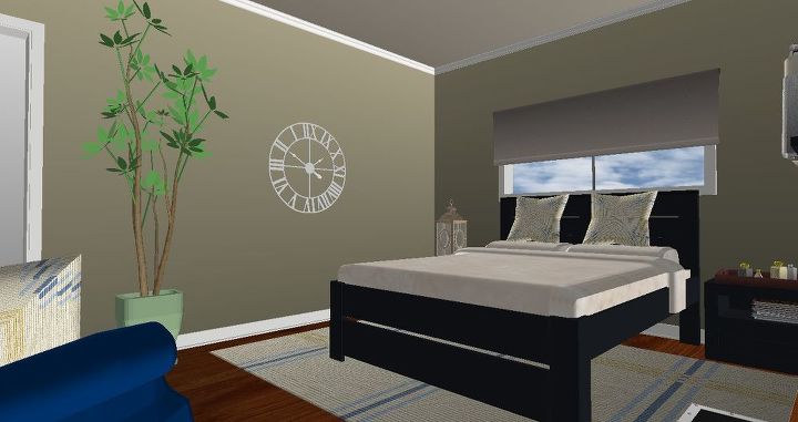
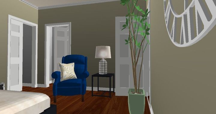
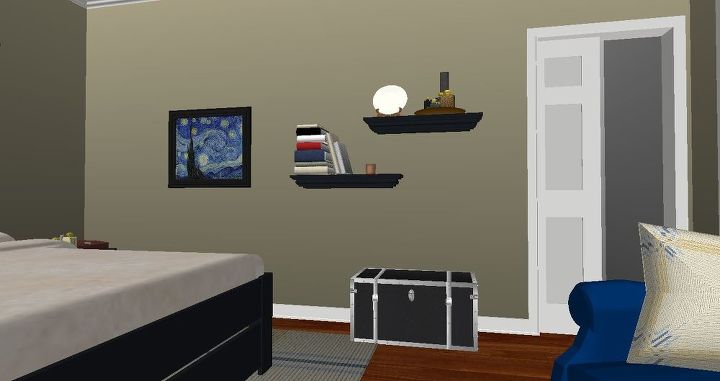
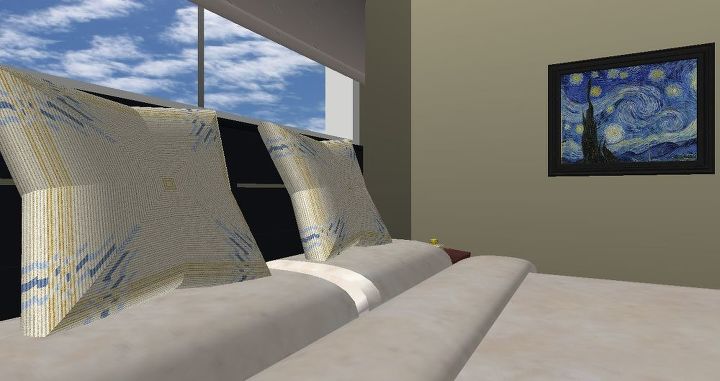
If you already have a piece of artwork that you will be putting in the room you are decorating I would use that. But it can also be an area rug, throw pillow, draperies, etc. As long as – and this is EXTREMELY important – it has a pattern and has a minimum of 3 colours (black and white don’t count). Let’s pretend, for the sake of this example, that you have a lovely copy (or original) of Van Gogh’s A Starry Night that you’d like to incorporate in your bedroom’s décor!
2 – Extract your colour palette
Now comes the fun part where, without getting overwhelmed by countless paint swatches, you’ll magically match a perfect palette right out of thin air (almost).
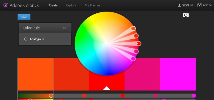
First take a picture or your artwork, pillow or rug and upload it to your computer. You’ll then head to adobe’s colour wheel page (free resource) here: https://color.adobe.com/create/color-wheel/
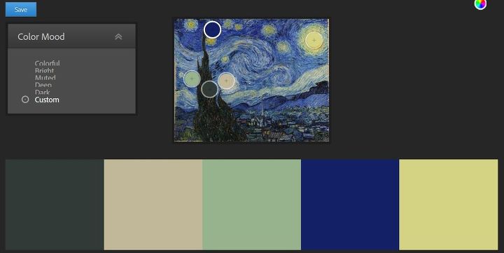
From there you’ll click on the camera icon on the top right to ‘create from image’. You’ll upload your image and voila! Under the Color Mood menu you can choose from preselected color palettes based on your image or you can click on ‘custom’ and make up your own.
Start moving the circles around your image to see what appeals to you! What you’re ideally looking for are 2 neutral colours (look for one light and one dark), 1-2 muted colours (not a pure bright colour), and 1-2 brighter accent colours. Pick the main colours in the picture because if not the whole décor will look a bit off. Don’t go for the little red dot that you can barely see in the picture as one of your main colours. In my picture below I made sure to select the blue and yellow for my bright accent colours, dug up a muted green and picked a dark grey and beige for my neutrals.

3 – Apply your masterpiece
Now what? You have your colours but we’ve still got to decide where we apply them. There’s no rule here and you could use bright yellow on the walls, bright blue furniture and neutral accessories. But if you’re not feeling quite as bold here is what I would recommend and I’ll explain why below. Starting with your neutrals, pick one for the walls and one for the furniture. Or use the two tones on your walls if you already have great furniture that matches. Your muted colour will be used as a bridge colour (linking the neutral and the brighter colours) for larger pieces and accessories like draperies, flower pots, some furniture, and area rugs and your two bright colours will be used in accessories.
The reason I prefer neutrals on the walls and furniture and brighter colours in accessories is that it’s easier to change over some throw pillows and décor with the latest colour trends then re-painting over a bright yellow wall and replacing all of your bright blue furniture after just one year. We get tired of bright bold colours a lot faster and it can have a big impact on emotions so use sparingly. You can do a brighter feature wall though which creates excitement, contrast and a good type of tension! Remember the above though as you pick the colour.
4 – Put on the finishing touch
And here’s my all time favourite part! Now that you’ve got your colour palette chosen and a plan for how you are going to arrange your furniture and décor, it’s time to go shopping. Print out a screenshot of your Adobe colour page (with both your picture and palette) and make sure you like how the colours turned out as sometime they can be a bit different printed them on your computer screen. If you’re not completely satisfied just go back and move the circles on your picture to find a colour you like best. You can then carry this with you wherever you go, so that you’re ready to buy when you eye catches something you like and you’ll be able to check that it will match perfectly in your new room.
When you’re looking for accessories, drapes or area rugs look for items that will introduce 1-2 other patterns into the room. Ideally they should have 2-3 colours from your palette to keep the room looking complete. So in the end you should have your painting introducing all of the colours then some throw pillows with 2-3 colours and drapes with 2-3 colours.
If you’ve picked a new colour for your walls bring your print out to the paint store and they’ll be able to scan the colour into their machine and get that exact colour for you.
Additional Tips:
With different trends it might be harder to find accessories in particular colours during a certain time of year. For example there might not be many yellow items in the stores during that time. If that’s the case you can always look at getting some custom fabric made to use on your pillows and drapes which is a bit more expensive. Or you can get your creative side working and re-paint a vase with can of spray paint.
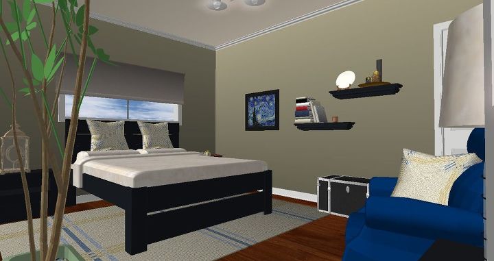
I’ve put the colour palette into a 3-D model of a master bedroom so that you’ll have a better idea of the application of the colour palette!
If you’ve given this a try post a picture of your colour palette here below with what you’ll use it for :). Or post in on our Facebook page!


Want more details about this and other DIY projects? Check out my blog post!
Comments
Join the conversation
3 comments
-
I found this very helpful. Using these ideas next time I struggle with paint options. Thank you.
-
WOW I love that customizable Adobe colour wheel! Thanks for sharing.


Frequently asked questions
Have a question about this project?