


Set the Tone, on Tone With Tone on Tone Wallpapers!

Tone on tone wallpapers are great for adding a subtle injection of pattern to your interiors or for adding bold colours without the fuss of an overwhelming pattern. While selecting tone on tone wallpapers are just like selecting any other wallpapers there are a few elements to which you should have a heightened awareness.
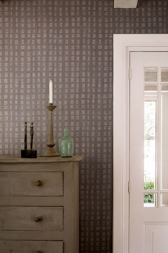
Slate Scratched Tone on Tone Wallpaper R2440
CONTRAST (light vs. dark tones)
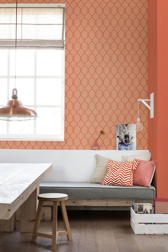
Coral Lattice Tone on Tone Wallpaper R2551
The greater the contrast, the bolder the pattern will appear, while low contrast will make the wallpaper sit back. Older eyes will have a harder time distinguishing between tones so keep that in mind while deciding the level of contrast you want to see in your tone on tone paper.
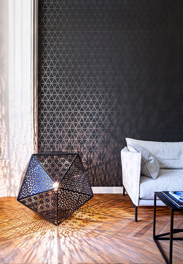
Slate Hexagonal Metallic Wallpaper R2253
LIGHTING.
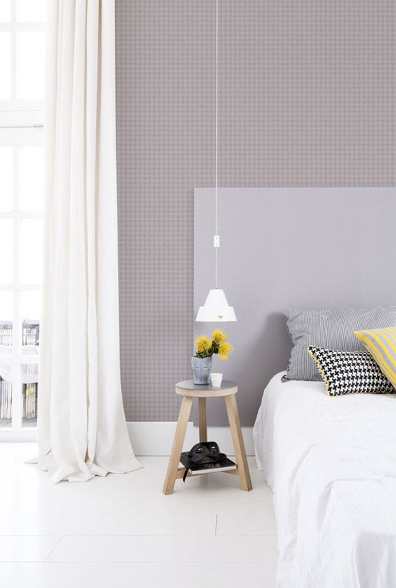
Warm Grey Puppytooth Home Wallpaper R2547
PATTERN SCALE.
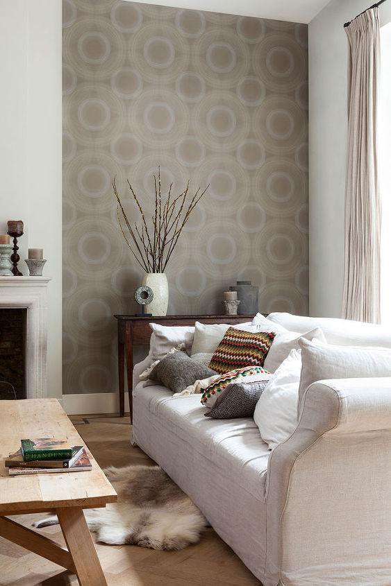
Ecru Rings Tone on Tone Wallpaper R2307
In a larger scale print pattern is more visible and grander but still has a very muted and simple effect in a tone on tone colour scheme. Subtle nuances like tone on tone wallpapers are great for tying your entire design together and adding a little more dimension and depth to your walls than paint would enable you to achieve.


Frequently asked questions
Have a question about this project?