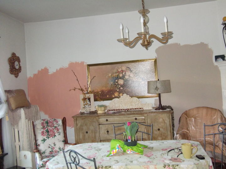
Which color should I paint my dining room?

by
Kathy P
+82
85 answers
-
The coral on the left is definitely more refreshing than the mud on the right, but if it is too vivid, tone down to a softer pleasing salmon colour. It can be hard to get good coverage with the red paints, so a darker base coat helps...menaing you could paint it the mud colour first as a primer, then apply the red coral over it
 Nichter's Home Services Corp
on Apr 13, 2012
Nichter's Home Services Corp
on Apr 13, 2012
-
I agree with you, but having a hard time finding a softer pleasing salmon color. Any suggestions?
 Kathy P
on Apr 13, 2012
Kathy P
on Apr 13, 2012
-
I just went thru this with a client at long distance. All my wheels etc are on the jobsite. But Benjamin Moore and Sherwin Williams both have online colorizers/visualizers. You can take your photo there and upload it, then trace around the wall with the tool and then apply paint right on your computer to see what it will look like I am attaching a link to this - don't know if it will work for you or not http://www.benjaminmoore.com/portals/bmps.portal?_nfpb=true&_pageLabel=fh_explorecolor&np=public_site/articles/application_article/app_personal_color_viewer&app=384b850f-2a48-4c67-9d59-9161be4eb20e&Image=915175 I started with the BM Salmon Run 019
Nichter's Home Services Corp
on Apr 13, 2012
-
I love Sherwin Williams color visualizer! Best tool for decorating! My opinion? tan tone on the right! It is a lovely color and you would likely not get tired of it. It has a nice depth of color without being TOO neutral. Add punches of colors with accessories that are easier (and less expensive) to change out based on the time of year and your mood :) If you LOVE color .. I would consider another color that brought out another color from your fabrics or accessories in the room. From what I can see ... I see a lot of that color - so it may be overwhelming to be on the wall too. I try to think balance..
 Designs by BSB
on Apr 13, 2012
Designs by BSB
on Apr 13, 2012
-
thank you. I tried doing the Benjamin Moore thing on line once before and gave up trying to figure out. but I will try again. thanks so much
Kathy P
on Apr 13, 2012
-
I don't care for the on-line color chart thingys. All computer monitors are different and you won't get a true read. My go to colors are the neutrals green, gray and whites.
 Donna McCrummen
on Apr 13, 2012
Donna McCrummen
on Apr 13, 2012
-
the one on the right
 Elise C
on Apr 13, 2012
Elise C
on Apr 13, 2012
-
I love the color on the left, but I have to agree that the one on the right seems to match your color scheme and won't get old.
 3po3
on Apr 13, 2012
3po3
on Apr 13, 2012
-
Why not a moss or lettuce green. I love green in a kitchen or dining room. It would go nicely with the funiture and the painting. You can use the deep coral color for accent pieces, i.e. pillows, trotskies, etc.
 Beth A
on Apr 13, 2012
Beth A
on Apr 13, 2012
-
The one on the right, and then use your pinks or corals for accents.
 Sherri B
on Apr 13, 2012
Sherri B
on Apr 13, 2012
-
the one on the right.. the pink is nice, but a neutral will allow for future color scheme changes and will make any color (say.. pink) that you introduce to accent POP.. ;) me
 Lesa K
on Apr 14, 2012
Lesa K
on Apr 14, 2012
-
Like others have said, the one on the right and then use the left color for accents. They both would also look great with a pop of turquoise!
 Dana T
on Apr 14, 2012
Dana T
on Apr 14, 2012
-
Take a risk, the color on the left.
 Glenda B
on Apr 14, 2012
Glenda B
on Apr 14, 2012
-
What about a soft gold {lighter or same a the pillow} for walls and a lighter shade of the coral or moss green for the ceiling? I wanted red for my dining room and a consultant suggested the walls a deep gold and the tray ceiling the deep rust red I had wanted for the walls. Turned out beautiful!
 Judy W
on Apr 14, 2012
Judy W
on Apr 14, 2012
-
I love the color on the right.
 Lacy B
on Apr 14, 2012
Lacy B
on Apr 14, 2012
-
I think you should go with a coral color that is a little more pinkish, more like the flower pattern in the chair but a pale shade. Green like the leaves of the plant on the table would be nice, too.
 Kelli E
on Apr 14, 2012
Kelli E
on Apr 14, 2012
-
taupe, the color on the right.
 Brenda A
on Apr 14, 2012
Brenda A
on Apr 14, 2012
-
Why not an accent wall? Use the tan on the right for 3 walls, and the salmon for the 4th
 Jenee C
on Apr 14, 2012
Jenee C
on Apr 14, 2012
-
I think the color on the left(coral)is a better choice. And it gives your credenza a nice balance of color and makes it stand out more...
 Pam R
on Apr 14, 2012
Pam R
on Apr 14, 2012
-
Jenee, that's a great idea. I have done the same thing in my house. That way you can get away with a bolder color without shocking the sh!t out of people who come to your home!
 Jane P
on Apr 14, 2012
Jane P
on Apr 14, 2012
-
I like both but I really like how the coral color brings out the color in your painting and adds a little pop of color to the room. You could just have that as an accent wall and paint the rest of the room the color on the right.
 Claudia L
on Apr 14, 2012
Claudia L
on Apr 14, 2012
-
Artist here...and my answer is neither color! A dining room should be a place for lively conversation and a color that wets the appetite. Choose one wall as your bold focal point and paint it a deep coral. The other 3 walls then paint in a lighter version of the neutral on the right. Your rich focal wall may seem over the top as you're painting it, but have faith that once it's done and your artwork is on the walls, it will look FANTASTIC!
 Paula
on Apr 14, 2012
Paula
on Apr 14, 2012
-
the pink color brings out the color in the furniture i would go with that
 Christy C
on Apr 14, 2012
Christy C
on Apr 14, 2012
-
I think an Amber would be better than either
 Mitzi B
on Apr 14, 2012
Mitzi B
on Apr 14, 2012
-
Do the coral! Never fear color, crap on nuetral, unless you want to sell your house, and then even that is debatable! If you get tired of it, paint it again!
 Margy M
on Apr 14, 2012
Margy M
on Apr 14, 2012
-
I vote for the coral, but maybe in a lighter shade. If you can't find a paint chip you like in the shade you like, the people at the paint counter can always add white in small increments until it's the exact shade you want...or they can add any other color, for that matter. If it needs to be warmed up a little, they can add yellow, if it needs to be darkened a little, add black. When I painted my living room a shade of "wheat" yellow, my hubby threw a fit because it was "too" yellow and he HATES yellow! ;-) I spent an hour at the paint store with them adding various colors to change the tone and shade. It doesn't cost anything extra and they (usually) know what they're doing when it comes to getting just the "right" color for you. It's only paint, if you decide a year from now that you really don't like coral on the walls. Easily and pretty inexpensively changed. Go for it! :-)
 Anna
on Apr 14, 2012
Anna
on Apr 14, 2012
-
I would paint the walls the taupe color and repaint the credenza in the coral.
 Brenda H
on Apr 14, 2012
Brenda H
on Apr 14, 2012
-
I just did my dining room in an 1850's farmhouse. Behr has a color called Mulled Wine. Its a shade darker than the coral but it brings out the charm of the older furnishings. Did the wood work in semi gloss white. Had 22 for Easter dinner and they all commented on the color. And I've used many brands of paint and I like the Behr the best. Very easy to clean.
 Sue S
on Apr 14, 2012
Sue S
on Apr 14, 2012
-
use the coral as is! dont be afraid of color! u need to brighten that room up. if u go w/ the neutral it will be blah.
 Sherry
on Apr 14, 2012
Sherry
on Apr 14, 2012
-
Just my opinion... I dislike muddy dark colors as they are depressing. I don't like bold, as I get tired of it. I love your credenza, but frankly the room needs updating. I personally would choose a neutral cream with gold undertones to warm up the room. Is this a formal dining room or one used daily? I do love the print, but would have it reframed ( not gold) and matted with accent colors. (also hang it higher on the wall, adding candle scones on each side) I would remove the table cloth and probably the two chairs. I would also choose a new chandelier. Remove the clutter from the credenza... use a pretty buffett lamp, a crystal bowl of potpourri. Choose accent colors from print for curtains, cushions for chairs. again just my opinion..... good luck
 Cindy R
on Apr 14, 2012
Cindy R
on Apr 14, 2012
-
My vote is for the coral color on the left....going with the furnishings that I see, I would choose that one.....happy painting :)
 Greedith B
on Apr 14, 2012
Greedith B
on Apr 14, 2012
-
I think the Coral is very pretty ~~ but it does depend what color/colors adjoining rooms are for continuity. Might think of painting the ceiling the same color and adding 5-/14" crown molding. Have you thought of a new ceiling fixture? Appears as if the one you have is too small and out of proportion with the room and table dimensions.
 Bonnie B
on Apr 14, 2012
Bonnie B
on Apr 14, 2012
-
Do both with a chair rail dividing the two. If your room is bigger than 12 X 15 it should work. Add color to the ceiling too. If it doesn't work paint is relatively inexpensive.
 Kelly S
on Apr 14, 2012
Kelly S
on Apr 14, 2012
-
Really like the coral - but looks like a better color for a bedroom - dress up the dining room with coral accents - flowers, artwork. I have taken to spray painting accessories to high;ite when I repaint.
 Dorinda B
on Apr 14, 2012
Dorinda B
on Apr 14, 2012
-
I'd be trying to bring out the rose in the chair on the left. I like the idea of white beadboard with chair rail and a rose or even a burgundy on the top.
 Nita O
on Apr 14, 2012
Nita O
on Apr 14, 2012
-
use the right then accents of the left
 Heather M
on Apr 14, 2012
Heather M
on Apr 14, 2012
-
I'm adding a 2nd post. My own personal experience with a color somewhat in the same family as Coral was when we moved into our home and the Dining Room was painted ~~ I'll call it "Salmon". I'll tell you it was such an invitingly warm color which enhanced the ambiance of the room and did most definitely "wet the appetite" ~~ especially with the fireplace aglow. I do like Paula's post and ideas though. I have since painted it a very, very dark charcoal that appears "black" to the eye and have turn it into a 2nd Living Room much needed for social charity functions. My Living Room was large enough to accomodate a Dining Room, if interested in pictures, pull me up.
Bonnie B
on Apr 14, 2012
-
I think the one on the right is too modern for your decor.....I would use a softer coral. Good luck!
 Cathy B
on Apr 14, 2012
Cathy B
on Apr 14, 2012
-
I have the coral and love it. I like the idea of using the second color as an accent.
 Karen P
on Apr 14, 2012
Karen P
on Apr 14, 2012
-
Why not make the coral a "base" coat, then sponge on the taupe (irregularly) to create a sort of "Tuscan" feel? I did that in my kitchen & dining room with shades of yellow & gold. Turned out very welcoming/cozy!
 Lujuanna H
on Apr 14, 2012
Lujuanna H
on Apr 14, 2012
-
The Tan
 Virginia H
on Apr 14, 2012
Virginia H
on Apr 14, 2012
-
Color on the left really is going to make your other stuff pop. Be reckless, it's only paint. I think you will love it. A lot of people are scared of color, but once you see what it does to enhance the other things you have you will love it. Good luck!
 Carol C
on Apr 14, 2012
Carol C
on Apr 14, 2012
-
I like the color on the right. You can high light with accessories of the color on the left. Use stripes of both colors, even plaids. It would make the room look great.
 Linda D
on Apr 14, 2012
Linda D
on Apr 14, 2012
-
I have taupe, and it is so elegant. You can do so much with it. Between your two colors you would feel totally closed in with the salmon color, also limited on colors. You want the best of both worlds, pain it taupe with salmon curtains, chair pillows and a pretty salmon centerpiece for you table. Also lay placemats out in salmon. So I say use both colors.
 Karen W
on Apr 14, 2012
Karen W
on Apr 14, 2012
-
The color on the left. The color on the right is too bland and too dark
 Judy R
on Apr 14, 2012
Judy R
on Apr 14, 2012
-
I say the color on the right. There seems to be a lot going on already
 Sonia R
on Apr 14, 2012
Sonia R
on Apr 14, 2012
-
Going with roasted cashew was the best choice I ever made.
 Kathleen B
on Apr 14, 2012
Kathleen B
on Apr 14, 2012
-
the one on the left compliments mor of the stuff in the room, like the painting and the chair in front it
 Karen B
on Apr 14, 2012
Karen B
on Apr 14, 2012
-
I love the color on the right. You can use the coral color as an accent color. what I like about that color is that you are not locked into a certain color. You can change the room around by changing the accent color. Even red or purple. You have a neutral background. I love changing the accent color to go with the various holidays. The fall (autumn orange color, Christmas reds & greens or cranberry & silver...its a good foundation color.
 Angela G
on Apr 14, 2012
Angela G
on Apr 14, 2012
-
a 'dusty Rose' mite be nice. Colors in the red family are said to aid digestion. I have one red wall in my dining room, and like it.
 Nancy L
on Apr 14, 2012
Nancy L
on Apr 14, 2012
-
a Soft neutral would be best, you can then accent with any color. With the neutral you can also accent and change with your moods.
 Sandra R
on Apr 14, 2012
Sandra R
on Apr 14, 2012
-
DO 3 WALLS OF THE TAN ON THE RIGHT AND ACCENT 1 WALL WITH THE CORAL COLOR!!!!
 SONJA C
on Apr 14, 2012
SONJA C
on Apr 14, 2012
-
Why paint only one color!!! Paint Graghics!!! All the renovations are in graphics!!! Clarence "Tulips"
 Clarence N
on Apr 14, 2012
Clarence N
on Apr 14, 2012
-
the brownish beige color for sure, the salmon color will look like too much.. Plus the color on the right is in the same color family .
 Gabriel R
on Apr 14, 2012
Gabriel R
on Apr 14, 2012
-
The one on the left reminds me of my grandmothers bedroom color and some old victorian bathrooms. I think the color on the right with other items within the room as accent colors would look better in the long run. You can switch out pictures and vases and totally chance the feel of the room quicker than repainting.
 John S
on Apr 14, 2012
John S
on Apr 14, 2012
-
A paler rose than the pink on the left, or a soft coal or peach, will make your guests look good!
 Rachel C
on Apr 14, 2012
Rachel C
on Apr 14, 2012
-
The colour on the right. Medium/light blue accents, Trims...bright white.
 Rhonda G
on Apr 14, 2012
Rhonda G
on Apr 14, 2012
-
My bedroom is painted in a light "Tea Green" which is beautiful with the wood and goes very with everything floral and landscapy, for a nature effect.
 Laurel W
on Apr 14, 2012
Laurel W
on Apr 14, 2012
-
I think you would very quickly 'tire' of the one on the left. Go with the "right" one - but - I would change it a little to something in that shade line but with a little added warmth & that would go better with all your furnishings.
 Cathy L
on Apr 15, 2012
Cathy L
on Apr 15, 2012
-
If you are set on these colors, feux paint and use the two colors together. In my opinion, the coral is too bright and the beige is too dull.
 Kathy S
on Apr 15, 2012
Kathy S
on Apr 15, 2012
-
Lotsa replies ~ ! My newest reply is "go with your gut feeling". What makes "you" feel good that blends with the rest of your home.
Bonnie B
on Apr 15, 2012
-
Neither...try a nice sage green...very warm and inviting.
 Clelia L
on Apr 15, 2012
Clelia L
on Apr 15, 2012
-
Go for the coral......it will really warm up the room, but I would like to know if this room transitions into another room, what the color of the ajoining room is........
 Danita H
on Apr 15, 2012
Danita H
on Apr 15, 2012
-
Both are very nice- the taupe with accents of the color on the left- add sage green as well?
 Brenda C
on Apr 15, 2012
Brenda C
on Apr 15, 2012
-
I like the taupe as well ...very classic. You could always use the mauve in the accents you put in the room
 Catherine M
on Apr 15, 2012
Catherine M
on Apr 15, 2012
-
I'm not a traditionalist. I was in charge of over 400 apartments and 350 homes. The apartments had to be some form of beige so I am burnt out on it. I had more fun with the homes. In dining rooms and kitchens I used food colors...which offers a wide variety of options. Instead of the taupe try using wheat or toast, accent it with a buttermilk color.Mauve was a big color in the 90's but has kind of faded into the background. Muted greens offers a very relaxed atmosphere ( think of things like celery or lettuce).Then find a color to accent. Look in your spice cabinet, you'll find some great colors there. Have fun
 Debi M
on Apr 15, 2012
Debi M
on Apr 15, 2012
-
I usually choose colors by theme. I do perfer the coral color.
 Pat S
on Apr 15, 2012
Pat S
on Apr 15, 2012
-
I like the taupe color, the coral looks pink.
 Culpepper Carpets and Interiors, Inc.
on Apr 15, 2012
Culpepper Carpets and Interiors, Inc.
on Apr 15, 2012
-
Neither.....the taupe is nice but your sideboard fades away into it..how about something like a golden cork.....Ralph Lauren used to have a "whicker Rocker" that we had matched at Sherwin Williams...it's a gorgeous color...kind of a golden brown if that makes sense?
 HandyANDY - Handyman & All Repairs, LLC
on Apr 16, 2012
HandyANDY - Handyman & All Repairs, LLC
on Apr 16, 2012
-
Thank you all for your input. I like the color on the right called "shabby chic" but not for this room, I do no think it has the right feel for what I want to accomplish. However, I may use it in another room. My thought is to tone down the color on the left. My house has a very shabby chic feel to it and that is how I like it, even though it may seem outdated to some. My furniture in my living room, which is adjacent to this room, is in different shades of green, corals, golds, etc., so I think a shade of green may be too much, even though I love the green shades. Again, all your input has guided me closer to a decision. PS: I love my credenza and would not change anything about it....picked it up for $40.00. Also, not fond of different colors on the walls in the same room....just me.
Kathy P
on Apr 16, 2012
-
Ahhhh......Love finalization !! and the fact that you've focused and are going with your "gut" ~~ Good Luck, Kathy! Post after pictures, if you have time.
Bonnie B
on Apr 16, 2012
-
I did the rose then alternate walls a lighter shade. If you were to paint the wall with the mirror rose then go a couple of shades lighter on the wall with the antique clock, it gives the room more dimension.
 Maureen S
on Apr 20, 2012
Maureen S
on Apr 20, 2012
-
Kathy, I'm with you on loving the shabby chic style. My house also has a shabby chic/cottage feel with lots of painted furniture. I love repurposing finds and giving them new life with paint. In my area, painted distressed furniture is very popular. I'm an interior designer and my advice to anyone is to "live with what you love". Let us know your decision and post a photo.
Glenda B
on Apr 21, 2012
-
Please post a photo when you are done..BTW, I love the credenza I just bought a cedar chest that is similar in time period and I can't wait to paint it!!
Cathy B
on Apr 21, 2012
-
how about stenciling the wall with the coral and cream?
 Marg C
on Aug 20, 2012
Marg C
on Aug 20, 2012
-
please let us know which one you have picked. I still like the taupe. Good luch painting.
Linda D
on Aug 23, 2012
-
Deep Teal.
 Marie Carlucci
on Jul 12, 2014
Marie Carlucci
on Jul 12, 2014
-
beige with cream accents
 Fenya Kashergen
on Jul 13, 2014
Fenya Kashergen
on Jul 13, 2014
-
I love the coral color! I think it might need to be a bit more enriched so it doesn't come off as rose. I think the coral really enhances your sideboard! The entire room in a taupe color would just be a yawn and it does nothing for the furniture.
 Anna B
on Jan 25, 2015
Anna B
on Jan 25, 2015
-
Do u have a make over on a garage to a sewing room
 Jo Brown
on Apr 11, 2015
Jo Brown
on Apr 11, 2015
-
I love the taupe but think you should paint one accent wall with the other color - maybe making it into more of a coral color or even slightly more purple-ish. Let us know what you do.
 KdMommy
on Oct 12, 2015
KdMommy
on Oct 12, 2015
-
I love the coral color. It really pops!
 Lindalee_47303
on May 06, 2016
Lindalee_47303
on May 06, 2016
-
Both are boring ,try a nice khaki green.
Clelia L
on May 11, 2016
-
The taupe would be more neutral, and then paint the sideboard the other color or similar to add the pop of color.
 Heide Suess
on Aug 04, 2016
Heide Suess
on Aug 04, 2016
-
My opinion is walls should fade into the background. The important things to see are art works, your furnishings and accent items. Walls should be a neutral as possible. So would vote for the taupe and maybe even lighter. My art is the most important thing in my life and I do not like for it to have to defend it's position against a competing "colored" wall.
 Lyn Buerger
on Oct 06, 2016
Lyn Buerger
on Oct 06, 2016
Sign Up to Answer