Boy, did we screw up the color! What should we do now?

by
Mary Ker
+41
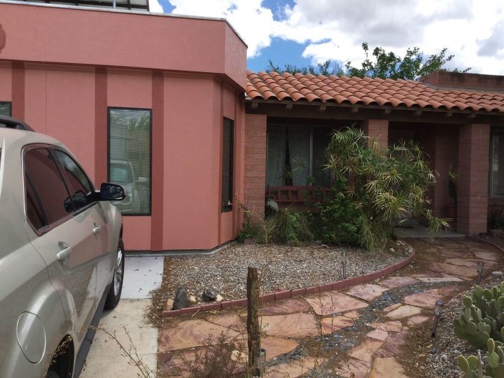
We tried to match the paint on this little addition to the color of the masonry, but it just looks too pink! How would people recommend we tone it down?
40 answers
-
The best way I've found to pick paint colors is to drive around and look for other houses with the same color brick and see what colors they picked to go with it. After 40 years in a brick house (a bit darker than your brick) I've seen 3 combinations I liked. And the one we have now is my favorite because it's right up to date and more modern (in style)...and this one I found on a business park.... it's taupe with charcoal trim and awnings; a clean combo with nice contrast. Watch out for which taupe you use...don't use a green or brown taupe. It should be as non-descript as possible...a grey, beige/brown. I;m sure there's other you may like but the car drive in a nice neighborhood is a must to see the possibilities. You have a large area to paint...bigger than ours so take that into consideration,
 Shelley Paul
on Jul 10, 2015
Shelley Paul
on Jul 10, 2015
-
of course it will need repainted, and if you have any paint leftover, add some green to tone down the pink, if you have to buy new paint, I wouldn't try matching, I would go with a green or deep golden tan OR find the color chip and choose the next darker color to this or even 2 shades
 Nancy J
on Jul 10, 2015
Nancy J
on Jul 10, 2015
-
I actually like it...:)
 Sheila Mccrary Weinandy
on Jul 10, 2015
Sheila Mccrary Weinandy
on Jul 10, 2015
-
Unless my monitor is way off, your bricks and stone pathway have pink tones...I would leave it, since it is actually really close to your brick colour. It may end up weathering to the tone you want. It isn't garish,you could live with it till the next time you paint. I think the darker stripe clashes more. Perhaps you could paint that out?
 B. Enne
on Jul 10, 2015
B. Enne
on Jul 10, 2015
-
Some times it doesn't take much to make a big difference. I would take a much lighter shade of the paint on the house, or a cream color, and paint above, below and beside the windows. Might just make all the difference you need. If not enough, you can take it from there.
 Jeannette Mospaw
on Jul 10, 2015
Jeannette Mospaw
on Jul 10, 2015
-
I feel for yall'. Trying to match another material is the pits, unless you happened to have kept a good file of your housing materials and such. A better idea would be to use a Contrasting Color, to compliment the colors already there. some ideas have been added, they all were found on Inspiration for a southwestern exterior. — Houzz I wish you the best of luck.
 Donna Strader
on Jul 10, 2015
Donna Strader
on Jul 10, 2015
-
Your competing with the stone on the house, stone on the walkway and a tile roof. I would go with the color of the tile roof, it is the predominate solid color from the street.
 Leigh Rowan
on Jul 11, 2015
Leigh Rowan
on Jul 11, 2015
-
Before you make any changes try uploading the photo you posted to the Sherwin Williams website. You can play around with the idea of changing the trim color to any color you choose. It's fun and you will lessen your chance of making another mistake. I'm a retired designer, who happens to live in a 240 Unit PINK building on the ocean. The pink is our claim to fame!!!
 Donatella
on Jul 11, 2015
Donatella
on Jul 11, 2015
-
Lightly sponge paint over what you have with a slightly browner shade of the paint you used. If you have any of the same paint, mix in a little brown paint and glazing compound, get a good sea sponge and give it a lightly textured look. That should tone it down without being overpowering. Try a small area and paint over if you are unhappy.
 Ryan
on Jul 11, 2015
Ryan
on Jul 11, 2015
-
Break it up with an awning over driveway or a short pergola. The colors blend well, no need to match they are earth tones.
 Beatrice Tangeman
on Jul 11, 2015
Beatrice Tangeman
on Jul 11, 2015
-
I think a contrasting color is the way to go and then try a new trim color to tie it all together.
 Suzy kerr
on Jul 11, 2015
Suzy kerr
on Jul 11, 2015
-
I feel your pain. We picked new paint and trim once from 2"x2" samples (it went well with the brick so we thought), hired the painter, and left on vacation. When we got home I barely recognized our home and it was gawd awful. I couldn't even look at it. Our solution ended up being to repaint the trim only. It was too stark and we toned it way down. In your case, I couldn't live with the clash of the pink to the roof or stones, and I'd repaint completely and go way more neutral, but you've got some good advice here. Good luck!
 Becky Greenwald
on Jul 11, 2015
Becky Greenwald
on Jul 11, 2015
-
I agree with suzykerr. Contrast with another autumn color, like sage or olive. Maybe even match the green to the cactus next to your walkway. Or, a creamy beige might work well too.
 Kristine
on Jul 11, 2015
Kristine
on Jul 11, 2015
-
A deep rust brown, 3parts glaze, 1 part paint, use sponge mop, mop on up and down, Seal, same manner with outdoor varnish/sealer.
 Rmn1935236
on Jul 11, 2015
Rmn1935236
on Jul 11, 2015
-
Full length shutters in contrasting colour
 Nan1927977
on Jul 11, 2015
Nan1927977
on Jul 11, 2015
-
How about choosing a color to tie into the walkway pavers. You will get the traditional artistic "rule" of left to right flow.
 Mimi
on Jul 11, 2015
Mimi
on Jul 11, 2015
-
how about painting with a contrast color above and below the windows and the top part
Nancy J
on Jul 11, 2015
-
I am with the "leave it" crowd...might weather to the color you want. I actually think it looks good.
 Pat
on Jul 11, 2015
Pat
on Jul 11, 2015
-
Use a terra cotta color.
 Katrina Warren
on Jul 11, 2015
Katrina Warren
on Jul 11, 2015
-
I like it. I wonder what it would look like if you painted the darker stripes the same color as the house. If you add some plants with height or even a multi trunk drought tolerant tree I think it might add depth.
 Linda
on Jul 11, 2015
Linda
on Jul 11, 2015
-
I was actually thinking you should paint it the same color as the darker trim pieces. Maybe with a little more terra cotta or orange added to it. I think that may be closer to the masonry.
 Karen
on Jul 11, 2015
Karen
on Jul 11, 2015
-
Some type of outdoor artwork or trellising would break it up somewhat. Unless the color looks much worse in real life, it really doesn't look bad.
 SandyG
on Jul 11, 2015
SandyG
on Jul 11, 2015
-
Very Southwest, add large scale garden wall art ( metal scrollwork, ceramic /metal sun , colorful tile house numbers...) DIY large fountain, or large rocks and interesting grasses.
 Lorraine
on Jul 11, 2015
Lorraine
on Jul 11, 2015
-
I don't think it looks bad in the picture, but maybe terra cotta color would work. ...
 Lottie_davenport @aol.com
on Jul 11, 2015
Lottie_davenport @aol.com
on Jul 11, 2015
-
It's pretty,but I would like to see it toned down a little.I would keep the top part pink,it blends with the clay roof.I would also keep the darker stripes.I would repainted the walls either a pale yellow,or mix the leftover paint50 percent with 50 percent white. I lived near a yellow house with a terra cotta roof,it I thought it was beautiful.
 Funnygirl
on Jul 11, 2015
Funnygirl
on Jul 11, 2015
-
I would also paint above and below the windows the yellow or lighter pink also.
Funnygirl
on Jul 11, 2015
-
Well, having grown up in the South West, I have to agree with the owner - the house looks way too pink and clashes with the very warm orange terracotta roof tiles. (Sorry I may be an idiot but I don't know what you mean by masonry!) Traditionally, the haciendas with this type of roof tile where always painted in an white-to-off white/beige 'whitewash'; but less formal reinterpretations of this are wide spread today in light but pretty pastels, especially blue and yellow.
 Duv310660
on Jul 11, 2015
Duv310660
on Jul 11, 2015
-
What a lot of wonderful ideas! Thanks to everyone who contributed!
 Mary Ker
on Jul 11, 2015
Mary Ker
on Jul 11, 2015
-
For anyone who cares, here are the ceramic house numbers I made and that decorate the front of our pink bump. Mpretty proud of these, actually.
Mary Ker
on Jul 11, 2015

-
get away from the terra cotta altogether and go with a darker color for contrast instead of matching.
 Charles Prock
on Jul 11, 2015
Charles Prock
on Jul 11, 2015
-
Miss Mary, I just found out you are amazing and accomplished.
 Jody H
on Jul 11, 2015
Jody H
on Jul 11, 2015
-
*blush* thanks you, Jody.
Mary Ker
on Jul 12, 2015
-
Simply paint the soffit thingy around the top of the addition the same color as the strips beside your windows, and everything will be in balance. From my viewpoint as an artist, I think it's lovely. Never be afraid of color!!! Oh, then sparkling white rocks on the ground.
 She
on Jul 13, 2015
She
on Jul 13, 2015
-
Simply paint the soffit thing around the top of the addition the darker color that you have on either side of your windows, and everything will be in balance. I am an artist, and from my point of view, it is lovely. Never be afraid of color! Sparkling white rocks on the ground would be the finishing touch.
She
on Jul 13, 2015
-
I would work with the contrast colour of the soffit, this colour would also take away the highlighting of the windows, I wouldn't bother using any additional colours on the uprights either side of the windows.
 Colin Hook
on Jul 14, 2015
Colin Hook
on Jul 14, 2015
-
Agree, painting the soffit the upright color or closer to the roof tiles would really define and highlight the walls. You can do a lot with the landscaping too, contrasting colors and the walkway.
 Sandra
on Jul 14, 2015
Sandra
on Jul 14, 2015
-
paint the soffit a medium gray and I think you will like the result!!
 Flower girl
on Jul 14, 2015
Flower girl
on Jul 14, 2015
-
I think painting the soffit will make the house look short. I'd put a chocolate exterior glaze over all of it. Should turn out looking beautiful!
 Cindy Richter
on Jul 17, 2015
Cindy Richter
on Jul 17, 2015
-
I don't think it looks too pink. Try the soffit idea. We painted ours a different color than our brick and it was just enough to set off the shutters.
 Nana in Texas
on Jul 19, 2015
Nana in Texas
on Jul 19, 2015
-
I'm sure you've resolved this by now, but my low-cost thought was trellis...with lots of green climbing vines etc to disguise the color; I'd keep the trellis natural wood...let me know how you've dealt with this!
 Carole White
on Aug 25, 2016
Carole White
on Aug 25, 2016
Sign Up to Answer