Sailor (navy) blue
Paint color for a bathroom ?
by
Kari
+26
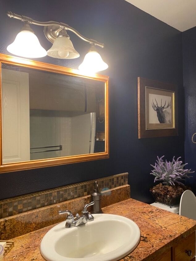
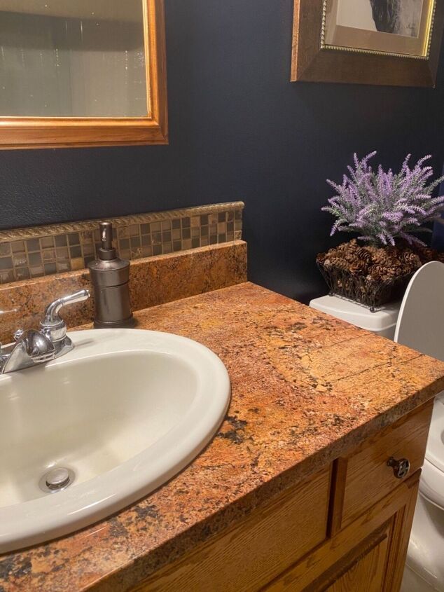
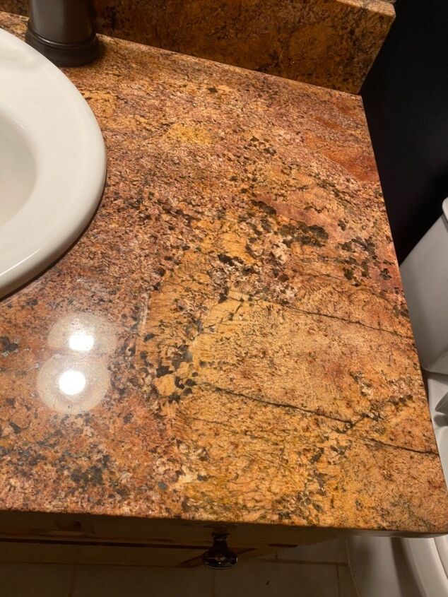
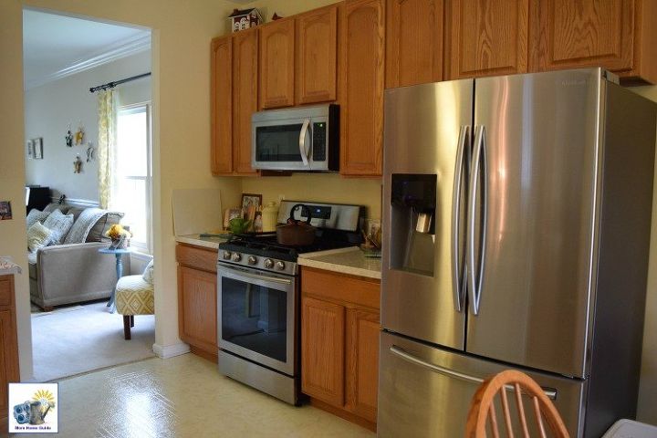
Alrighty! You folks have come through before and I need ya again! Loved the blue idea and loved it for a few years. But have just learned my husband never did ☹️ Yes, yes, yes I know “rule of thumb” is no dark colors for smaller spaces. First, I’m not much of a follower, prefer to try, try and try again. Second, the reason I painted in the first case was due to my vanity top. The color? I believe it’s Baby Puke #2 or possibly Putrid Drifts. It’s awful. However, less expensive for me to paint. So, please any suggestions for a lighter, more neutral color to go with my lovely vanity would be appreciated! Naturals and greys seem to be very popular right now. But I’d really like a nice hue. TY😊
Navy blue goes nice with gray
If you have to keep that, go with a brown that you can find in that stone, after it’s dry tape out a giant geometric design in thin lines to paint in a metallic color also drawn from the stone. Just make sure they contrast. Like a cream with a yellow/orange hue on the walls and a deep bronze for the design? Or maybe a latte color on the wall with a metallic or glitter ebony line? Or better yet, make that thing the standout feature and paint All the walls and the cabinetry black and treat your frames too, paint them rose gold and rub some black into the details.
creamy whites are very popular now and go with everything you get your color by the decor and countertops
First, let me say I love the fact that you're not a follower. I once wallpapered a small bathroom with a black background wallpaper and it was gorgeous! Now about that countertop. It has brown/rust/terracotta colors in it, so I don't think gray would be a good choice. I would try a soft yellow or cream.
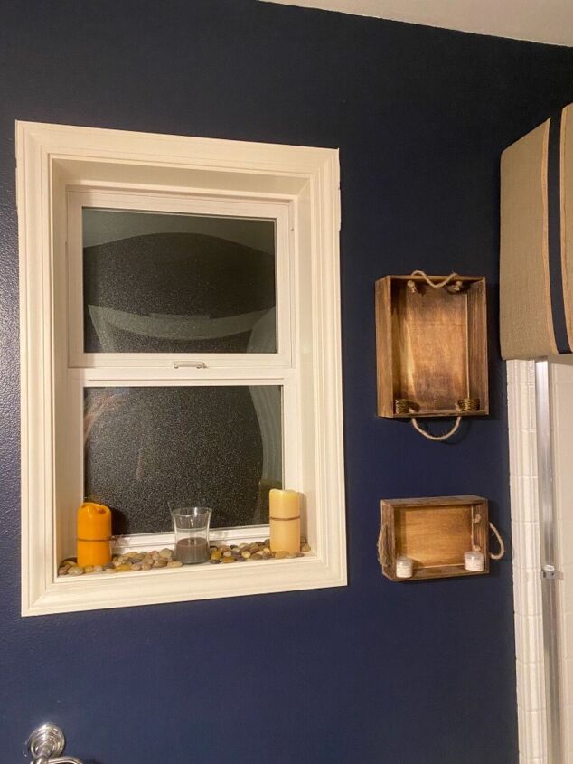
Just love your vanity top, so creative and wish I had it, gorgeous. The dual backsplash and pebbles on the window sill, perfect.
For the paint, I do like the blue, contrasted with the decorations makes the room pop.
I have to agree with the rose gold or champagne gold with blended corners to the middle of the room. I would stay away from browns, but that is just a personal preference.
I think the rose gold sounds perfect too. But what I would do since you hate your countertop is go to Habitat for Humanity. They sell granite countertops cheap. I changed mine out several years ago. Or go to Lowes and check out their Wilson Art countertops. I think you would be happier if you got rid of the counter top. By the way, I love the navy blue paint.
Check out Sherwin Williams Sea Salt. It's a neutral with a blue/green tint. I think it will bridge your gap.
If you prime with Zinser Bullseye 1-2-3, it will be a 1 coat coverage over the dark blue. I painted light french gray over DARK red and it was 1 coat of primer then 1 of paint for perfect coverage.
The color of wicker or rattan would look good against the blue which you could keep in very small doses like an accent wall. Straw-hued wicker and rattan accents, and concrete-gray countertops partner perfectly with navy blue hues.
You'd have to ask Bonnie Walker how to do the blending of the darker corner to the lighter centers, I was intrigued by that and have never done it. Maybe Google the technique if she does not get back to you.
What kind of lighting do you presently have in the bathroom?
If you are considering changing it to LED in the near future, I would advise to do it before you choose the new paint color.
Different types of lighting can have an effect on how the paint color is perceived: incandescent casts a yellowy tone, fluorescent a greenish tone, with LED light being the most clear.
Here are some examples showing how different the same paint color can look, with different types of lighting.
Personally, I like the blue, perhaps just lighten it up a bit, but same blue tone
I used Ballet White by Benjamin Moore for my whole house. I love the warm neutral color! https://www.homeroad.net/2015/10/painting-house-beautiful-neutral.html
I had a deep crimson red bathroom for years and loved it. Then I decided to go with a neutral...white...and I hate it. It has no depth. So seeing that you love color I would go with something with warmth. My living room is painted in Benjamin Moore Philadelphia Cream it's warm, but light. It's part of their Historic line and there are other colors that compliment or in the same family. Good luck!
Darker colors on the walls make a bathroom feel more special .. I am not to good to advice since my powder room has even darker navy color
That rule of thumb for dark colors in small spaces is so totally not true, by the way. Small spaces are perfect for darker colors as the walls recede making the space feel larger. Do you have the paint chip for the walls or know the color and can find the family of colors? A lighter shade in the same value or family should work or if you’re adventurous, a contrasting color would be fun.
Well sorry I dropped of the face of the earth there for a bit.
Paint your walls the lightest color you like. Make sure it’s good and dry. Then use your complimenting gold color and cut it into the edges and corners. While it’s wet, (you will need to do one edge or portion at a time) use a wet -with water- but not soppy rag or sponge and wipe away from the edge and blend toward the center of the wall. Practice the technique on a board. The whole thing, paint your light color first, then your cut and blend from the outside in.
on the project, if you don’t want your edges very dark, don’t load the brush completely, when it becomes too loaded do a couple swipes on the board or try to wipe it off inside the lid of the can, or use a rag to soak some off. Just don’t start out the color heavy handed.
if you’d like some depth with this, start with a deeper gold or a rose gold, after that’s dry come back over the top of it with a champagne gold to really blend it into the lighter color. It’s like paint washing for lack of a better term.
the overall effect will have a sort of rustic feel unless you are that good At blending. I however like the rustic look. It can look very nice when done well. So practice it on a board or another wall you plan to paint over. If you want it really rustic, wipe some plaster or spackle in different places then run rough edges through it. As you wipe the darker gold off it will stain the crevices left behind.
hope this helps.