


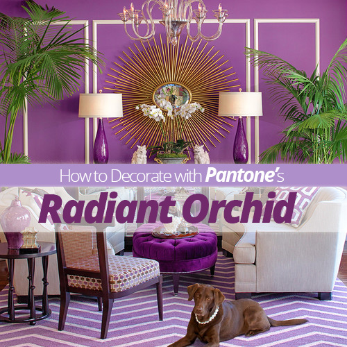
Decorating With Pantone's Radiant Orchid

by
Homes.com
Brought to you by our friend Beth Hunter from Home Stories A to Z:
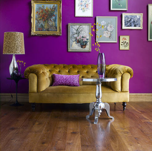
When Pantone announced that Radiant Orchid was the Color of the Year for 2014, I may or may not have cringed just a bit. Growing up in the 80′s, this “hot purple” reminds me of color schemes from my childhood better reserved for the tail on my former “My Little Pony”. I asked my trendy friends what they thought of Radiant Orchid and the reviews were mixed. We all agreed that people are going to continue to use whatever colors they love in their homes in spite of a “Color of the Year”, and we also agreed that any color can look smashing when done right.
WAY USE RADIANT ORCHID WITH OTHER POPS OF COLOR
Pops of color work best in accessories such as toss pillows, throws, rugs, and accent chairs. In this living room, white walls, tan drapes, and a cream couch look fantastic when paired with accessories in shades of purple, pink, and turquoise. When using a bold color like Radiant Orchid, a little goes a long way.
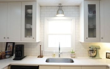
WAY USE RADIANT ORCHID AGAINST NEUTRAL BACKDROPS
Renters stuck with white walls take note! A neutral backdrop allows you to change your decor easily with the seasons and with the trends. In this kitchen, the bold pendant and bar stools add zest and life to an otherwise stark space.
For the full tips visit our blog here: http://blog.homes.com/2014/01/how-to-decorate-with-pantones-radiant-orchid//
When Pantone announced that Radiant Orchid was the Color of the Year for 2014, I may or may not have cringed just a bit. Growing up in the 80′s, this “hot purple” reminds me of color schemes from my childhood better reserved for the tail on my former “My Little Pony”. I asked my trendy friends what they thought of Radiant Orchid and the reviews were mixed. We all agreed that people are going to continue to use whatever colors they love in their homes in spite of a “Color of the Year”, and we also agreed that any color can look smashing when done right.
WAY USE RADIANT ORCHID WITH OTHER POPS OF COLOR
Pops of color work best in accessories such as toss pillows, throws, rugs, and accent chairs. In this living room, white walls, tan drapes, and a cream couch look fantastic when paired with accessories in shades of purple, pink, and turquoise. When using a bold color like Radiant Orchid, a little goes a long way.
WAY USE RADIANT ORCHID AGAINST NEUTRAL BACKDROPS
Renters stuck with white walls take note! A neutral backdrop allows you to change your decor easily with the seasons and with the trends. In this kitchen, the bold pendant and bar stools add zest and life to an otherwise stark space.
For the full tips visit our blog here: http://blog.homes.com/2014/01/how-to-decorate-with-pantones-radiant-orchid//
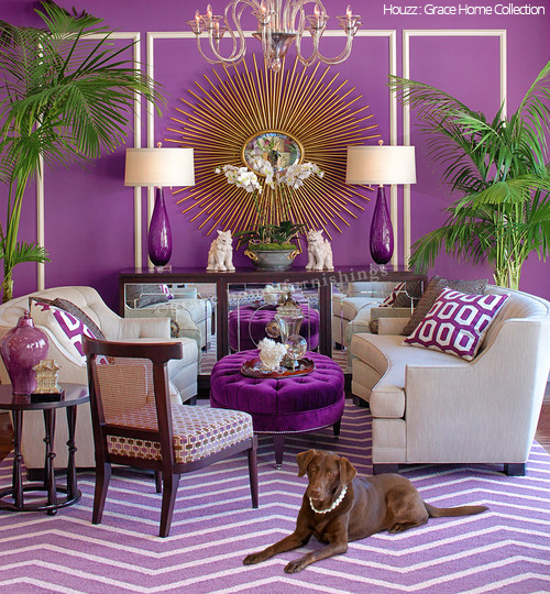
Source: Houzz
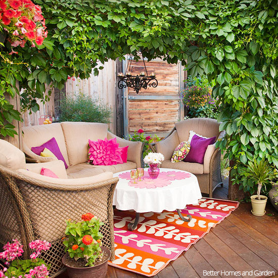
Source: BHG
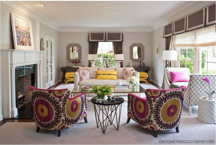
Source: Decorpad
Source: Gaita Interiors


Frequently asked questions
Have a question about this project?