


Stylishly Breaking Up Our Stark White Interior
4 Materials
$400
2 Weeks
Medium
Our little cottage is only around 1,100 square feet. Though we created more walking and living space within the structure as we tore down three walls, finished off the upstairs level and completed the basement, we were not able to actually generate any additional square footage, so we all live in relatively close quarters.
To make the room appear as airy and bright as possible, my husband and I knew we wanted to use white as a primary paint color. Yet, though minimalist decor trends mandate that an all-white interior is a chic way to get that farmhouse look that everyone craves, we decided to use it as an accent tone rather than a main hue. Here are a few ways we are able to achieve the cleanliness that the shade provides without devoiding our colorful home of character and charm.
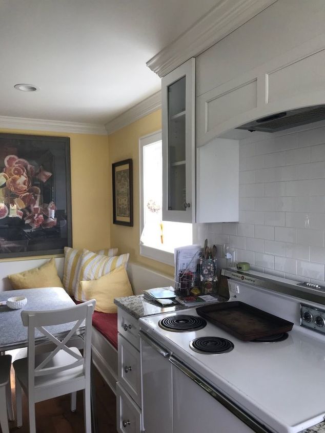
One of the rooms in our home where we devoted the most use of white is in our kitchen. We worked with our contractor to find white, faux wood cabinets and we also installed a century-old white ceramic sink that used to belong to my husband’s grandfather. During our new kitchen remodel, we also installed shiny white subway tiles as an oven backsplash behind our trusty old, two-door GE vintage original stove. We leaned toward this clean and modern look to add a little bit of newness to the design, as many of the elements we were incorporating were vintage finds, antique items or hand-me-downs from family members. Modern decor is more streamlined and clean-toned, so we used it wherever we could to keep the home from looking to kitschy.
Thus, when it came time to decorate around these elements, I knew I wanted to inject a punch of color to break the space up a little. In our living room, we chose to paint the walls a deep and rich shade of greige, or gray/beige, known as Revere Pewter by Benjamin Moore. Yet, in the kitchen, I had only one color in mind: sunny, happy yellow. After searching for various shades, I finally found a pretty golden Benjamin Moore hue called Harvest Time. I worked with my local paint store to custom adjust the hue, making it a little brighter than the formula originally called for. We then painted it on every wall that did not have a cabinet or appliance covering up the space.
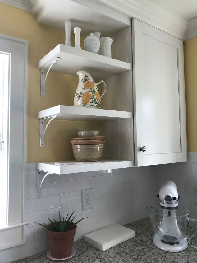
We also chose to use beadboard accents along the sides of the refrigerator cabinet to add an element of texture. This was one of my favorite touches, as even just a little bit of texture can elevate an all-white space and add visual interest.
We painted the walls this yellow tone, and then incorporated it elsewhere, as you can see through the yellow and green painted pitcher that sits atop our painted white shelves. I also enjoyed finding areas in which I could incorporate warm natural wood in this room to accentuate our natural hardwoods underfoot.
Therefore, the wooden mixing bowls on the open shelving were placed there intentionally as permanent decor and are not taken down for everyday use. I also have a wooden picture frame that I often sit on the shelves, along with a collection of vintage white milk glass vases that are also permanent fixtures, as well as a simple aloe plant in a natural brown planter.
Another area of the kitchen in which I was able to inject some color was our breakfast nook. Though this was originally intended to be a space for our refrigerator and stove, I worked with our contractor to move those appliances elsewhere so we could have a gathering spot. As the kitchen was too tiny and narrow for an island, I knew I wanted a table that we could all gather around and share a meal.
We were fortunate to secure a vintage gray metal table from my grandparents, which fit in well in this space and brought in hues of greige from the adjacent living room. In the breakfast nook, I chose to use a deep crimson fabric for the bench seating, which pulled the red from the oversized wall art of a bowl of fruit behind it. Thus, the two accent colors of our kitchen, apart from white, became deep red and bright yellow. Now, whenever I am out shopping for decor for this room, I do so keeping those hues in mind.
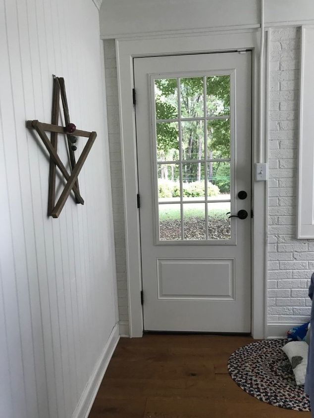
Our laundry room sits right behind our kitchen and is another favorite room in the house. Before we started our remodel project, this room featured natural red brick and old, dusty mini-blinds that blocked the gorgeous view of the backyard.
While the red brick was rustic and added a certain element of charm and warmth, we decided to paint it white to give the space a cleaner feel. After all, this is where I spend a majority of my time as a mother of two. I need it to be a calming and soothing space! While going with an all-white interior would have been a design fail, I was able to break up the space with an heirloom rag rug I inherited from my maternal grandparents, along with a handmade wooden star crafted by my uncle from old local tobacco sticks.
The longer we live in this home and create memories in these rooms, I am happy that we chose to use a white paint color as a standout in so many of our spaces. While there are definitely times I wished we had darker walls, especially when my curious and messy toddlers decide to run around the house with a new box of markers, I have learned several simple cleaning methods that keep them as pristine as possible during this season of life. In all, I would keep these rooms the way they are, as the white background affords me more opportunity to play around with complementing accents and pieces that really make the spaces pop.

Want more details about this and other DIY projects? Check out my blog post!


Frequently asked questions
Have a question about this project?