


How Layout Changes Fixed Our Broken Kitchen
2 Materials
3 Months
Medium
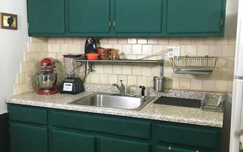
Originally, I wanted to hold off on the kitchen remodel until our kids were in school. Having them off to school most of the day while contractors worked seemed much easier. So, in 2013, we changed the funky orange tile counter tops to a basic black granite. And I put up a new tile back splash one weekend between feeding sessions for my then 2-month old baby. If you’ve tiled before, you know it’s a mess. I literally showered every 2-3 hours that weekend because I had to wash off all of the thinset and dust from cutting tiles before I could feed my son. But, I like tiling, so that was my kind of fun. ;)
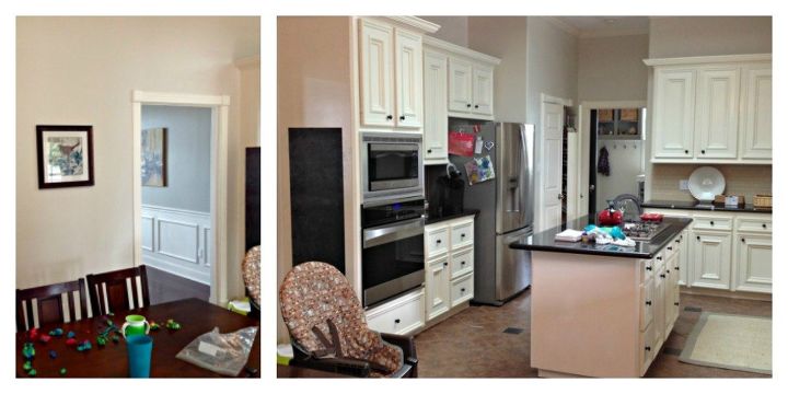
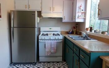
When we did that little makeover in 2013, I thought it would stay like that until 2020, or so. Once our youngest was in school. But last year, my husband decided he was tired of waiting. The kitchen was poorly designed, so the layout didn’t work. The room felt small, although it is actually quite big. The built-in 20-year old cabinets were covered in chipping paint. And, that florescent light box had to go! Luckily, we were able to rescue most of the granite and donate it to our locale Habitat for Humanity Re-Store.
Get all the details and see more pictures on my blog.
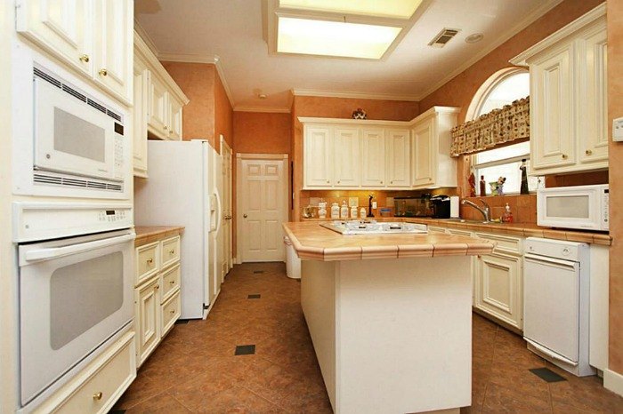
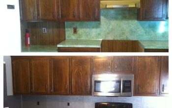
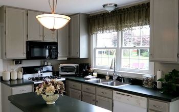
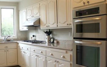
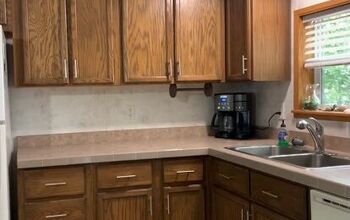
Our kitchen, when we moved in.
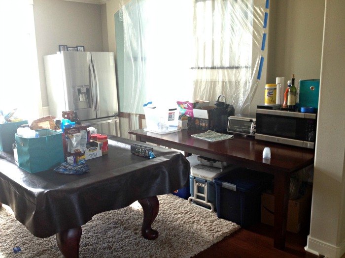
This was my temporary "kitchen" for the 3 months of the remodel. We lived like this with a baby and a toddler. Yikes. It was like camping in our own house.
The kitchen right before construction started.
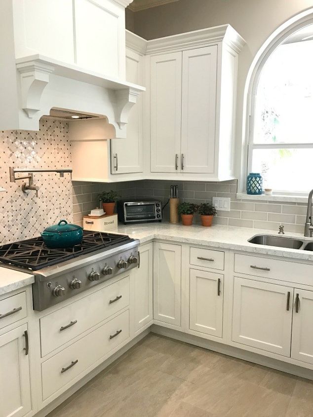
We made a lot of layout changes during our kitchen remodel. We wanted to make the room feel larger, update the look and make the kitchen much more functional. This is how we upgraded the layout.
- Removed that old fluorescent light box that was so popular in the 90’s.
- Turned the small doorway between kitchen and dining room into a large open concept archway to match the other arches in our home. This one was strange, if you look at the rest of our house, you see arches everywhere and wonder why they didn’t do this originally.
- Expanded the exterior door to our patio, from a 32″W x 6’8″H to 38″W x 8’H. We have high windows and doorways in most areas of our home. An 8′ high door just worked better in the design. Plus, my husband is 6’4″, so I thought he’d enjoy a little more space there.
- The island lost it’s stove top and moved closer to the center of the kitchen to increase my work zone. The stove, sink, fridge, microwave and oven are open to each other now. No more walking around that island to get from one place to the next.
- Moved dishwasher to the other side of the sink. Originally the dishwasher was in the corner. When the dishwasher was open, I couldn’t reach or even open some of the cabinets I stored dishes in AND I couldn’t even use the drawer next to it because the dishwasher handle kept it from opening.
- Removed breakfast nook chandelier and added can lights all over. A designer recommended losing the breakfast nook chandelier to make the whole room feel larger and more open. She was right, it worked!
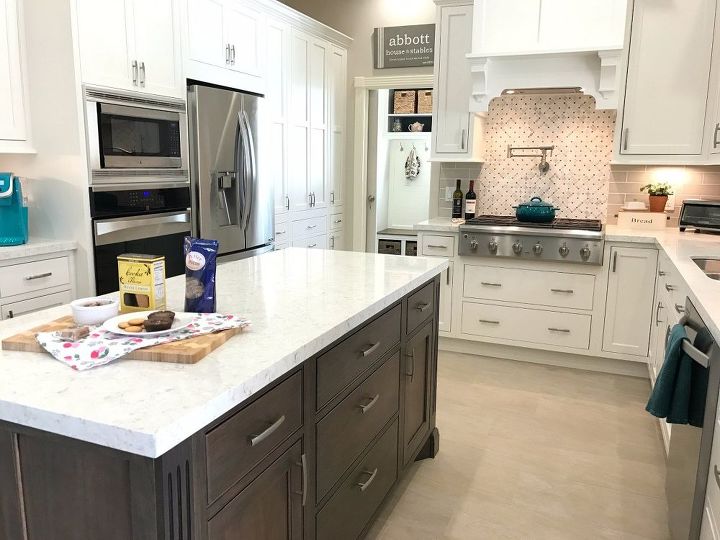
- Moved stove from island to the back wall. I wanted an island that my kids could sit at while I cooked dinner AND I wanted a feature stove against the wall with a nice cabinet hood above. Win-win!
- Moved oven next to refrigerator to make the room feel larger and open up space for the beverage station. Having that large oven cabinet on the end of the kitchen made the room feel smaller and closed in. Our cabinet guy said that they try to always put those deep, tall cabinets towards the back of the kitchen to make the opening or front of the kitchen feel more open.
- Skipped the switch to a double oven. They are nice to have and trendy, but I really would have used it twice a year. It wasn’t worth giving up every day pantry or beverage station space to have it. And I can’t do a low microwave with 2 toddlers in the house. That would have been an endless battle for mommy. Plus, the new microwave/convection combos actually do work as convection ovens. When it’s time to replace our current microwave, we’ll go for one of those.
- Switched from a closet pantry to a cabinet pantry. This was to increase the functionality of the pantry and to make the room feel larger again.
- Switched to a counter-depth fridge. That extra 4 inches really did work wonders to make the room feel more custom and larger.
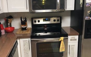
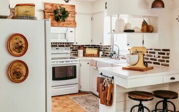
The new layout is so much more functional. It makes our kitchen feel twice as big.
Moving the stove away from the island made the island a safe place for my boys.
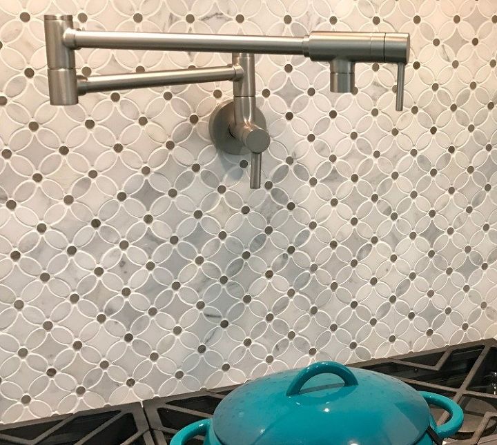
I just love this flower tile. Get all of the details about this kitchen and our 3 small regrets by following the link.

Want more details about this and other DIY projects? Check out my blog post!
Comments
Join the conversation
4 of 6 comments
-
Looks awesome, taking notes for my remodel.
-
Nice to see someone paying such attention to layout! You'd be surprised how much I've seen people spend on kitchen and spend absolutely zero time thinking about workflow and usability. Great work!


Frequently asked questions
Have a question about this project?