

Color Theory: Be Calm With Blue

by
BrightNest
Unlike warmer colors such as red or yellow, which trigger strong emotions, blue has a calming effect and is generally associated with stability and depth.
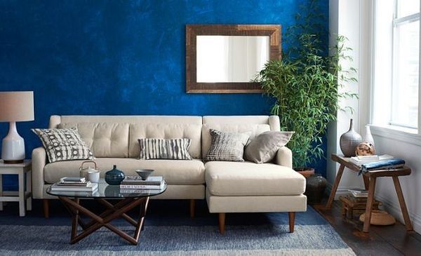
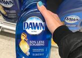
Companies will often use the color blue to promote a sense of purity, which is why you frequently see blue on products like water filters and cleaning supplies. Blue is also a very attractive color to men, who often associate it with expertise and precision. This may be one of the reasons that blue has become a go-to color for corporate America (think IBM, Chase and Jet Blue).
Want more details about this and other DIY projects? Check out my blog post!


Frequently asked questions
Have a question about this project?
Whats the name of and brand of blue paint is that behind your couch. Im usually not a big fan of most "blues" This one definitely caught my eye. TiA!